28.3.2022 - 27.6.2022 (Week 1 - Week 14)
Chung Yi Ki / 0345014 / BDCM
Advanced
Typography
Final compilation and reflection
INSTRUCTIONS AND FULL BLOG POSTS
SUBMISSIONS
Task 1: Exercises / Typographic Systems (Approximate time spent: 29-32 hours)
28.3.2022 - 8.4.2022 / Week 1- Week 2

|
| Fig 1.1 Final axial system - JPEG(8/4/2022) |

|
| Fig 1.2 Final radial system - JPEG (8/4/2022) |

|
| Fig 1.3 Final dilatational system - JPEG (8/4/2022) |

|
| Fig 1.4 Final random system - JPEG (8/4/2022) |

|
| Fig 1.5 Final grid system - JPEG (8/4/2022) |

|
| Fig 1.6 Final modular system - JPEG (8/4/2022) |

|
| Fig 1.7 Final transitional system - JPEG(8/4/2022) |

|
| Fig 1.8 Final bilateral system - JPEG (8/4/2022) |
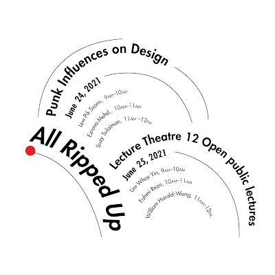
Fig 1.9 Final typographic systems outcome with grids and guides - PDF
(3/4/2022)
Fig 1.10 Final typographic systems outcome - PDF (3/4/2022)
Task 1: Exercises / Type & Play: Part 1: Finding type (Approximate time spent: 15-22 hours)
4.4.2022 - 24.4.2022 (Week 2 - Week 4)

|
| Fig 2.1 Final type design compilation process - JPEG (24/4/2022) |

|
| Fig 2.2 Final type design comparison - JPEG (24/4/2022) |

|
| Fig 2.3 Final type design - JPEG (24/4/2022) |

|
| Fig 2.4 Letter T - JPEG (24/4/2022) |

|
| Fig 2.5 Letter L - JPEG (24/4/2022) |

|
| Fig 2.6 Letter U - JPEG (24/4/2022) |

|
| Fig 2.7 Letter H - JPEG (24/4/2022) |
Fig 2.8 Final type design - PDF (24/4/2022)
Task 1: Exercises / Type & Play: Part 2: Type & Image (Approximate time spent: 10.5-13 hours)
18.4.2022 - 1.5.2022 (Week 4 - Week 6)

|
|
Fig 3.1 Original picture of sailboat floating on sea (24/4/2022) Source: https://www.pexels.com/photo/sailboat-floating-on-rippling-sea-6678139/ |

|
|
Fig 3.2 Original picture of oil tanker (30/4/2022) Source: https://www.vesselfinder.com/news/16189-Shell-Charters-Fleet-of-Lower-Carbon-Oil-Tankers |

|
| Fig 3.3 Final type & image - JPEG (30/4/2022) |
Task 2A & 2B: Key Artwork & Collateral (Approximate time spent: 49-53 hours)
25.4.2022 - 31.5.2022 (Week 5 - Week 9)

|
| Fig 4.1 Final black and white key artwork (29/5/2022) - JPG |

|
| Fig 4.2 Final colour key artwork (29/5/2022) - JPG |

|
| Fig 4.3 Final poster (29/5/2022) - JPG |

|
| Fig 4.4 Final poster mock-up (29/5/2022) - JPG |

|
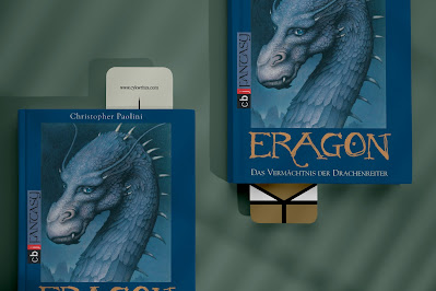
| Fig 4.5 Final bookmark version 1 (22/5/2022) - JPG |

|
| Fig 4.6 Final bookmark version 1 mock-up (22/5/2022) - JPG |

|
| Fig 4.7 Final bookmark version 2 (29/5/2022) - PNG |

|
| Fig 4.8 Final bookmark version 2 mock-up (29/5/2022) - JPG |

|
| Fig 4.9 Final bookmark version 3 (29/5/2022) - PNG |

|
| Fig 4.10 Final bookmark version 3 mock up (29/5/2022) - JPG |

|
| Fig 4.11 Final rubber stamp mock-up (22/5/2022) - JPG |

|
| Fig 4.12 Final stamp simulation on paper (22/5/2022) - JPG |

|
| Fig 4.13 Final example use of stamp as stamp signature mock up (29/5/2022) - JPG |

|
| Fig 4.14 Final flat lay (29/5/2022) - JPG |

|
| Fig 4.15 Final animated invite (29/5/2022) - GIF |
Fig 4.16 Final PDF compilation (29/5/2022) - PDF
Task 3: Type Exploration and Application (Approximate time spent: 39-47 hours)
30.5.2022 - 27.6.2022 (Week 10 - Week 14)
About the project:
An experimental typography project using a music sequencer to create a uniform set of letters, numbers and punctuations that also sounds nice. The experimental typeface, named as "MIDI Type" is created on an online music sequencer where it allows anyone to access it and play around with the letters, numbers and punctuations to make music or sound, and export the outcome as well if they wish to. MIDI files of MIDI Type is also uploaded to a Google drive link where anyone can download it and use it in any digital audio workstations software.
Online MIDI Type link:
https://onlinesequencer.net/2836390
Link to downloadable MIDI files of MIDI Type:
https://drive.google.com/drive/folders/1xZm0_Zvl1ReMofqD-DnisI5DWQzbVVvI?usp=sharing
Final tutorial and demonstration videos playlist:
https://youtube.com/playlist?list=PLCFFVGJ1z5u11N_QsryJp49wzYAMnAkqn
MIDI Type tutorial video:
Fig 5.1 Final MIDI Type tutorial video (26/6/2022)
Short demonstration on using MIDI Type on FL Studio:
Fig 5.2 Final MIDI Type FL Studio demonstration (26/6/2022)
Fig 5.3 Final MIDI Type example uses demonstration (26/6/2022)
REFLECTION
Experience
After taking Typography module back in my semester 1, Advanced Typography did come a bit easier in terms of knowing which typeface to choose and the rules of type setting, but it didn’t make it any less challenging as we learnt more about how to create a more creative and exciting layout and how to push the realms of typography further in this module. The tasks that I found the most challenging for me would be the typographic system exercise in Task 1 and Task 2A&2B, because I found that wanting to maximize the use of a space in a layout can be a double-edged sword. The type and play exercise and Task 3 on the other hand, are the ones that I found the most interesting and exciting as we get to do something with typography that’s not using words as just plain words.
Other than that, the weeks in this module have been hectic as we needed to do as much work as we can before each class for consultation while also making progress in other modules. But it is still manageable since Typography covered a lot of topics and we had a bit more time to focus on our works in Advanced Typography. All in all, this module was a great experience in touching the grounds of layout design and explore the realm of typography application.
Observation
After completing this module, I noticed that typography is more than just creating a typeface, type setting a paragraph or distorting a word to make it express something. In general, typography is about creating a visual meaning through letters, numbers or punctuations, or solving a problem using them. Task 3 also showed that typography can exist in a lot of things, the subject being comprised of letters, numbers and punctuations leave room for many explorations to be done. I also noticed that I tend to pay more attention on the layout in a design and how each elements are positioned after going through the tasks in this module.
Findings
Wanting to utilize the space in a layout but also wanting to make the point sizes suitable for the size of the layout is something that I found that can be a conflicting decision. A big point size would grab attention and fill up more spaces but it could be too big if it was printed out compared to seen on-screen, while a small point size would be more comfortable to read but might leave more white spaces. Knowing how to balance space and elements require careful attention and consideration of the medium, and multiple tryouts would help in comparing different outcomes.
Comments
Post a Comment