25.4.2022 - 31.5.2022 (Week 5 - Week 9)
Chung Yi Ki / 0345014 / BDCM
Advanced
Typography
Task 2A & 2B / Key Artwork & Collateral
LECTURE
Week 5 / Perception and Organisation
Contrast
Rudi Ruegg

|
Fig 1.1 Ways contrast can be applied in typography
Source:
Lecture slides
|
According to Rudi Ruegg, contrast can be created in typography by changing
weight, font, style, size, colours and typeface.
Carl Dair
Carl Dair has a slightly different explanation on how contrast can be
applied in typography.
Size
Contrast using size in typography means to direct the viewer's attention to
the word that is big in size.
Weight
Contrast using weight in typography is made by creating a heavy weihgt
within a text, it can be created using bold weight or using non-obejctive
elements.
Form
Contrast in form is created by changing the style of the text, from roman to
italic.
Structure
Creating contrast using different types of typefaces.
Texture
Texture refers to the way the lines of text look as a whole from up close
and from far away. Texture can be created by using different sizes and
weights.
Direction
Creating contrast by changing the direction of the text, either it be
horizontal or vertical.
Colour
Creating contrast using different colours. It is important to consider the
number of colours used and where the colour should be used to create
hierarchy.
Form
Refers the overall look and feel of the elements that make up the
typographic composition. A good form in typography is able to lead the
viewer's eyes and visually interesting.
An integration of meaning and form can bring a balanced harmony of function
and expression. When a typeface is perceived as a from, it no longer be
perceived as a letter.
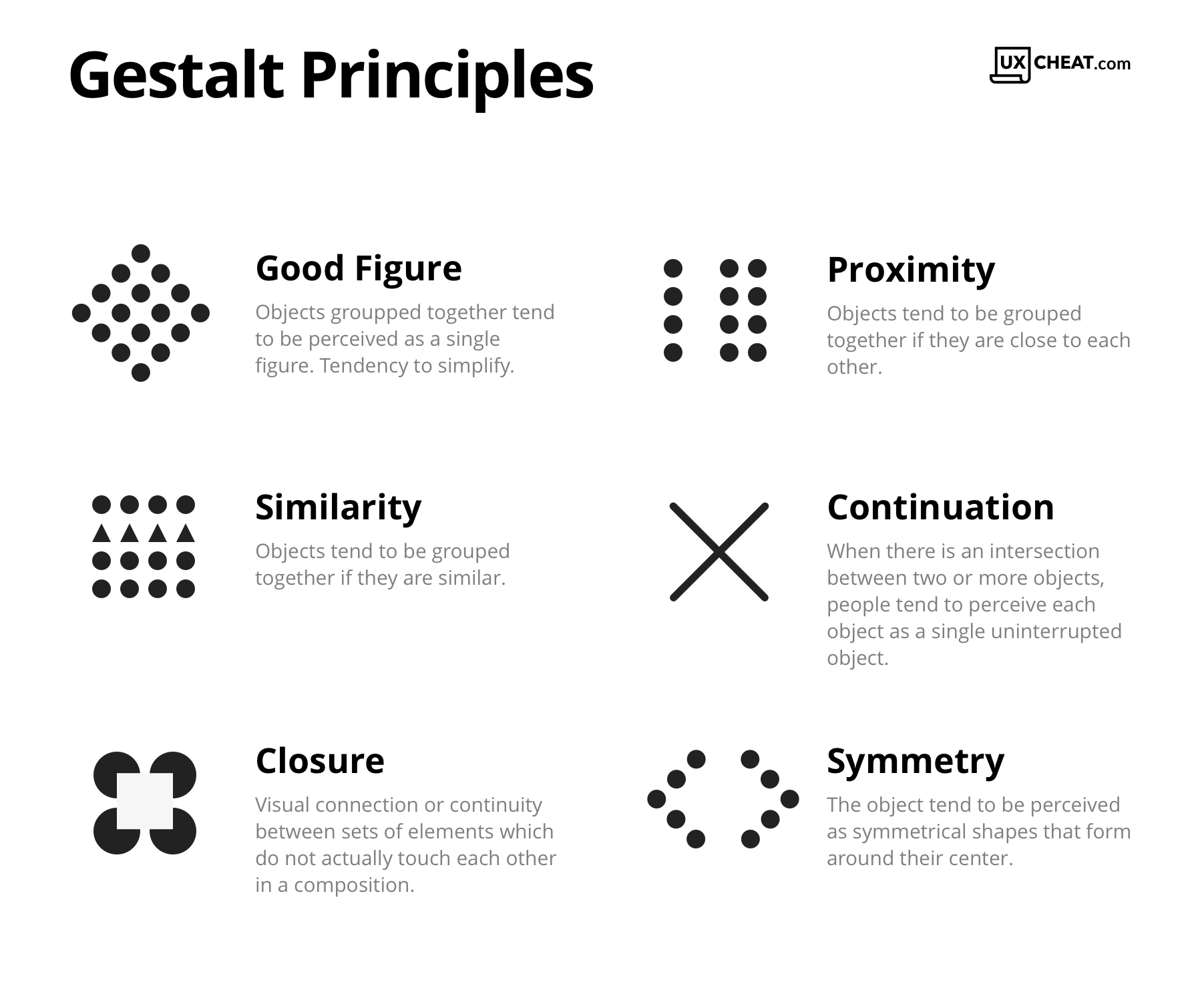
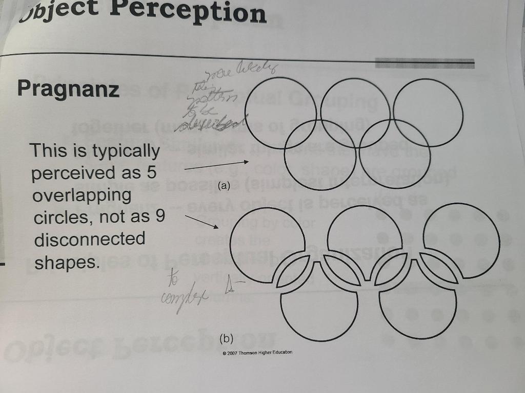
Organisation/gestalt
Gestalt theory emphasizes that the whole of anything, that is, the complete
form of a design, is greater than the detailed part of it. Thus in design, a
design is only considered a good design if it is visually interesting and
appealing as a whole.
Law of similarity
Elements with similar characteristics will be seen as a group of one.
Law of proximity
Elements which are closer to each other in distance will be seen as a group
of one
Law of closure
Refers to how human minds would complete gaps present in an image
Law of continuation
Refers to how human minds perceive two or more elements as different
groupings, even when the elements intersect each other.
Law of symmetry
Refers to how elements that are symmetrical to each other are tend to be
perceived as one grouping.
Also known as Law of good figure. Refers to how human minds tends to perceive
complex shapes in the simplest manner possible. In other words, our brains
find it less taxing to process simple shapes.
INSTRUCTIONS
This task has been divided into two parts. For the first part, we are tasked
to create a key artwork using the initials of our names or our full name, in
other words, making a monogram. We have to use more than one letter for our
key artwork and it should be typographical in nature. For the second part,
we are tasked to use the key artwork we created in our first part and create
collaterals for the type of occupation or event the key artwork suits. The
collateral can be anything from posters to various product mock-ups.
Task 2A: Key Artwork
Visual research

|
Fig 1.3 Gold colour rectangle and circular shapes on keys
(8/5/2022)
|
Before and while I was sketching my monogram design ideas, I went to look
for some inspirations for my design. I thought blackletter and slab serif
typefaces would be interesting directions for my ideas, so I searched for
pictures of the typefaces for observation. I also was inspired by the
rectangle and circle shape on my keys for the key inspired sketches in Fig
1.4.
Sketches and quick digitization

|
|
Fig 1.4 Sketches of possible ideas (8/5/2022)
|

|
|
Fig 1.5 Quick digitzations of sketches and their combination
breakdown (8/5/2022)
|
I did a few rough sketches on the possible letter combinations with the
letters “Y” and “K”. I then traced some of them in Adobe Illustrator to have
a better idea on what they would look like more accurately. I added slanted
edges in tryout #3 to make it give an impression of swords.
Further digitization
I decided to choose tryout #3 to develop further as I like the form of it. I
thought it looks like a mark that reflects fantasy with its sword-like edges
so I decided to look up some visual reference to construct my further
digitization of it. I later thought of relating the mark to an occupation of
a fantasy book writer and wanted the mark to reflect that. Since typewriter
is often tied with the concept of writer, and typewriter uses slab serifs
typefaces, I looked up some images of it for me to reference the
characteristics a bit.

|
|
Fig 1.9 Combination of letter "C" attempts (8/5/2022)
|
After doing some minor refinements on the initial digitization of tryout #3,
I wanted to try adding in another letter from my initial in the mark, which
is “C”, to make the mark look like a seal. I tried a few possible
combinations of the “C” with the mark and though that digitization #number
looks more like a seal, and the straight strokes gives a stoic and ancient
feeling to it. To integrate the “C” with the mark, I changed the straight
stem of the letter “Y” to make it resemble the tip of a fountain pen (and a
sword in some way too), so that the “C” would look like it’s a stroke from
the pen. I also rounded some edges to refer to the appearance of typewriter
letterforms.

|
|
Fig 1.10 Further changes on mark (22/5/2022)
|
After receiving feedbacks from Mr. Vinod, I went to make some changes on
my mark. I tried to simplify it by removing the pointed edges in in the
letters “YK” and instead stick to a more sans-serif simplicity. After
trying out the first and second attempt, I eventually ended up with the
third attempt where the “YK” is enlarged to be a part of the “C” border,
which makes the whole form to look like a seal and more pleasing to the
eye.

|
|
Fig 1.11 Black and white and colour mark (22/5/2022)
|
After that, I tried adding colours to the mark. After looking at the mark
for sometimes, I noticed that the form kind of look like an owl’s face due
to the counter spaces, so I filled the counter spaces with colours that
would represent an owl to make the look more apparent. I kept the mark to
be a writer’s mark since I thought the owl-looking form suits the
occupation of a fantasy writer too, as owl is often portrayed to be a wise
being in fantasy stories. Plus, the mark can work both ways, a black and
white version for a traditional and sophisticated looking writer seal and
a coloured version for a more graphical representation of the writer’s
personality.
Task 2B: Collateral
Fort this part of the task, we are required to create a poster of an
event and minimum one related collateral using the key artwork we created
in our task 2A. I decided to design a poster for a book signing and
sharing event since the key artwork is a writer’s mark.
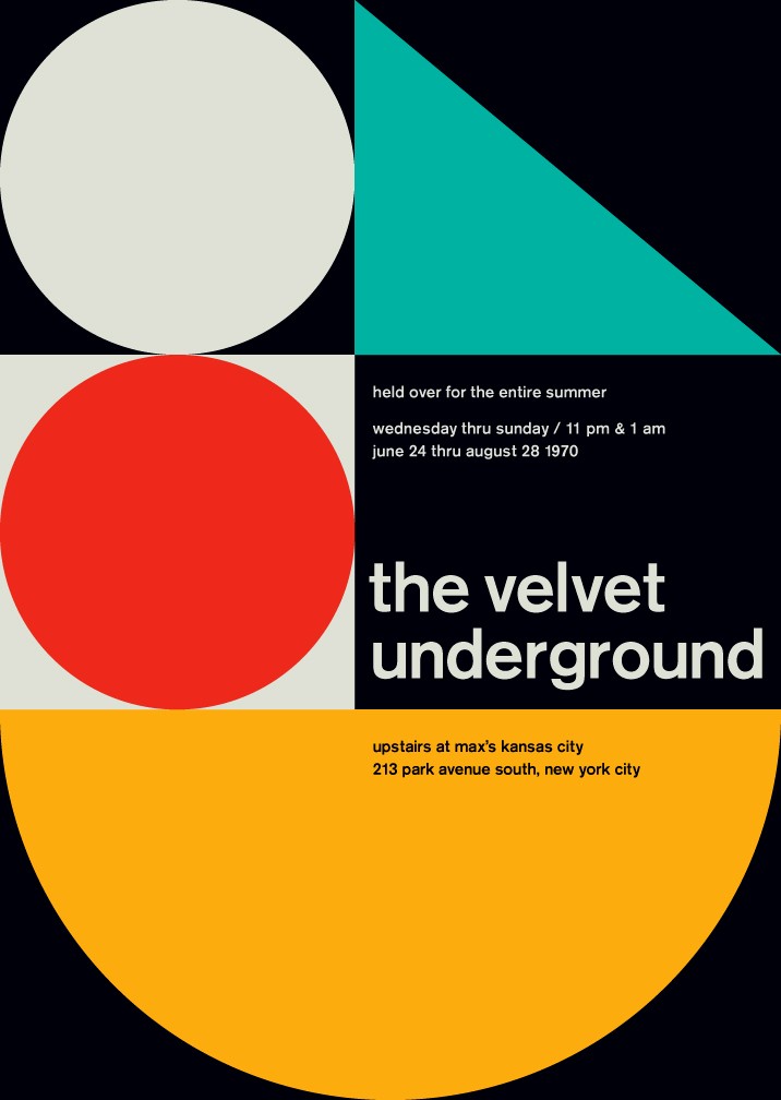
Visual research
While I was searching for some inspirations for my layout, I came across
some posters designed using the Swiss grid system. I thought the asymmetry
and use of large white spaces in the posters are interesting, and the
ordered and clean layout would be suitable for the rigid form of my mark
and the small amount of text I have. So, I planned to include those
characteristics when making my poster layout.

|
|
Fig 2.4 Poster layout tryouts (22/5/2022)
|
I created different tryouts to test which layout would look better and
eventually chose tryout #4 to further refine as my final outcome. I used
ITC Garamond for the typeface in the layouts as a serif typeface would
suit a book event.

|
Fig 2.5 Colour and text changes in tryout #4 (22/5/2022)
|

|
|
Fig 2.6 Poster mockup (22/5/2022)
|
I decided to fill the counterspace above the horizontal stem for “K” white for
the small mark beside the title of the poster and leave the counterspace empty
for the large marks (which are enlarged to be used like a pattern in the
poster), so that the white colour won’t distract the readers from the text and
the small mark would be more prominent. I also adjusted the leading a bit and
edited the details in the body text. I then put the poster into an Adobe
Photoshop mockup file that I downloaded from the Internet.
Fig 2.7 Screen recording showing the path changes for the shape layers of
the "eyes", the motion path of the mark and the value changes for "free
admission" (22/5/2022)

|
|
Fig 2.8 Animated invite (22/5/2022)
|
For the animated invite, I treated the mark as a character which in a way
guides the viewer through the details presented in the animation. The
black and white mark is shown in the end as a transition from character to
a static mark identity. I also adjusted the speed of each elements using
the speed graph so the movements and transitions would be smo

|
Fig 2.9 Bookmark (22/5/2022)
|
|
|
Fig 2.10 Bookmark mockup (22/5/2022)
|

|
|
Fig 2.11 Notebook cover (22/5/2022)
|

|
|
Fig 2.12 Notebook mockup (22/5/2022)
|

|
|
Fig 2.13 Rubber stamp mockup (22/5/2022)
|

|
Fig 2.14 Stamp mockup on paper texture (22/5/2022)
|
As for the collaterals, I decided to choose a bookmark and notebook that can
be given away during the event, and a rubber stamp for the writer to use. I
used free mockup files that I found from the internet to make the collaterals.
The idea for the bookmark layout is to have the mark sort of "peeking out"
from the book when it is used. For the notebook, I went with a
minimalistic approach to the cover as it gives a more intimate feeling. As for
the rubber stamp, I create another paper mockup (Fig 2.10) for it as the
initial mockup file I used (Fig 2.9) doesn't show the paper texture that well.
The paper mockup was made using a paper texture picture from Unsplash and
using hard light blending mode of a copy of the picture layer on top of the
mark layer and adjusting the brightness and contrast of the picture layer
copy.
Further changes on poster and collaterals

|
|
Fig 3.1 text layout change in poster (29/5/2022)
|

|
|
Fig 3.2 Poster mock up of layout change (29/5/2022)
|
After receiving feedbacks from Mr. Vinod, I went to change the text layout in
my poster. I changed the title text orientation to vertical and increased the
size until "Tall Tales &" extends out of the edge of the poster. I then
reintroduce the title again at the upper right part of the poster and kept the
size bigger than the detail text, so it has more hierarchy. The first line of
the detail text is in bold so that it has more hierarchy than the others, but
it doesn't clash with the title as its point size is smaller. I resized the
mark beside the title to be smaller and typed out my initial, "C.Y.K"
underneath and and positioned them so that they're aligned with the height of
the title. For the poster mock up, I removed the person passing by and made
the crumpled paper texture more apparent so that it would focus more on the
poster.

|
|
Fig 3.3 Added "title transition" to the animated invite (29/5/2022)
|
Since there's a big title layout in the poster, I decided to add the same
element in my animated invite but used as a transition. So that the animated
invite would match better with the poster.

|
|
Fig 3.4 Bookmark layout version 2 (29/5/2022)
|

|
|
Fig 3.5 Bookmark layout version 3 (29/5/2022)
|

|
|
Fig 3.6 Bookmark layout version 2 mock up (29/5/2022)
|

|
|
Fig 3.7 Bookmark layout version 3 mock up (29/5/2022)
|
For the collaterals, I decided to go with the bookmark and rubber stamp
as my final outcomes. I went and did 2 different layout for the bookmark
collateral, so that people coming to the event can have different options to
choose from. I kept the "peeking out" and cropping idea in mind and tried to
execute them in different ways. I also used different sentences for different
bookmark layout but they all have the same meaning of protecting the book
pages.

|
|
Fig 3.8 Example usage of stamp collateral, as a stamp signature
(29/5/2022)
|
Mr. Vinod also mentioned that the stamp look like it could be used as a
signature at the end of something like a poem. So, I thought I create a mock
up depicting it to give a more visual look of the example and further
describing how the stamp can be used as a signature. I used a
Lorem Ipsum generator
for the text in the mock up.
Fig 3.9 Sources used in mock-ups (22/5/2022)
(Blogger marked my blog post as spam when I typed this
down directly on my post, so I had to upload this as a PDF file)
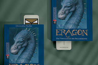
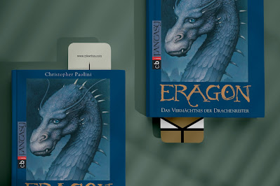
Final Key Artwork & Collateral

|
|
Fig 4.1 Final black and white
key artwork (29/5/2022) - JPG
|
|

|
|
Fig 4.2 Final colour key artwork (29/5/2022) - JPG
|

|
Fig 4.3 Final poster (29/5/2022) - JPG
|

|
Fig 4.4 Final poster mock-up (29/5/2022) - JPG
|

|
Fig 4.5 Final bookmark version 1 (22/5/2022) - PNG
|

|
|
Fig 4.6 Final bookmark version 1 mock-up (22/5/2022) - JPG
|
 |
| Fig 4.7 Final bookmark version 2 (29/5/2022) - PNG |
|
|
Fig 4.8 Final bookmark version 2 mock-up (29/5/2022) - JPG
|

|
|
Fig 4.9 Final bookmark version 3 (29/5/2022) - PNG |

|
|
Fig 4.10 Final bookmark
version 3 mock up (29/5/2022) - JPG
|
|

|
|
Fig 4.11 Final rubber stamp mock-up (22/5/2022) - JPG
|

|
|
Fig 4.12 Final stamp simulation on paper (22/5/2022) - JPG
|

|
|
Fig 4.13 Final example use of stamp as stamp signature mock up
(29/5/2022) - JPG
|
 |
| Fig 4.14 Final flat lay (29/5/2022) - JPG |

|
|
Fig 4.15 Final animated invite (29/5/2022) - GIF
|
Fig 4.16 Final PDF compilation (29/5/2022) - PDF
FEEDBACKS
Week 7: Key Artwork
General feedback: Avoid making the form of the mark too
complicated. Check the counter spaces by drawing a square or rectangle over
our mark and see if there's unbalanced space in the composition of the
mark.
Specific feedback: The length around the straight stem of the
letter Y in the mark, angles and additional shapes has destructed the
simplicity of the form. The space around the straight stem of the letter Y
seems to be too much, throwing off balance. Simplify the mark and maintain
the ratio of the thickness in strokes when reconstructing it.
Week 9: Key artwork & Collateral
General feedback: An extension of the key artwork is to use the key
artwork as an artwork in the poster and/or collaterals. Try enlarging the
key artwork until is becomes a form in the background of the poster, and
introduce the key artwork again in full as a logo in a smaller size. Be
careful to not crowd the elements in the poster.
Specific feedback: There's no problem in the way the key artwork is
used for the layout of the poster, though there's a lack of imagination in
how the texts are arranged at the side. Try enlarging the title and orient
it vertically until it fills up most of the space of the poster, it can go
out from the margin of the poster. Then, introduce the title again at a
smaller size in the empty space of the poster along with the other text
details. The key artwork logo could also be at a smaller size and type out
the initial that it stands for under it. The animated invite works, good use
of the key artwork element. But when the poster is redesigned, some elements
in the refined poster can be considered to include them in the animated
invite. For the bookmark, there can be different layout versions of it so
people can choose which one they like the most.
REFLECTION
Experience
This task was an enjoyable process though it was somewhat challenging when
coming up with ideas for task 2A and incorporating the mark into a poster
layout. But it was interesting on figuring out how to use letterforms to
create a complete form rather than just treating them as letters. The most fun
part for me in this task would be creating the animated invite. I never got to
test out tweaking the motion paths and speed graphs this much before so it was
fun trying them out, and figuring out how to make the text interactive enough
in the animated invite so people would view it again and again was exciting to
work on too.
Observation
I observed that a simpler form often leaves a more lasting impression as we
tend to remember and comprehend simplicity more than complexity. I also
observed that different typefaces will give out a different feeling too. For
example, sans serif gives a more modern look while serif gives a more
traditional and book-ish look, especially old style serifs as it has the
characteristics of smooth and round strokes similar to words written using ink
pens. I noticed this back in typography module but it was a good refresh on
the observations when doing this task.
Findings
I found that a clear sense of visual hierarchy is always important when
creating a layout, especially for one that's expected to be seen far away. Headings might need to be in a rather large point size to grab attention instantly, while the point size of body text would depend on the canvas size and how the product outcome is expected to be used. Generally, when making poster, the rules of body text point size is always a good starting point to follow although it might look small on screen. Of course, the best way to determine the point size is by
actually printing out a physical test. But in situation where this can't be
done, point size can be determined by judging the space ratio of the layout
and the text when testing out different point sizes on screen.
FURTHER READING
Week 8
This week, I've read a book titled "Typographic Essentials: 100 Design
Principles for Working with Type" by Ina Saltz.

|
Fig1.1 Book cover
|
Using letter as form (pg8 - pg9)
Letters can be created in away that they are seen as forms of a shape rather
than alphabets. It can serve as an illustration, icon, vessel, graphic focal
point, texture, pattern, an image container and anything other than their
use as alphabets in a string of word. For example, the lettered logo in Fig
1.2 form leaf like shapes and the counter spaces are filled in some
renditions too. While in the bottom layout image in Fig 1.3 the letterforms
are sliced and diced until it forms a form that's related to vinyl records.
As for the image of the logo at the top in Fig 1.3, the logo is defined in a
way where the letters can contain different type of images.

|
|
Fig 1.2 Lettered logo with a form of a discrete shape (pg 8)
|

|
|
Fig 1.3 Logo containing images and vinyl-shaped letterforms (pg 9)
|
Using counter spaces as form (pg10 - pg11)
Counter spaces can be utilised as design elements as well. They can be
filled with colours, patterns or texture. This adds to the weight of the
type and can provide a unique and memorable effect. An example of using
images is the layout in Fig 1.4. While in Fig 1.5, the counter spaces are
used in a way where the negative spaces becomes the letter forms.

|
|
Fig 1.4 Filling counter spaces with images (pg10)
|

|
|
Fig 1.5 Using counter spaces as positive space (pg11)
|
Hierarchy using position (pg62-pg63)
Often times, text put in the upper areas of a layout would be more
prominent. And people prefer more slightly to read text from the right-hand
side than the left-hand side. So, positioning text in these "primary"
location would receive more hierarchy, though exceptions can be made if
other methods of hierarchy is used. For example, in Fig 1.6 and Fig 1.7, the
headlines are not positioned on the upper areas, but the use of colour, size
and choice of typeface helps differentiate the headline from the other
elements.

|
|
Fig 1.6 Headline positioned at the bottom (pg62)
|

|
|
Fig 1.7 Headline positioned at the center at a large size (pg63)
|
Hierarchy using size (pg64 - pg65)
The bigger the text, the more attention it grabs. Though, the size of a text
should not impede its legibility. Other than creating hierarchy by using
different sizes, it can also be used in conjunction with other adjustments
such as creating contrast using colour as seen in Fig 1.8.

|
|
Fig 1.8 Hierarchy using size and contrast (pg65)
|
Hierarchy using weight (pg66 - pg67)
The weight of a text can create a stronger hierarchy than position and size,
as the wider or heavier a text is, the more prominent it is, as shown in the
word "out" in Fig 1.9. Though, position and size should also be taken as
consideration when employing weight as hierarchy, as changes in one aspect
might lead to different outcomes. This can be seen in the word "one" in Fig
1.9, "one" has a lighter appearance than "avoid" and "thing", but the center
position might have promoted its hierarchical value.

|
|
Fig 1.9 Hierarchy using width, weight and position (pg67)
|


Comments
Post a Comment