30.5.2022 - 27.6.2022 (Week 10 - Week 14)
Chung Yi Ki / 0345014 / BDCM
Advanced
Typography
Task 3 / Type Exploration and Application
LECTURE
Lectures 1-4 are documented in Task 1 / Exercises
Lectures 5 is documented in Task 2A & 2B / Key Artwork & Collateral
Instructions
For this project, we are tasked to either design a typeface to solve a problem
or experiment with typography using any medium and methods. For the choice of
designing a typeface for problem solving, we can either locate a problem
within an area of interest or enhance an existing typeface.
Idea generation

|
| Fig 1.1 Idea #1 - MIDI letters (30/5/2022) |
I came up with two ideas for this task. The first idea is inspired by MIDI art, where people use a music sequencer to create a graphic using music notes. I found that there’s a lot of graphic MIDI works but none is really typographical, and in most of the MIDI artworks, the sound is actually terrible when played. So, I wondered if it’s possible to create recognizable type using a music sequencer but also making sure each letter sounds decent. I went to try it out using an online music sequencer creating the letters A B C D E F G.
Link to A B C D E F G on online music sequencer: https://onlinesequencer.net/2801580
Link to the YouTube screenshots in Fig 1.1
How Does Kahoot Sounds Like - MIDI Art
https://www.youtube.com/watch?v=YQdBBik2D-A
https://www.youtube.com/watch?v=YQdBBik2D-A
What Bruh Sounds Like - MIDI Art
https://www.youtube.com/watch?v=vrCawnz9BF4
https://www.youtube.com/watch?v=vrCawnz9BF4
2021 MIDI Art
https://www.youtube.com/watch?v=4zcXdlZ9iqg
https://www.youtube.com/watch?v=4zcXdlZ9iqg

|
| Fig 1.2 Idea #2 - Dragon inspired typeface (30/5/2022) |
My second idea was to expand on an existing typeface to develop a full set of
characters for it, enhancing its use for other purposes. I was looking at
fantasy novels and noticed a type design for the word “Dragons” on the book
“The Erth Dragons: A New Age”. I thought that was an accurate portrayal of
look and feel of the word, so I went to search if other Dragon related books
have the same approach, and I found that most of them doesn’t and relied on
creating the general feel of fantasy instead. So, I thought it’d be useful if
there’s a set of typeface based on the type design on “The Erth Dragons” so it
could be used on any dragon-related situations.
Source links of the book covers shown in Fig 1.2
The Erth Dragons: A New Age
https://www.bookxcess.com/products/the-erth-dragons-9781408349564
https://www.bookxcess.com/products/the-erth-dragons-9781408349564
Dragon Rider
https://corneliafunke.fandom.com/wiki/Dragon_Rider
https://corneliafunke.fandom.com/wiki/Dragon_Rider
Tea with the Black Dragon
https://www.kobo.com/my/en/ebook/tea-with-the-black-dragon-3
https://www.kobo.com/my/en/ebook/tea-with-the-black-dragon-3
Further development of idea
|
|
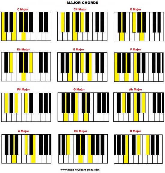
Fig 2.1 Major chords on piano keys. The keys in yellow are the notes in
the chord, when the notes are played individually, it's called a broken chord (13/6/2022) Source: http://www.piano-keyboard-guide.com/piano-chords.html |
|
|
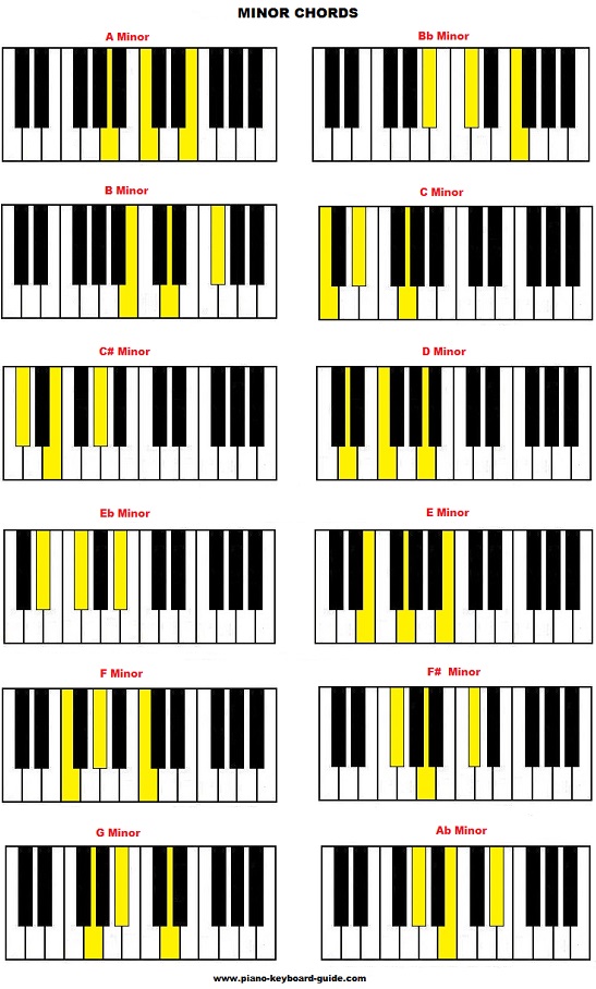
Fig 2.2 Minor chords on piano keys. The keys in yellow are the notes in
the chord, when the notes are played individually, it's called a broken chord (13/6/2022) Source: http://www.piano-keyboard-guide.com/piano-chords.html |

|
|
Fig 2.3 Letters A-Z on the online music sequencer (13/6/2022) Link to the MIDI letters: https://onlinesequencer.net/2826513#t3 |
After receiving feedbacks from Mr. Vinod, I decided to further develop my
first idea. I continued creating all the letters on the music sequencer and
tested them out in various usage. The letters are constructed based on broken
chords. To illustrate the meaning of broken chords, Fig 2.1 and Fig 2.2 shows
the major and minor chord diagrams on piano keys. Counting from the first
yellow key to the last yellow key, each of the chords take up 8 piano keys.
And when the yellow keys are played individually, the chord is broken thus
being called as a broken chord. So, the range of 8 keys became the height of
each letters, and the music notes to fill in that range is a combination of
plotting the notes from different chords and adding extra notes as well as
rearranging existing notes by trial and error. All the letters are put on the
same line after being constructed for ease of viewing.
 |
| Fig 2.4 Discarded look for the letters A M N Q and their issues (19/6/2022) |
 |
| Fig 2.5 Testing out filling the gaps with notes of different instruments on different grid sizes (19/6/2022) |
Fig 2.4 and Fig 2.5 are screenshots of the experimentation process that I managed to document while constructing the letters. While constructing the letters, I would try out different ways of constructing and it would end up in different looks and sound. In Fig 2.4, it shows the other look of the letter A M N Q which is discarded in the final outcome. In Fig 2.5, I thought I try out if it's possible to fill in the gaps between the notes in each of the letters. To prevent the horrible sound in MIDI art, I thought of using different instrument notes to fill in the gaps and tested it out in different grid sizes. But, I ended up discarding the idea as it kind of ruins the look and feel of the original version and makes it somewhat harder to read. It would also end up sounding noisy when a lot of letters are played or when the letters are stacked together. Other than that, if the instrument used is a melodic instrument, it would have the same outcome as MIDI art, and if the instrument used is a drum, it would be noisy when all the notes are played as cymbals.

|
|
Fig 2.6 Tryouts on using the letters to form a word and to create short melodies and music arrangement (13/6/2022) Link to the tryout: https://onlinesequencer.net/2826516#t1 |

|
|
Fig 2.7 My friend's outcome on using the letters (DECKYZ is spelled above and JIBBY is spelled below) (13/6/2022) Link to the tryout: https://onlinesequencer.net/2826520#t1 |
I also tried out using the letters on a blank music sequencer to see if they
work as how I intended it (which is to be able to create melodies using it). I
also asked my friend to try it out to see what is her outcome.
Numbers and punctuations

|
| Fig 3.1 Observation of Arial and Calibri (19/6/2022) |

|
| Fig 3.2 Observation of Gill Sans Std and Futura Std (19/6/2022) |

|
| Fig 3.3 Observation of Roboto and ITC Garamond Std (19/6/2022) |

|
| Fig 3.4 Observation of Open Sans (19/6/2022) |
After receiving feedbacks from Mr. Vinod, I continued to create the numbers and punctuations using the music sequencer so that it would be a full set of experimental typeface. Before plotting them out in the music sequencer, I did some observations on how the height of numbers and the common punctuations that I want to include relate to the height of the letters. I used different typefaces for the observation as I noticed the height of the brackets and slashes vary between typefaces. I noticed that for parentheses, the two ends are always longer than the letters. But for square brackets, the top part is either at the same height of the cap line or it’s higher than the cap line, or both ends could be longer than the letter height, depending on the typeface. I compared both parentheses and square brackets as the look on the music sequencer will be more like a square bracket but might work better if it follows the height of a normal bracket. For the slash, it’s either the same height as the letters, or with one end being longer, or with both ends being longer.

|
| Fig 3.5 Different lengths of bracket and slash (19/6/2022) |

|
| Fig 3.6 Different lengths of bracket and slash (19/6/2022) |
 |
| Fig 3.7 Final numbers and punctuations (19/6/2022) |
I found that how a punctuation is style is heavily dependent on how it
complements the look of the rest of the letters. So, I created the
punctuations based on how my letters and numbers look so that they would work
well together, and tried out different height variations for the brackets and
slash. After comparing, I think variation #5 works better as the letters have
a top-heavy feeling to it so making the top end of the slash the same height
as the letter but the bottom end of the slash slightly longer than the letter
would give a more natural distinctive look to it.
Recording and editing tutorial video

|
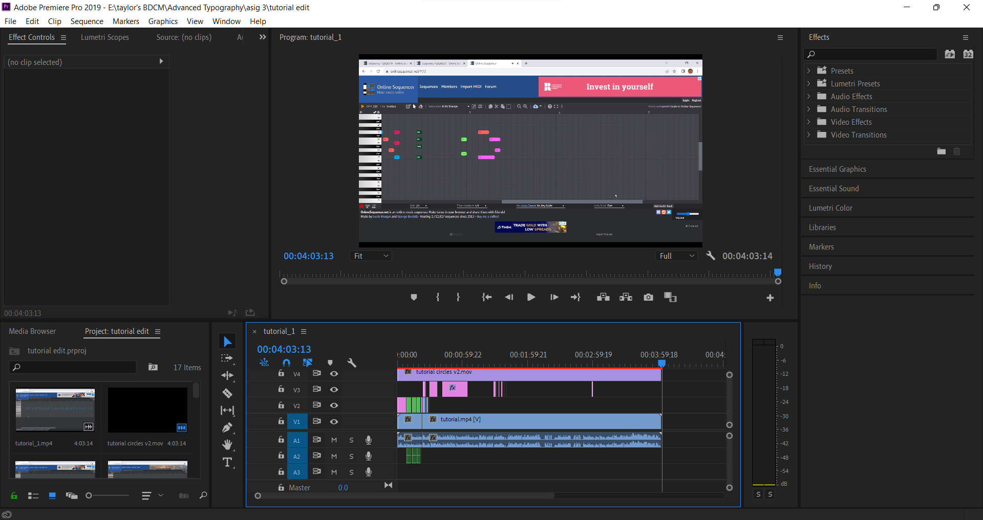
| Fig 4.1 Screenshot of main Adobe Premiere Pro workspace (19/6/2022) |

|
| Fig 4.2 Screenshot of Adobe After Effects workspace (19/6/2022) |
|
|
Fig 4.3 Screenshot of editing video export of indication marks into the tutorial video in Premiere Pro (19/6/2022) |
Fig 4.4 Full tutorial video (19/6/2022)
After creating all the needed numbers and punctuations, I decided to name the experimental typeface as “MIDI Type”, a reference to MIDI art, and recorded a tutorial video explaining the basic steps on how to use it and how to play around and experiment with it. I included indication marks (circles and rectangles) and words in the video so that viewers would understand what the video is talking about even without hearing the audio or they want to skip through parts of the video. The video and audio was edited in Adobe Premiere Pro while the indication marks were made in Adobe After Effects and edited into the video in Premiere Pro.
Fig 4.5 Short demonstration of using MIDI Type
on FL Studio (copy and pasting parts are sped up) (19/6/2022)
Fig 4.6 Re-edited MIDI Type tutorial video (26/6/2022)
Fig 4.7 Re-edited FL Studio demonstration with voice over (26/6/2022)
After receiving feedbacks from Mr. Vinod, I re-edited some parts in the tutorial video and FL Studio demonstration video. In the tutorial video, around the timestamp 2:01 in Fig 4.6, instead of showing the viewers that they can stacked and overlap the letters, numbers and punctuations, I edited it to let them know they can move the position of the characters higher, lowers or nearer to each other in order to preserve the readability of the words that's been spelled. For the FL Studio demonstration, I added a voice over and edited the video to match the script so that viewers would have a better understanding when watching the demonstration.
Fig 4.8 Two examples showing how the sound produced can be used (26/6/2022)
In the video (Fig 4.8) where it shows the example of ringtone sound, I used my cousin's phone to call my phone and covered up his phone number for privacy reasons.
For submission, I compiled all the 3 videos in a YouTube playlist for easy navigation and access.
YouTube playlist link: https://youtube.com/playlist?list=PLCFFVGJ1z5u11N_QsryJp49wzYAMnAkqn
Lesson 29 (comma and period)
The comma is roughly the height of two stacked periods, but its head is slightly smaller than a period. Comma can de stylised differently and this depends on the look of the typeface.
For ideal legibility, the space between the quotation marks and guillemet in a double quotation mark and guillemets shouldn't be too narrow or too far.
Usually, parentheses are places around the cap-height and its lower end can extend to the descender line. Square brackets usually also follows the proportions of parentheses, and their stem width is slightly thinner than the capital "H".
The em dash is equal to the width of the em space. In traditional typography, the em space is roughly equal to the width of the capital "M". In digital typography, the em space is around 1000px width. The en dash and underscore is half of the width of the em space, that is, half of the width of the em dash.
Final Type Exploration and Application
Online MIDI Type link: https://onlinesequencer.net/2836390
Link to downloadable MIDI files of MIDI Type: https://drive.google.com/drive/folders/1xZm0_Zvl1ReMofqD-DnisI5DWQzbVVvI?usp=sharing
Final tutorial and demonstration videos playlist: https://youtube.com/playlist?list=PLCFFVGJ1z5u11N_QsryJp49wzYAMnAkqn
MIDI Type tutorial video:
Fig 5.1 Final MIDI Type tutorial video (26/6/2022)
Short demonstration on using MIDI Type on FL Studio:
Fig 5.2 Final MIDI Type FL Studio demonstration (26/6/2022)
Short demonstration showing how the sound produced by MIDI Type can be used:
Fig 5.3 Final MIDI Type example uses demonstration (26/6/2022)
FEEDBACKS
Week 10
General feedback: Make sure that you're clear with what your intention with your typeface is. Whether it is to solve a problem, enhance a use or is purely experimental
Specific feedback: The first idea is interesting, go ahead with the idea. Continue experimenting on it and think of some potential ways for its application
Week 12
General feedback: Think of your application thoroughly and clearly, as the font only get realised that way.
Specific feedback: It's a cool experimentation. Just get the numbers and punctuations done and submit it with the links. Do also record a tutorial video showing how to use the experimental typeface.
Week 13
General feedback: Make sure that when you're making collaterals with the generated font, prioritise in showcasing the font rather than the visuals.
Specific feedback: Around the timestamp 2:01 in the tutorial video, don't show the viewers that the letters can be stacked when they're spelling out something, since the goal is to have the sound but also retain readability. If they're no trying to spell out something though, it is fine if the letters are stacked like the example shown around the timestamp 3:33 of the video. It'd be cool too if you could show the outcome on the online music sequencer and also how the sound is applied to something. Continue to refine a bit of the submission of the work.
REFLECTION
Experience
This project was challenging at first as I was trying to figure out what to do for it. But once I found something that I'm really interested in, it became fun for me. Music is one of my hobbies so integrating it with something visual is always something I wanted to do. I was also always fascinated by MIDI art so this project gave me a reason to challenge myself creating something using a music sequencer. Overall, this project was enjoyable and gave me a refresher on my music theory and also showed me some experimental ways on constructing letters.
Observation
I observed that in order to create a consistency on a typeface, whether it’s an actual typeface or experimental typeface, having an idea of the overall look and pattern for each letters and how they proportion to each other can help in creating a sense of unity in the typeface, even if it’s something wild and experimentative.
Findings
I found that typography doesn’t have to be just about static letters, numbers, punctuations and what not. It can be as fun or interesting as you want and this experimental project is kind of a way to prove that. In the end, while typography will always be about making the usual, actual set of typefaces, experimental typography shows how far the realm of typography can be stretched out to. I also found that a letter doesn’t have to be recognizable with only solid strokes, but knowing the important characteristic of a letter and keeping them while omitting all the others part will still make a letter recognizable.
FURTHER READING
Week 12
This week, I've read the posts posted by grillitype on Instagram about their lessons on punctuations.
 |
| Fig 1.1 Instagram guide cover Source: https://www.instagram.com/grillitype/guide/chapter-4-punctuation/18095890297286770/ |
Lesson 29 (comma and period)
 |
| Fig 1.2 Difference between period and the width of the letter "O" and the dot of "i" (Slide 8) |
 |
| Fig 1.3 Difference in overshoots of period and the letter "O" (slide 3) |
The shape of the period is related to the dot of the lowercase "i", but its width should be larger so it would indicate a pause when a paragraph is read. Heavier fonts require heavier period but the period shouldn't be too large until it interferes with reading. Square period should sit on the baseline while round periods have a slightly less overshoot than the letter "O".
 |
| Fig 1.4 Comparison of comma and the width of period (slide 5) |
 |
| Fig 1.5 Different styles of comma (slide 7) |
The comma is roughly the height of two stacked periods, but its head is slightly smaller than a period. Comma can de stylised differently and this depends on the look of the typeface.
Lesson 31 (guillemets and quotation marks)
 |
| Fig 1.6 Ideal spacing of double quotation marks and guillemets (slide 7) |
For ideal legibility, the space between the quotation marks and guillemet in a double quotation mark and guillemets shouldn't be too narrow or too far.
Lesson 31 (Parentheses and brackets)
 |
| Fig 1.7 Height of parentheses (slide 5) |
 |
| Fig 1.8 Proportion of square brackets (slide 6) |
Usually, parentheses are places around the cap-height and its lower end can extend to the descender line. Square brackets usually also follows the proportions of parentheses, and their stem width is slightly thinner than the capital "H".
Lesson 33: (en dash, em dash, underscore)
 |
| Fig 1.9 Width of em space (slide 6) |
 |
| Fig 1.10 Width of em dash, en dash and underscore (slide 9) |
The em dash is equal to the width of the em space. In traditional typography, the em space is roughly equal to the width of the capital "M". In digital typography, the em space is around 1000px width. The en dash and underscore is half of the width of the em space, that is, half of the width of the em dash.
Lesson 34: (slash, backslash)
 |
| Fig 1.11 Proportions of the slash (slide 2) |
Usually, both slash and backslash extend above the ascender line and below the baseline. They have a similar angle to the stem of the capital "V" but their stroke is slightly lighter.
Comments
Post a Comment