28.3.2022 - 1.5.2022 (Week 1 - Week 6)
Chung Yi Ki / 0345014 / BDCM
Advanced
Typography
Task 1 / Exercises
LECTURE
Week 1 / Typographic systems
Typographic system depends on heiarchy, reading flow, legibility, contrast
in order to create a coherent system. Each system has a set of rule that
provides sense and purpose to them.

|
|
Fig 1.1 Lists of typographic system Source: https://mrsseckler.weebly.com/typography.html |
Axial system
Elements are arranged at the left or right of an axis. The axis can be
straight or bent. Following the rules, axial system only follows a single
line (no multiple lines).

|
|
Fig 1.2 Axial system layout Source: https://www.pinterest.co.uk/pin/333688653617405020/ |
Radial system
Elements are radiated/extended from a point of focus. Can have multiple
points of focus.
|
|
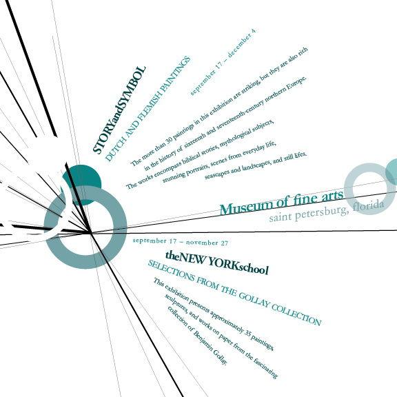
Fig 1.3 Radial system layout Source: https://www.deviantart.com/fragmentx/art/Radial-Design-265239706 |
Dilatational system
Elements expand from a central point of a circle. In other words, it's
similar to axial system but following a circular path. Can create a
hierarchy where the most important element is taking a bigger size than the
others.

|
|
Fig 1.4 Dilatational system layout Source: https://www.pinterest.com/pin/1337074883382801/ |
Random system
Elements are arranged in no particular pattern or relationship. Although
random, contents still have to be somehow organized in a chaotic layout in
order for the readers to make sense of it.

|
|
Fig 1.5 Random system layout Source: https://www.idccdesignhouseblog.com/single-post/2016/10/28/what-is-so-good-about-helvetica |
Grid system
Elements are arranged following a system of vertical and horizontal
grid.

|
|
Fig 1.6 Grid system layout Source: https://en.wikipedia.org/wiki/Grid_(graphic_design) |
Transitional system
Informal system where elements are arranged in layered bands (like the
pattern of sedimentary rocks). Words can be straight or have a wavy
shape.

|
|
Fig 1.7 Transitional system layout Source: https://www.behance.net/gallery/4871349/Typographic-Systems |
Modular system
A layout where each field of text is contained in a "unit" of a modular
grid. The text can be positioned anywhere in the layout but it has to be
within a number of units.

|
|
Fig 1.8 Modular system layout Source: https://type365.com/2017/02/21/7-typographic-layout-systems/#modular |
Bilateral system
A system where the texts are in a center alignment. The elements are
arranged at the center of an axis.
|
|
Fig 1.9 Bilateral system layout Source: https://www.deviantart.com/fizzybb/art/Bilateral-System-399361974 |
Although these systems might start out awkward, but with enough
understanding, different systems can be used to create a distinctiveness to
a certain project by giving some expression for the text, other than
sticking only to the grid system. The systems have to be used appropriately
according to the text its dealing with in order to prevent impeding the
readability of the words.
Week 2 / Principles of Design Composition
Design principles such as emphasis, repetition, perspective, symmetry,
etc. are suitable to
apply on imagery, but some principles may become difficult when using it
for textual information.
Principles such as emphasis and symmetry can be successfully applied on
typography composition.
The rule of thirds

|
|
Fig 2.1 Rule of thirds in use Source: Lecture slides |
Based on the rule of thirds, subject of focus should be put on the
intersecting points of the grid. But, realistically it wouldn't be use for
typographic composition when there are other options available.
Typographic systems
Grid system is the most use system out of the 8 systems. It first derived
from the grided composition of Letter Press printing but now, it's
enhanced through the Swiss (modernist) system to give more excitement to
it. Though it may seem old and rigid, but it's versatile and allow a lot
of form of adaptations.
Randomness and asymmetry comes during the post-modernist era. Designers
who uses this by arranging textual information in a particular method
where it looks balanced within the chaos of the composition.
Other models/Systems
Environmental Grid

|
|
Fig 2.2 Environmental grid process and example Source: Lecture slides |
A composition where nonobjective elements and textual information
rearranged according the look of an environment in an abstract sense.
Form and Movement

|
|
Fig 2.3 Form and movement grid example from layout planning to
content arrangmeent Source: Lecture slides |
Based on the existing grid systems, where placement of text, image and
colour are explored across pages to create a kind of slowed-down animation
experience. It is to dispel the rigid and seriousness of grid
system.
Week 3 / Context and Creativity
Handwriting
Handwriting is important in the study of typography as it's the basis
for letterforms and spacing. Different writing tools and different
writing surface will affect the appearance of the letterforms.
Cueniform

|
|
Fig 3.1 Cueniform writings Source: https://www.historyextra.com/period/ancient-egypt/cuneiform-6-things-you-probably-didnt-know-about-the-worlds-oldest-writing-system/ |
Earliest writing system, produced by using reed stylus into wet clay
tablets. Written from left to right.
Hieroglyphs

|
|
Fig 3.2 Hieroglyphs chart Source: https://www.egyptabout.com/2016/12/hieroglyphics-chart.html |
A writing system which is a mix of rebus and phonetic characters, it's
the first link to future alphabetic system. It can be used in 3
different ways:
- As ideograms for literal pictorial presentation
- As determinatives where it is meant to be seen as phonograms to indicate the general idea of the word
- As phonograms where it represent the sound of an individual word
Early Greek

|
|
Fig 3.3 Early Greek writing Source: Lecture slides |
Based on the Egyptian logo-consonantal system, a writing system where it
consists of 22 phonetic alphabets. It is later adopted by Greeks where
necessary vowels are added. The words are read from left to right and
then right to left. The letters are written freehand with no serifs. It
later served as models for formal lettering in imperial Rome where flat
brush are used and serifs are added as the letter strokes grew
thicker.
Roman Uncials
Roman letters became more rounded by the 4th century. The curved form
allow for faster writing as it needed less strokes.
English half uncials
The uncial evolved into a more slanted and condensed form in England.
While the uncials evolved, Carolingian Handwriting Reform came about to
reform the writing in Europe as it devolved considerably.
Carolingian Minuscule
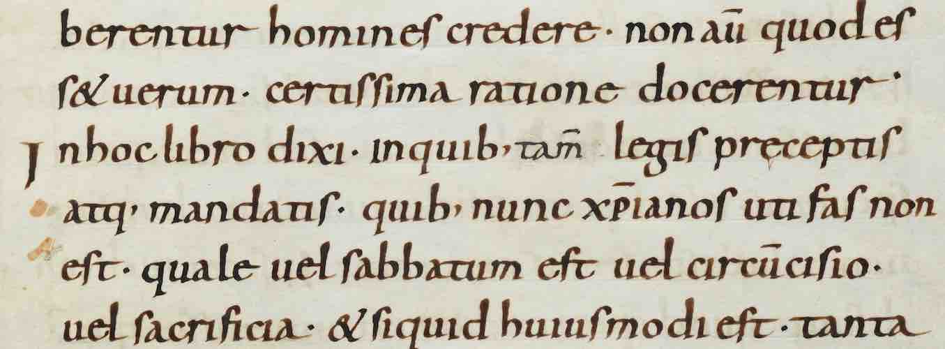
|
|
Fig 3.4 Manuscript written in Carolingian Minuscule Source: https://hmmlschool.org/latin-caroline/ |
A script emerged in Emperor Charlemagne's time where it standardized
style of writing. This style became the pattern of Humanistic writing of
Roman capital in the 15th century and later, the basis for lower-case
roman type.
Movable type

|
|
Fig 3.5 Korean woodblock printing Source: Lecture slides |
China attempted to use movable type for printing after invented printing
on wood block, but was unsuccessful due to resource shortage. Later on,
Korea achieved letter printing in bronze in the late 1300-1399 CE,
earlier than Europe.
Evolution of Middle Eastern alphabets

|
|
Fig 3.6 Evolution of Middle Eastern alphabets Source: http://webspace.ship.edu/cgboer/evolalpha.html |
While the Phoenician letter evolves in written language, the script
itself has been possibly influenced by Egyptian Hieroglyphics and
Hieratic Scripts.
Evolution of Chinese script

|
|
Fig 3.7 Evolution of Chinese script Source: Lecture slides |
From oracle bone to Seal Script, to Clerical Script, Traditional and
finally Simplified scripts.
Indus script
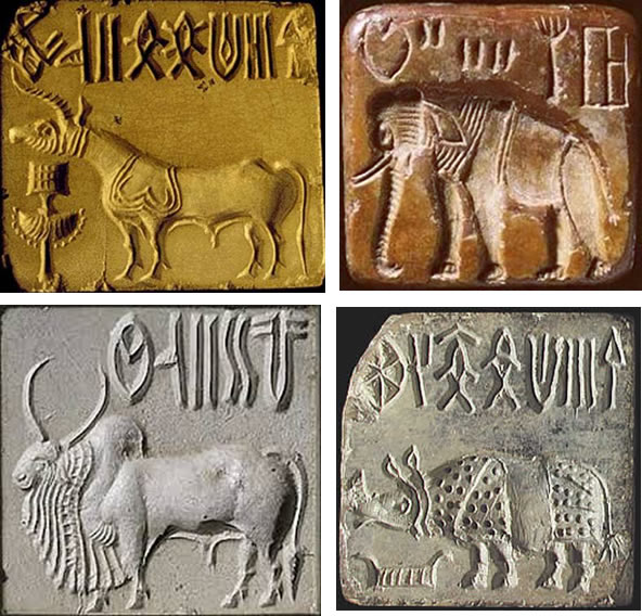
|
|
Fig 3.8 Indus script seals Source: https://omniglot.com/writing/indus.htm |
Although the writing system has not been deciphered yet, the scripts
seem to be somewhat logo-syllabic in nature. There's argument on whether
or not the scripts are linguistic in use.
The Brahmi script (450-350 BCE)

|
|
Fig 3.9 Brahmi script vowels Source: https://commons.wikimedia.org/wiki/File:Brahmi_script_vowels_according_to_James_Prinsep_March_1838.jpg |
Earliest writing system developed in India after the Indus script. One
of the most influential writing system, Southeast and East Asia scripts
are influenced by it a lot. Some believed that it was derived from
Middle Eastern script while some believed it was derived from the Indus
script.
|
|
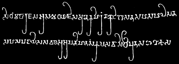
Fig 3.10 Pallava script Source: https://omniglot.com/writing/pallava.htm |

|
|
Fig 3.11 Pra-nagari script Source: Lecture slides |
Oldest writing systems appeared in the Southeast Asia were the Indian
scripts. The most important script would be Pallava, originally used for
writing Sanskrit and Tamil. It was highly influential as it became the
basis for other writing systems across Southeast Asia. Another script
that was used is the Pra-nagari script, an early form of the Nagari
script.

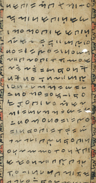
|
|
Fig 3.12 Laguna Copperplate Inscription in the Kawi script Source: https://scriptsource.org/cms/scripts/page.php?item_id=entry_detail&uid=xpww65eg2t |
The Kawi script is the most important historical script in Indonesia. It
is based on Nagari but indigenous from Java. It was used to contact with
other kingdoms and so, it became the basis for other scripts in
Indonesia and Philippines.
|
|
Fgi 3.13 Incung script Source: Lecture slides |
Some Indonesian scripts assimilated into the community in Peninsula
Malay. The Incung writing system, which orginated from South Sumatra,
was the original script used in Kerinci.
The Jawi writing system is based on Arabic alphabets. Jawi is used in
famous works of literature in Malaysian history but it is not the
original script used in Malay civilization, as there are pre-Jawi
inscriptions and writings in Indonesia.
Programmers and type design

|
|
Fig 3.14 "Baloo 2" a multi-script typeface by Ek Type Source: https://fonts.google.com/specimen/Baloo+2#standard-styles |
More vernacular scripts are being produced by software giants to cater
to situations where vernacular scripts are needed for writing a
document. "Multi-script" typefaces where it includes both Latin and
vernacular alphabets are also developed for convenience in using both of
these scripts at once.
Local movements and individuals
Muthu Nedumaran developed a programming language which allows user to
type out vernacular writing systems in mobile phones and desktops.
Huruf, a group of graphic designers, digitized and revitalized typefaces
in Malaysia through creating typefaces based on how Latin and vernacular
letters are written on walls and signages.
Ek Type and Indian Type Foundry are two organizations which have
contributed a lot in the development of vernacular typefaces in India.
Creativity and inspiration should begin by observing our surroundings
and exploring our collective histories. Young designers should think
about their heritage and community to bring past development into the
future, instead of blindly following other cultures with no context.
Week 4 / Designing type
Two reasons for designing a typeface:
- Type design carries a social responsibility so a designer should continue to improve its legibility.
- Type design is a form of artistic expression
Adrian Frutiger
Designed the Univers, Avenier and Fruitger typefaces. He also designed
the new Devanagari font for modern typesetting and printing process as
requested by the Indian Design Institute. His goal was to simplify the
sacred characters while preserving their ancient calligraphic
characteristics.
Frutiger

|
|
Fig 4.1 Frutiger typeface Source: https://en.wikipedia.org/wiki/Frutiger_(typeface) |
A sans serif typeface with the purpose of creating a clean, distinctive
and legible typeface that is easy to see from near and far. In other
words, an extremely functional typeface.
Considerations when making this typeface is to make sure the letterforms
are still recognizable in poor light conditions or when the reader is
moving pass a worded sign quickly. He tested with unfocused letters in
his process to see which letterforms can still be identified in blurred
condition.
Matthew Carter
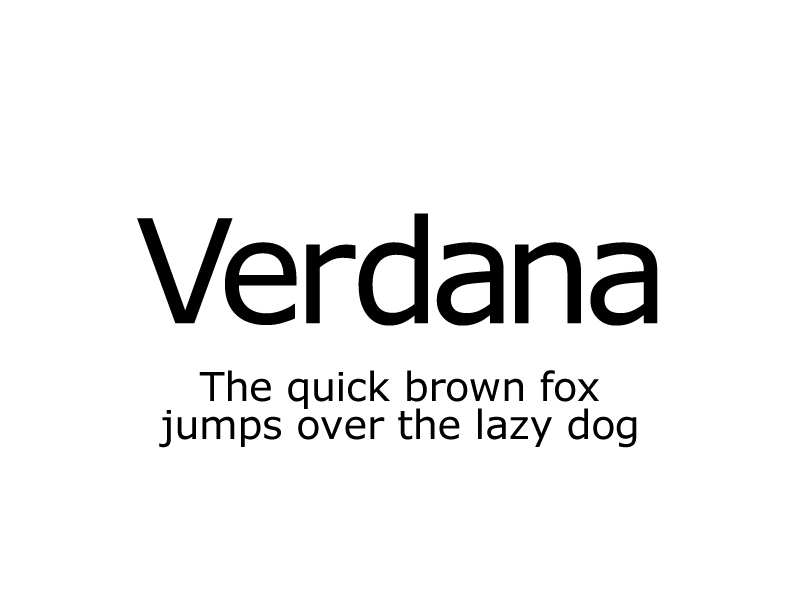
|
|
Fig 4.2 Verdana typeface Source: https://fx-pm.com/blog/fun-font-facts/verdana/ |
Most of his font were created to solve specific technical challenged,
such as the typeface Verdana. Its purpose is to be extremely legible
even at a very small size. Considerations in the process of making the
typeface is for the letterforms to be made using pixels. Though, i j l
are commonly confused characters in the typeface.

|
|
Fig 4.3 A poster introducing the Bell Centennial typeface Source: https://www.behance.net/gallery/13281059/Bell-Centennial-Type-Specimen-Poster |

|
|
Fig 4.4 Effect of the ink traps Source: https://cleosmits-types-of-art.tumblr.com/post/83327927352/entry-9-investigating-the-typeface-bell |
Another typeface he designed is Bell Centennial for AT&T, to address
the printing issues present in phonebook printing. It is to make sure
the letterforms printed are still clear and legible and won't be blurry
by introducing ink traps.
Edward Johnston
|
|
Fig 4.5 Johnston's original design for the Underground
typeface Source: https://www.theguardian.com/artanddesign/2016/mar/10/edward-johnston-london-underground-typeface-100-years-ditchling-sussex-eric-gill |
Designed the typeface Underground, also known as Johnston Sans. The
purpose of the typeface is to creating a design that has the simplicity
design for the modern age yet still rooted in tradition.
Considerations during the process is to keep the proportions of Roman
capital letters in his typeface, so that the design is rooted in
traditional calligraphy. But he took out the serifs in Roman capital
letters to create the simple and modern appearance.
General process of type design
Research
When creating a type, we should understand type history, anatomy,
conventions, terminologies, side-bearing, metrics, hinting etc. These
helps you understand the context and techniques in creating type. We
should also examine existing fonts and determine the purpose of our own
type design.
Sketching
Some designers sketch their typeface using bushes, pens, or ink on paper
before digitizing them as they feel they're more confident and have
better control with their output, but it takes more time. Though some
designers sketch their typeface using digital tools such as a drawing
tablet as it is much quicker and more consistent. But this can sometimes
lead to impediment of the natural movement of hand strokes.
Digitization
The leading software in digitizing typefaces are FontLab and Glyphs App.
Some designers uses Adobe Illustrator to design their letterforms and
further develop it in the specialized font apps. Attention should not
only be given on the overall form of the letters, but also their counter
forms as the readability of the typefaces is heavily dependent on it.
Testing
Testing is an important process in designing a typeface. It lets the
designer knows which part of the letterforms still need
refinements and further developments. Readability and legibility are
important consideration for most typefaces, but it is not a crucial
aspect for display typefaces where the forms can be more artistic or
expressive.
Deploy
After deploying, there might be teething problems that did not show up
during the testing and prototype phases, so revisions are still needed.
Rigorous testing is important to make sure these issues remain
minor.
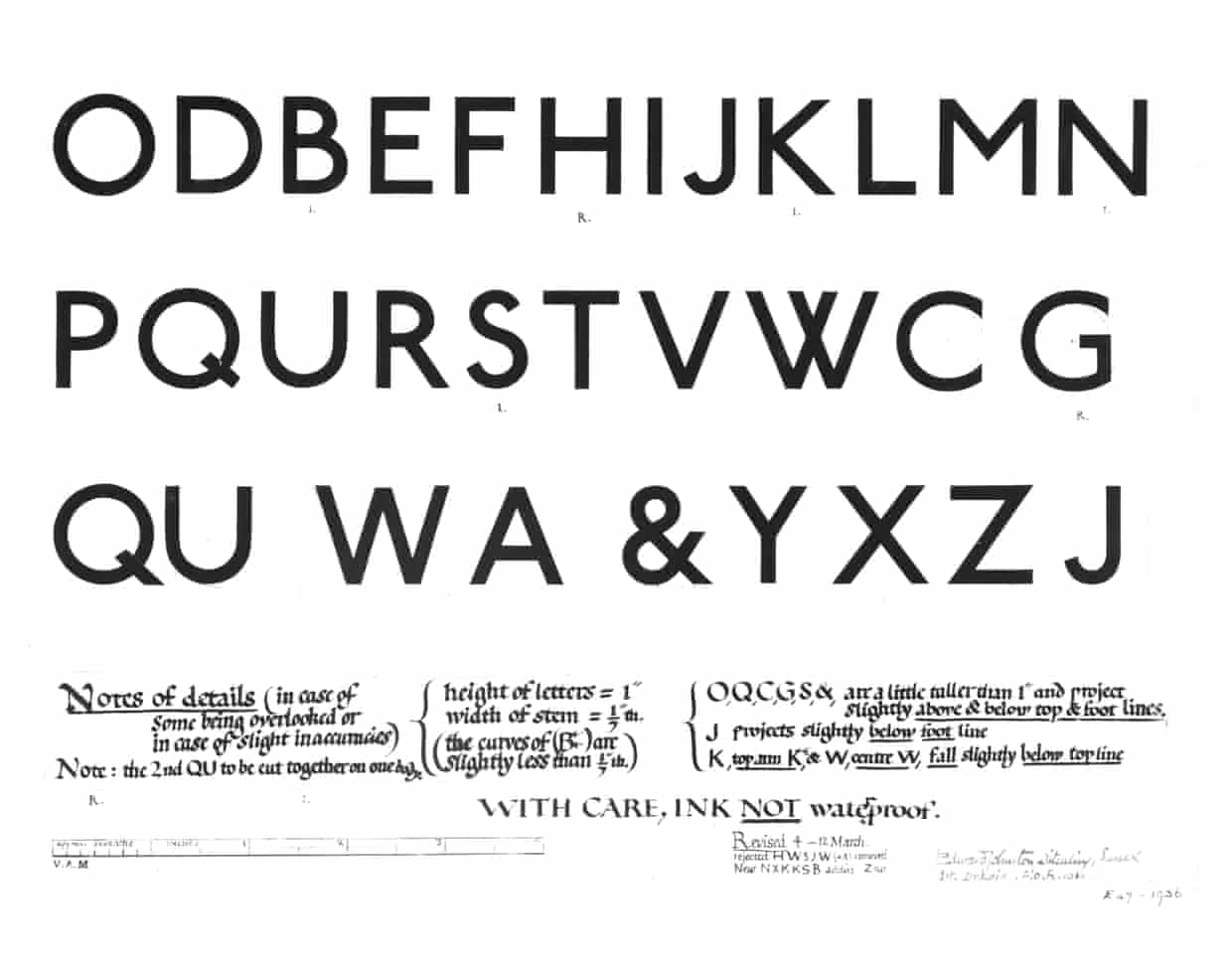
Typeface construction
Roman capital
|
|
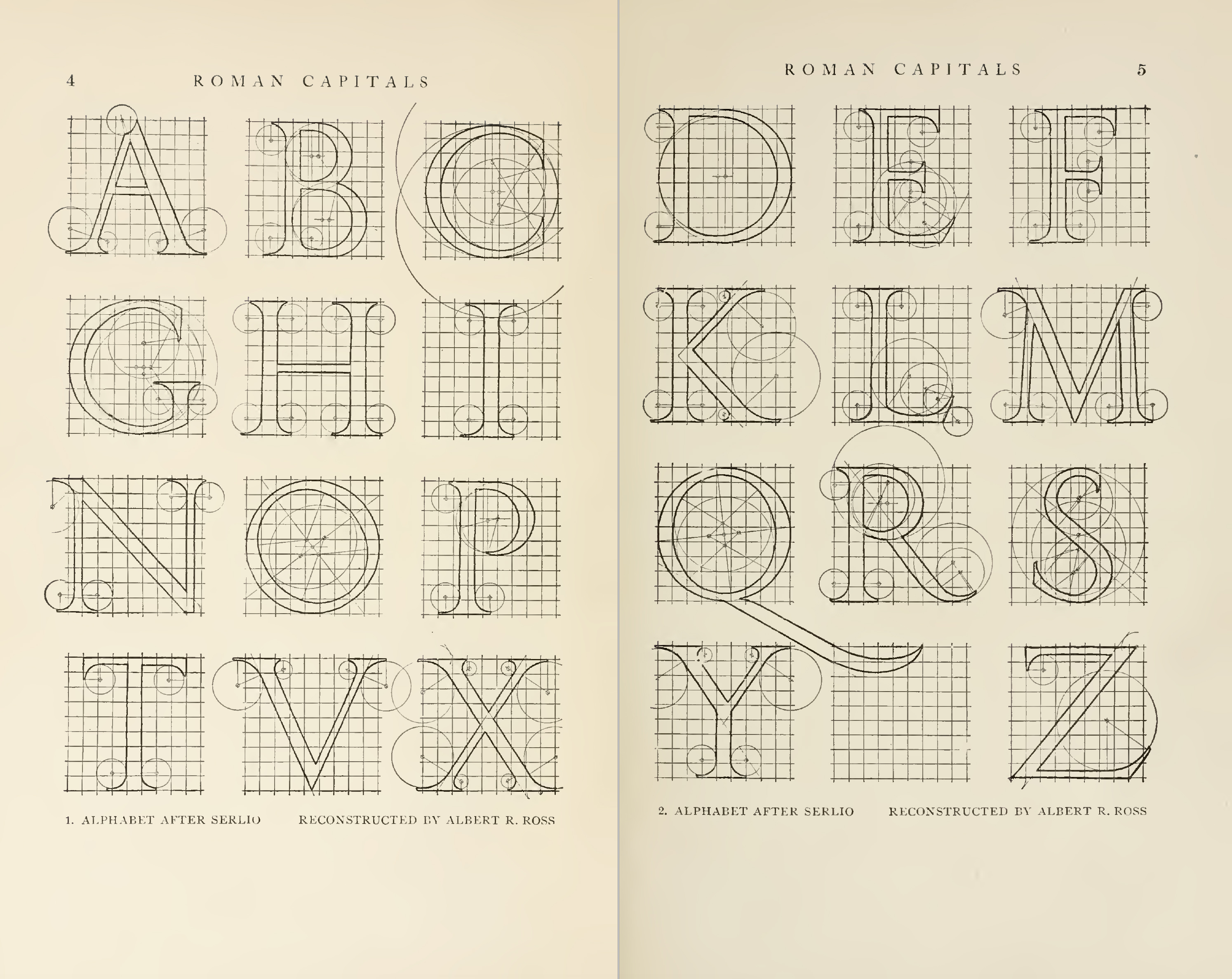
Fig 4.6 Roman capitals construction by Albert Ross Source: http://ku-viscom.com/TypeSystems/TypeSystems_RomanduRoi.html |
Roman capitals are constructed in a grid with circular forms and
rectangles inside it. So, using grids with circular forms can help in
facilitating the construction of letterforms and is a possible method to
build/create/design your letterform.
Constructions and considerations

|
|
Fig 4.7 Letter construction groupings Source: Lecture slides |
Depending on the forms and construction of the letters, the 26
characters of the alphabets can be arranged into groups so that it'll
help in making the process quicker by reusing the same construction
parts from different letters.

|
|
Fig 4.8 Overshoots for curved strokes Source: https://frerejones.com/blog/typeface-mechanics-001 |
Visual corrections are also important when constructing a letterform.
For example, overshoots should be present for curved or circular
strokes. The distance between letters should also be adjusted where
there is equal visual white space between letters, which is also known
as "fitting".
INSTRCUTIONS
Exercise: Typographic Systems
For our first exercise, we are tasked to create layouts using each of the 8
typographic system for the paragraph of text given to us. We are given a
choice of 3 titles to choose from and we are also restricted to use only the
10 typefaces given to us in Semester 1, which are: Adobe Caslon Pro, Bembo
Std, Bodoni Std, Futura Std, Gill Sans Std, ITC Garamond Std, ITC New
Baskerville Std, Janson Text LT Std, Serifa Std, Univers LT Std.
1. Sketches

|
| Fig 1.1 Sketches #1 (1/4/2022) |

|
| Fig 1.2 Sketches #2 (1/4/2022) |
Before arranging the text in a layout digitally, I roughly sketched out a few thumbnail sketches for each typographic system so that I’d have a clearer idea on how the layout would look like and how to arrange them in Adobe InDesign later. I chose the title “All Ripped Up: Punk Influences on Design” for this exercise.
2. Digitization of sketches
I then chose the sketches that I think is the most workable from each
typographic system and tried laying them out in Adobe InDesign. Since the
title is about punk, I wanted the layouts to reflect that. So, I focused on
using sans serif typefaces for a modern look and large font size so it feels
like it’s screaming the message to the viewers. I used mostly Futura and
Univers as these two typefaces offers more variations of weight and suits the
look I was going for.
Axial system

|
| Fig 2.1 Axial system tryouts (3/4/2022) |
Typeface used: Futura
I started off creating a simple axial layout for this system and then moved
on trying to use a zig zag axis and slightly shifting the words to create a
“ripped” or “zipper” look. I used a guide for the straight axis but used pen
tool to create a zig zag line for the zig zag axis
Radial system

|
| Fig 2.2 Radial system tryouts (3/4/2022) |
Typeface used: Futura
For radial system, I first tried out arranging the text in a way that they’re
radiating out from a point at the corner of the page. The #1 tryout has a
rather blocky arrangement while the #2 tryout has a more circular arrangement.
I then try arranging the text again but this time radiating out from a point
at the center of the page for tryout #3 and #4, I think these 2 works better
than the first two ones as they look more dynamic.
Dilatational system

|
| Fig 2.3 Dilatational system tryouts (3/4/2022) |
Typeface used: Futura
This system is the one I had to struggle with the most. I wanted to create a
composition that flows nicely from detail to detail while keeping the overall
look interesting. I started with different ideas and a lot of failures but
eventually settled with a composition that I think works best for the
deliverance of the message.

|
| Fig 2.4 Random system tryouts (3/4/2022) |
Typeface used: Futura, Univers, Janson Text, Bodoni, Serifa, ITC Garamond,
Gill Sans
Since carefree collages style is often used in punk influenced design, I
wanted my random system to show that. I tried making it looks as grunge and
collaged as possible while retaining some sense of readability in the message
being delivered. In tryout #1, I first started off with a very chaotic layout
to make it feel like the page is screaming to the viewers, words are repeated
multiple times and layered over each other. Different typefaces are also used
to make it look random. Rectangles are used to simulate the shapes of ripped
off paper often seen in punk designs and white words are layered over black
words to create a grunge texture. I then created tryout #2 based on the first
tryout but making the composition a bit more legible while retaining the
collage and chaotic look. The red rectangle in tryout #2 is to balance out the
composition. Tryout #3 was to experiment a less chaotic look but I still think
a tryout #2 works better.
Grid system

|
| Fig 2.5 Grid system tryouts (3/4/2022) |
Typeface used: Futura
I started the grid system with a rather simple layout, with everything
weighted at the left corner. Then, I tried on experimenting different
arrangements on how to make it look more exciting. I struggled with this
system for a bit as I was trying to figure out the difference between this and
modular system, since they both uses grids. But I think I got the hang of it
when creating tryout #4, using different weight and font sizes to create
hierarchy and positioning them in a way which is more interesting for the eyes
to read but also have enough white space for the composition to breathe.
Modular system

|
| Fig 2.6 Modular system tryouts (3/4/2022) |
Typeface used: Univers
One thing that I really wanted to try out for the modular system is the making the word “Ripped” look likes it’s ripped. Tryout #1 is very much centered on that idea and tryout #2 was created for experimentation purposes. I used Univers for this layout as I needed an extended sans serif font while having the modern look similar to Futura.
Transitional system
|
|
| Fig 2.7 Transitional system tryouts (3/4/2022) |
Typeface used: Futura
For transitional, since the system is about shifting the words left and
right without any specific alignment, the first idea I had was to make the
layout look noisy. I started with repeating the title and certain words and
layering them above each other to create that feeling, and aligning the
words from right to left in each bands to make an off-balance layout. I then
tried a more centralized alignment for tryout #3 with black words at
different opacity in the background to create the noise. Tryout #4 is to
compare how it would look like without the different opacity texts in the
background in tryout #3.
Bilateral system
 |
| Fig 2.8 Bilateral system tryouts (3/4/2022) |
3. Further development of digitization

|
| Fig 3.1 Final choice and development of layouts (3/4/2022) |
I then shortlisted one layout from each system to be used as final and further developed some by adding graphical elements to help with the reading flow or the add some interest in the layout. The intersecting lines in the radial system is to mimic a shatter or ripped look in the composition while also separating the groups of contents. The arcs and circle in the dilatational system is to help guide the reader’s eyes. Rectangles are used to crop out words in most of the layouts in order to create a look that’s similar to ripping of certain words from a piece of paper. In random system, I kept the sequence of the time backwards as it fits the nature of punk culture, where it’s about rebelling against the norm. For transitional system, I added a circle at the bottom left to balance out the composition.
I also changed all the AM and PM into small capitals and hyphens to en dash
for the time as I forgot to do that early on in the process.

|
| Fig 3.2 Further changes on final layout (8/4/2022) |
After receiving feedbacks from Mr. Vinod, I made some changes to the
formatting and layout of the systems and switched my final bilateral system to
its tryout #1 since there should only be one axis in a bilateral system.
Because body text should generally be 8-12pt for printing, I changed all the
informational text (i.e: name and time), to be within that range and as for
the other text, their size depends on the layout. The title is always the
biggest and, except for bilateral system, the subtitle is about half the size
of the title and the other text either follows the size of the informational
text or they're 2-4 points bigger for hierarchical and layout purposes.
Final Typographic System Outcome

|
| Fig 4.1 Final axial system - JPEG(8/4/2022) |

|
| Fig 4.2 Final radial system - JPEG (8/4/2022) |

|
| Fig 4.3 Final dilatational system - JPEG (8/4/2022) |

|
| Fig 4.4 Final random system - JPEG (8/4/2022) |

|
| Fig 4.5 Final grid system - JPEG (8/4/2022) |

|
| Fig 4.6 Final modular system - JPEG (8/4/2022) |

|
|
|

|
| Fig 4.8 Final bilateral system - JPEG (8/4/2022) |
Fig 4.9 Final typographic systems outcome with grids and guides - PDF (8/4/2022)
Fig 4.10 Final typographic systems outcome - PDF
(8/4/2022)
Type & Play: Part 1: Finding type
For our second exercise, the first part is to select an image of either man
made or natural objects or structures, and find potential letterforms within
the image.
Dissection and identification of letterforms

|
| Fig 5.1 Original picture (9/4/2022) |

|
| Fig 5.2 Identifying potential cracks similar to the shape of a letter (9/4/2022) |
I first started with a picture of a tree bark with a lot of cracks. It's the
bark of a tree that I passed by and though the cracks would be interesting to
extract letterforms out of so, I took a picture of it to later observe closer.
I marked the cracks that's similar to the shape of a letter in Fig 5.2 to see
which works best.

|
| Fig 5.3 Tracing out the potential letterforms following the shape of the cracks (9/2/2022) |

|
| Fig 5.4 Traced out letterforms (9/4/2022) |
Later when tracing, I observed the marked cracks in Fig 5.2 more closer and
clearly and picked 4 of the most probable ones to trace out, which are H, Y,
F, V.

|
|
Fig 5.5 Cityscape stock picture (9/4/2022) Source: https://images.app.goo.gl/P7Hg9WynpFVEvwyx7 |
After that, I thought I try out extracting letterforms from a picture of a
cityscape, which I think would be interesting and see what result I can get
from there.

|
| Fig 5.6 Tracing out the letterforms following the edges of the buildings (9/4/2022) |

|
| Fig 5.7 Traced out letterforms (9/4/2022) |
I observed the picture before tracing and found out that the roads could become potential letterforms, I later then traced them out following the road and the edges of the buildings sticking out to the road. The identified letterforms are T, L, U, H.
After receiving feedbacks from Mr. Vinod, I decided to choose the second
tracing (Fig 1.4) to further develop.
Typeface study

|
|
Fig 6.1 Univers typeface (17/4/2022) Source: https://en.wikipedia.org/wiki/Univers |
Before proceeding to develop the tracing to a typeface, I chose an existing
typeface for me to study and reference for the tracings I will develop.
Since the tracings are from a picture of a city aerial view and they look
rather blocky, I decided to choose a clean and simple sans serif typeface,
which is Univers. The letter constructs in Univers are rather
straightforward, so I thought it would suit the look that I’m going
for.

|
|
Fig 6.2 Notes from studying Univers typeface for T, L, U, H
(17/4/2022) |
Since I’ve never closely observe Univers before, I decided to so some study
on its letter construct to help me on making my typeface. I found that the
width of the straight stems are the same; the same goes to the horizontal
stems stroke widths but they are a bit thinner than the straight stems. The
length of the horizontal stems also differs from one another, the one in T
being longer, the one in L is shorter, and the one in H is the shortest. I
also found that U can be made up of two circles, but the inner strokes are
more tapered down as they reach the bottom.
Further development of digitization

|
| Fig 7.1 Placing original tracings on guidelines and adjusting them (17/4/2022) |
After that, I started to develop my tracings. I started with increasing the
width on some thinner parts in the tracing so they’ll be more constant and
give me an idea on how the final typeface can look like. I also made sure
they are all on the baseline and under the cap height, lengthening the left
stem of H to achieve that.

|
|
Fig 7.2 Digitization process of first 3 attempts (17/4/2022) |
Then, I constructed the letters following what I’ve learnt from studying the
Univers typeface and tried out ways on how I could make and position the
indentations in the letter strokes so they’ll reflect the original tracing.
I made the U to have a more rigid and blocky appearance to reflect the
origin of the city aerial view picture.

|
| Fig 7.3 Sketch of possible typeface outcome (17/4/2022) |
I then sketched out the possible final look of the typeface after having an
idea on how the form works.

|
| Fig 7.4 Digitization process of 4th attempt (17/4/2022) |
Later in the digitization process, I made the bottom of the U to have more
curve as the initial one looks too flat for it to be recognizable as a U at
first sight. Then, I added the indentations in the strokes, similar to the
ones in the original tracings but with some adjustment on the sizes. I also
tried out keeping one stroke in each letter with little to no indentations
to work as a contrast and balance with the ones that are indented. And from
the previous tryouts, I decided to add some “jutting out blocks” so it gives
more of an impression of a silhouette of a city street.

|
| Fig 7.5 5th attempt (24/4/2022) |
After receiving feedbacks from Mr. Vinod, I adjusted the curve stroke of the
U on both left and right side to make the stroke and form more
consistent.
Final Type & Play: Part 1: Finding type
 |
| Fig 8.1 Final type design compilation process - JPEG (24/4/2022) |

|
| Fig 8.2 Final type design comparison - JPEG (24/4/2022) |

|
| Fig 8.3 Final type design - JPEG (24/4/2022) |


|
| Fig 8.5 Letter L - JPEG (24/4/2022) |

|
| Fig 8.6 Letter U - JPEG (24/4/2022) |

|
| Fig 8.7 Letter H - JPEG (24/4/2022) |
Fig 8.8 Final type design - PDF (24/4/2022)
For this part of the exercise, we are tasked to select any picture that we
like and think of a word, sentence or letter that is relevant to the picture
and integrate the text and picture together.
I wanted to try out doing text manipulation in my design so I went to look
for some pictures that would be suitable for me to use on a free stock image
website called “Pexels”. I picked 4 pictures for me to try out manipulating
the text.

|
|
Fig 9.1 Original picture of arcade (24/4/2022) Source: https://www.pexels.com/photo/city-man-person-vacation-7887656/ |

|
|
Fig 9.2 Tryout #1 - "Out of order" text edited into the picture
(24/4/2022) |
I used the first two pictures as a practice for me to see the methods I
could use to edit and manipulate words with the picture using Adobe
Photoshop. For the first picture, I used the word “out of order” since it
shows an arcade machine in an off state. I used the typeface VT323 since I
needed pixel letterforms and edited it to look like it’s a reflection on the
arcade screen outer glow, inner glow, drop shadow, overlay blending mode and
layering duplicates of the same text in different opacity.

|
|
Fig 9.3 Original picture of a man sitting in front of a turned on
screen alone (24/4/2022) Source: https://www.pexels.com/photo/man-sitting-in-front-of-turned-on-screen-2736135/ |

|
|
Fig 9.4 Tryout #2 - "Wages earned" text edited into the picture
(24/4/2022) |
Since the second picture shows a lonely man sitting in the dark, I thought
using “wages earned” (which is from the song “Right where you left me”)
would be suitable to add context to the picture. I used Univers for the
typeface choice and used drop shadow, inner shadow, inner glow, distort and
perspective transformation, and blur tool to edit the text.

|
|
Fig 9.5 Original picture of sailboat floating on sea (24/4/2022) Source: https://www.pexels.com/photo/sailboat-floating-on-rippling-sea-6678139/ |

|
| Fig 9.6 Tryout #3 - "Set sail" text edited into the picture (24/4/2022) |
After that, I moved on to using the third picture and try doing a more
complex manipulation, where the words would look like they’re a part of the
ocean. I used the phrase “set sail” for this picture and Berlin Sans FB for
the typeface choice since the letterforms have rounded forms and edges
compared to other sans serif typefaces. I positioned the words behind the
boat so it’ll look like it drags behind it and used bevel and emboss, inner
shadow, inner glow, and gradient tool for the manipulation. I duplicated the
layer containing the text multiple times and overlayed them on one another
to enhance the shadow effect. I also used a liquify filter to make the text
look more watery and edited the text using the text warp tool and
perspective transformation.

|
|
Fig 9.7 Original picture of glacier on ocean (24/4/2022) Source: https://www.pexels.com/photo/landscape-photography-of-glacier-on-ocean-694218/ |

|
|
| Fig 9.8 Tryout #4 - "Arctic" text edited into the picture (24/4/2022) |
Later on, I wanted to try out the fourth picture which is a picture of a
glacier. I thought the word “Arctic” would suit this picture and used it
with an idea that each letter is a big piece of ice in the picture. The
typeface I used is Univers and I picked the text colour according to the
colour of the glacier in the picture and used bevel and emboss for the
manipulation. I also added reflection on the water of the text by
duplicating and rotating them and adjusted the opacity as well as using the
gradient tool. I also manually added a shadow below the text and around the
sides of the horizontal "C" using the brush tool with opacity
adjustment.
 |
| Fig 9.9 Tryout #5 - Trying out serif typeface for "Arctic" text (24/4/2022) |
I later tried out using a serif typeface for the "Arctic" text to see if it fits better with the picture. I chose Bembo Std as the thin letter strokes gives a medieval and classical feeling. To my observation, a serif typeface does fits better for this image.
I decided to choose tryout #3 (Fig 9.6) in the end as my final since it blends well
with the original picture and adds more enhancement to it.
 |
| Fig 9.10 Added blue reflection under letters in tryout #5 (30/4/2022) |
 |
| Fig 9.11 Replaced sailboat with oil tanker in tryout #3 (30/4/2022) |
 |
| Fig 9.12 Original picture of oil tanker (30/4/2022) Source: https://www.vesselfinder.com/news/16189-Shell-Charters-Fleet-of-Lower-Carbon-Oil-Tankers |
After receiving feedbacks from Mr. Vinod, I've made some further changes on my tryouts. I added a light blue reflection under the letters in tryout #5 so that it matches with the reflection of the glaciers in the picture. As for tryout #4, I isolated an oil tanker from a picture and used it to replaced the sailboat in the original picture I used for tryout #4, so that the words would look like as if they're oil spillage. In the end, I choose tryout #4 as my final.
Final Type & Play: Part 2: Type & Image
 |
| Fig 10.1 Final type & image - JPEG (30/4/2022) |
Fig 10.2 Final type & image - PDF (30/4/2022)
FEEDBACKS
Week 2 - Typographic systems
General feedback: Do take note that size of body text is generally
8-12pt for printing, as 12pt is already very large. When making diagonals,
avoid 45 degree angles as it causes a lot of tension. When creating
layouts, always start with black and white, colours and nonobjective
elements are just to enhance the layout only. Try to focus on laying it
out as typographically as possible, minimize the usage of shapes and
colours.
Specific feedback: Axial system complies with the rule of the
system, no issue in the arrangement, but it feels a bit too safe. For
radial system, the point of focus is clear and the information is arranged
clearly, but could try rotating the words in "All Ripped Up" more so their
edges has more curve. The lines and point size of the words in
dilatational system is too huge, decrease the line thickness to either
0.5pt or 1pt and also decrease the point size of the text. The red
rectangle in random system is too disturbing as it makes that side more
visually heavy, other than that the text are nicely placed. Decrease the
letter spacing of the word "June" in grid system. The body text is too
squeezed up in transitional system, making it too congested, increase the
leading space. Bilateral should only have one axis, try one where it only
uses one axis.
Week 3 - Type & Play: Part 1: Finding type
General feedback: Make sure to extract the whole form, that is, see
the form as a whole plane rather than lines. Don't trace out the
letterforms with only thin lines, but pay attention to the small details
of the form as well.
Specific feedback: The tracings for the bark and the city aerial
view are good, but the edges in the tracing of the city view is very
crucial when developing the font. Both are good choices, up to me to
decide on which I want to develop as final.
Week 4 - Type & Play: Part 1: Finding type
General feedback: When constructing curves for letterforms, make sure the radius of the curves are all constant so as to make the strokes consistent. Also, make sure that the type design reflects the characteristics of the elements in the chosen picture.
Specific feedback: Have a go with the type design, but refine the letter U more as the curve stroke looks inconsistent.
Week 5 - Type & Play: Part 2: Type & Image
General feedback: Make sure the manipulation reflect the texture of the surface the text is on in the image.
Specific feedback: Maybe try replacing the sailboat to an oil tank in the picture, so it would look like the words are oil spills. For the glacier one, you can also try making the reflection similar to the one in the picture, can try drawing a random shape under the letters to make a smear effect for the reflection.
REFLECTION
Exercise 1: Typographic systems
Experience
It felt pretty rushed and the schedule was very tight when doing this
exercise, as we only had 1 week to complete it, and some layouts took
longer time to complete such as random system and dilatational system. But
it was interesting to learn about the typographic system along the way and
learn how to create a layout of my own. I had to refer back to multiple
references and redo sketches back and forth in the process of digitizing
the layouts, but I’m glad it worked out in the end and I had a better
understanding on how each of the system works.
Observation
I observed that hierarchy can be created through font size, positioning in
a composition and font weights. Different font weights gives different
visual weights too and by playing around with it, it can be used as a way
to balance a composition. I also found that asymmetrical composition is
often more visually interesting than symmetrical ones.
Findings
I found that non objective elements, other than putting excitement and
highlighting certain content in a layout, it can also be used to create
balance and work as a grouping tool too for scattered text. Asymmetrical
positioning of the text within the space, such as putting the text close
to the edge or using the non objective elements to crop out part of the
words can create interesting results too, as long as the text are still
distinguishable within the space.
Exercise 2: Type & play
Experience
For part 1, It was challenging at the start of the digitizing stage as I needed to figure out a way to make the indentations work. They can either end up too messy or too clean for it to reflect its origin. And there’s also the time-consuming process of making a typeface. But it felt rewarding at the end seeing how the outcome turned out to be, and it was also interesting to experience the process of extracting letterforms directly from a picture and refine them in the end to form a proper typeface. As for part 2, I had a lot of fun doing it as it was exciting to see how many possibilities can the text be manipulated to produce a range of outcomes. It was my first time editing text this way but knowing some Photoshop skills beforehand did really help a lot in knowing what to tweak to produce certain illusions and appearances. All in all, it was an enjoyable part in the exercise.
Observation
I observed that the nuances found in typeface design is important to know in order to make a type design work. All the little details can have affect the appearance of a typeface design greatly, whether that be affecting the recognizability or the form of a letter. I also observed that combining text and image in a seamless way can greatly enhance an image, which may be because it gives context to the viewers looking at the design.
Findings
I found that, in making a typeface that has a lot of subtractions in the strokes, keeping parts of strokes to stay clean would make the typeface more readable as it gives readers a sign for them to recognize the letters. As for combining type and image, I found that adjusting the bevel and emboss filter, as well as inner shadow is a great way to manipulate text to make it look 3D and realistic enough to be a part of the environment in the picture.
FURTHER READINGS
Week 1
This week, I've read a book titled "Typographic systems" by Kimberly Elam.

|
| Fig 1.1 Book cover |
The circle and composition (pg12 - pg13)
A circle can be used to create emphasis, tension or contribute to the
visual organization and balance of a composition. Fig 1.2 shows how a
circle can be placed for different function within a composition.

|
| Fig 1.2 Different placements of a circle for different compositional purposes (pg12) |
As Fig 1.3 shows, the placement of a circle can affect the reading flow of a
composition a lot. It's important to think about what's the best placement
that would communicate the message well enough without impeding readability,
for example the tension placement.

|
| Fig 1.3 How placement of a circle affects the reading flow (pg13) |
Nonobjective elements (pg14 - pg 15)
Using nonobjective elements such as circles, lines or tones can act as a
guide in a composition and thus, enhancing the hierarchical order of the
details in the layout and also guides reader in the flow of text.

|
| Fig 1.4 Using nonobjective elements to create hierarchy (pg15) |
Axial system (pg17 - pg 33)
Axial system is the simplest system, often than not asymmetrical
arrangement in an axial is able to increase the visual interest in a
composition, while also keeping the layout simple. The axis can be of
any shape and grouping of text can be done through line breaks and
leadings. As long as the text is align to the left and right of an axis,
then it follows the axial system.

|
| Fig 1.5 Curved axis example (pg 20) |

|
|
Fig 1.6 Different layouts using the axial system, groupings are done by different spacing of the text (pg23) |

|
| Fig 1.7 Axis with bends, creating a more interesting look (pg30) |
Radial system (pg35 - pg51)
Radial system creates visual interest but it lessens readability since
the text aren't arranged in a horizontal format. So, this system is
best used for limited amount of text. The text arrangement doesn't
have to be in a circular form or have a circular curve to it but as
long as it radiates from a point in the composition, then it follows
the radial system.

|
| Fig 1.8 Text radiating out from one point, converging at point of emergence (pg37) |

|
| Fig 1.9 Different layout examples of radial system (pg41) |
Some ways to improve the hierarchy of the text is by grouping them
using nonobjective elements or different tones.

|
| Fig 1.10 Using nonobjective elements to help group the different lines of text (pg42) |
Dilatational system (pg53 - pg69)
Dilatation system involves typing text on a circular path. Since
dilatational system can impair readability, the content needs to be
arranged in an order to make it readable. Spiraling shapes, while
visually interesting, would lessen the legibility as text would be
upside down. Arrangement following a step-stairs flow would be able to
guide the eye through the composition.

|
| Fig 1.11 Dilatational system layout examples (pg59) |
Random system (pg71 - pg85)
Texts in a random system are arranged without a definite aim, rule,
pattern or method. It is frequently successfully created when
legibility diminishes and instead focus on creating a visually
captivating result. Traits that often contribute to the randomness is
overlapping, cropped, angled, textured, not horizontal, not aligned
and not patterned texts.

|
| Fig 1.12 Layout examples for random system (pg 77) |
Grid system (pg87 - pg103)
Texts are arranged according a grid made up of horizontal and vertical
lines. Arrangements are usually formal and are organized neatly.
Texture can be explored through different character and line spacings
as well as line breaks.

|
| Fig 1.13 Layout examples for grid system (pg93) |
Groupings can be made through character tracking, creating different
grey values for each detail, and non objective elements such as line
can be used to guide the reader's eye.

|
| Fig 1.14 Groupings through tracking of text (pg94) |

|
| Fig 1.15 Using lines to guide the reading flow (pg98) |
Transitional system (pg105 - pg119)
Transitional system involves moving text freely left and right without a
specific alignment. Hierarchy and groupings can be made through
different textures of the line of text.

|
| Fig 1.16 Layout examples of transitional system (pg111) |
Transitional system often emphasize on the negative space of the
composition as texts are arranged loosely or tightly. It can also create
a sense of movement through the position of the text.

|
| Fig 1.17 Creating a sense of movement through left and right arrangement of text (pg 113) |
Modular system (pg121 - pg137)
In modular system, text are contained in a single unit in the
composition and are arranged according to that particular unit. The
unit it is contained in can be of any shape. Nonobjective elements
often comes to play in modular system.

|
| Fig 1.18 Layout examples for modular system (pg127) |

|
| Fig 1.19 How units can be arranged in modular system (pg135) |
Bilateral system (pg139 - pg156)
All text are in center alignment in bilateral system, but the axis can
be off center or diagonal in the composition. Nonobjective elements are
able to heighten the visual interest in the layout.

|
| Fig 1.20 Example of a bilateral system where the line of texts are slightly shifted from their opposing sides (pg142) |

|
| Fig 1.21 Layout examples for bilateral system (pg145) |

|
| Fig 1.22 Example uses of nonobjective elements in bilateral system (pg148) |
Comments
Post a Comment