5.11.2021 - 19.11.2021 (Week 11 - Week 13)
Chung Yi Ki / 0345014 /
BDCM
Typography
Task 3B / Type Design & Communication
LECTURES
Lectures 1-5 were documented in
Task 1 / Exercises
Lecture 6 was documented in
Task 2 / Typographic Exploration & Communication
INSTRUCTIONS
Task 3B / Type Design & Communication
For Task 3B, we are tasked to choose a holiday/greeting from a list that was
given to us. After that, we'll need to design a typographic greeting sticker
of our chosen option by using one of the typeface from the 10 typefaces given
to us at the start of the semester. The sticker can have minimal graphic
elements or visuals and the final result needs to be in colour and animated.
The size is 512px x 512px and the sticker needs to be readable and usable
within the size.
1. Visual research
The greeting that I chose to design is April Fools Day. It is an annual custom
that occurs on 1st April where people would participate in making practical
jokes, pranks and hoaxes. I then went to search on how April Fools greetings
are designed.
|
|
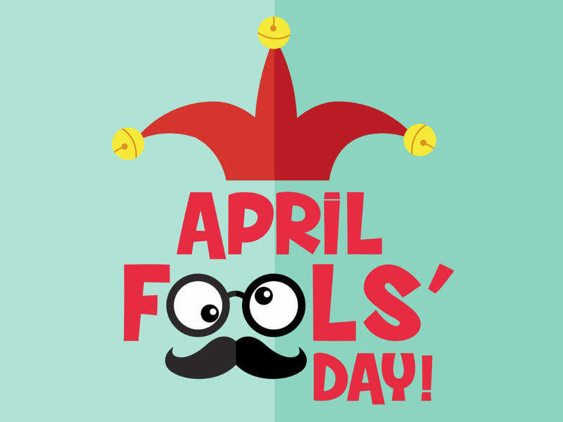
Fig 1.1 Visual research #1 (4/11/2021) Source: https://timesofindia.indiatimes.com/life-style/events/april-fools-day-2021-funny-messages-memes-and-jokes-that-will-make-your-laugh-out-loud/articleshow/81787044.cms |
The signature jester hat, googly eyes and mustache that are used for jokes and pranks. The googly eyes and mustache joke disguise is incorporated in the words by substituting the two "o" in "Fools".
|
|
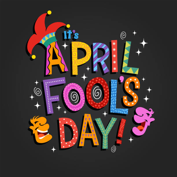
Fig 1.2 Visual research #2 (4/11/2021) Source: https://www.istockphoto.com/vector/april-fools-day-design-with-hand-drawn-decorative-lettering-gm1200442193-343852171 |
The jester hat is also used in this design, and also graphic of people
laughing. Spirals are used to represent the wackiness of the day. The words
are colourful and has patterns incorporated in them.

|
|
Fig 1.3 Visual research #3 (4/11/2021) Source: https://www.zoomtventertainment.com/lifestyle/article/5-hilarious-april-fools-day-memes-to-make-your-day-brighter/572220 |
Another signature icon of the celebration: Jack-in-the-box. There are two different typefaces used in the greeting, the two "o" in "fool's" are also used as eyes but this time, the form of the "o" is the same with only black circles added into the counter space.
While these visual researches relies heavily on visual and graphic elements,
and the typefaces used aren't similar to the 10 typefaces that were given to
us, but they did give me an idea on how to express the greeting.
2. Sketches

|
| Fig 2.1 Sketches (4/11/2021) |
Since April Fools is all about being wacky and crazy, the immediate idea I
thought of is to express that by using different font, sizes, letter case and
position for the letters. In sketch #1, #2, #3 and #5, I tested out that idea
by thinking about what kind of font can be used for each letters, which should
be in uppercase and lowercase, how each letters can be positioned and what
graphical elements to include. Sketch #1 uses the jester hat, sketch #2 uses
the jack-in-the-box, sketch #3 uses spring and sketch #5 uses eyes. I also
tested out a normal style of typing out letters in sketch #4 and just using
the two "o" as spiral eyes. But I still think the other sketches are better
since the words itself shows more of the wackiness.
3. Typeface testing

|
| Fig 3.1 Typeface testing (4/11/2021) |

|
| Fig 3.2 Typeface testing (4/11/2021) |
Before I try and digitize my sketches, I tried out 6 serif typefaces from the 10 typefaces for "April Fools Day" to see which is more suitable. Since I'm going to be rotating the letters a lot, I thought using a serif typeface would be a good choice since the serifs will make the transformation of the rotation more apparent and the formal look of serif will make the wacky expression more playful. While I like the ball terminal of the "f" in Janson Text LT Std, I think ITC Garamond Std would be more suitable to use since its "f" is close to the ball terminal look in Janson Text and also it has a lot of font choices which would make it very flexible and helpful when creating the expression.
4. Digitization of sketch

|
| Fig 4.1 Digitization of sketch on Adobe Illustrator (4/11/2021) |
After that, I went to Adobe Illustrator to try out in digitizing my sketches. Digitization #1, #4 and #5 are directly based on sketch #1 and #2 in Fig 2.1, while the idea in the others came up during the process of digitization. I used asterisks (*) as star shapes and at marks (@) as swirl shapes. Fullstops (.) are also used as the "eyeballs" in digitization #3.
Further development of digitization #2

|
| Fig 4.2 Reworked version of digitization #2 (12/11/2021) |
After receiving feedbacks from Mr. Vinod, I decided to choose digitization #2
to develop further. I went to change all the light fonts to a heavier font and
also adjusted the size so that it uses up most of the space in the square
box.

|
| Fig 4.3 Colour palette from Adobe colors (12/11/2021) |

|
| Fig 4.4 Colour testing using colours derived from the colour palette (12/11/2021) |

|
|
Fig 4.5 Flat colours with white boarder using finalize colour choices
(12/11/2021) |
I then proceeded to plan out the colour scheme of my sticker. I first went to Adobe colors to choose a colour palette to help me in deciding the colours I want to use. I want to show the wackiness, fun and kiddy characteristics of April Fools so I wanted the stickers to be vibrant and very colourful. After choosing the colour palette from Adobe colors, I then used it to test out different versions of colour combination in Fig 4.4. I then decided to include in purple and take out the colour blue to make it look more april-fool-like, which resulted in colour test #4 and is then made to be my final colour choice.

|
| Fig 4.6 Eye candies (12/11/2021) |
 |
| Fig 4.7 Shadow layer and highlight layer (12/11/2021) |
After that, I went to try out putting eye candies on my stickers. For the left one, I duplicated the sticker and changed to a darker hue to use as the shadow, and used the pen tool to create the white highlights. For the right one, I did the same thing for the shadow and the highlights also uses the same method but with a brighter hue and shifted to a higher position.

|
|
Fig 4.8 Testing stickers on Telegram (4/11/2021) |
Then, I tested out the sticker in telegram to see how would they look.
After receiving feedbacks from Mr. Vinod, I decided to use the version with
the white highlights in Fig 4.6 to develop further for my final sticker.

|
|
Fig 4.9 Sizing and position adjustments (18/11/2021) |
I resized the wordings to be bigger so it'll take up more space of the
512x512px square. I resized some of the symbols to be smaller to not only
conform to the new spacing, but also to give variety to the sticker and also
to give more focus on the words. The positions of the symbols are also
adjusted according to the new sizing.
5. Animation of sticker

|
|
Fig 5.1 Technical requirements of a Telegram-usable animated
sticker Source: https://core.telegram.org/animated_stickers?fbclid=IwAR2DDscACpjDP-38Pe3bHTAOg3qHjdDwROB_NvdMjiwfrXC4dVJVsBns5Bw |
Other than needing to animate the sticker in After Effects and having the
Bodymovin-TG plugin installed to export the file in .tgs format, above are the
detailed technical requirements in order to make sure the final animation is
usable in Telegram.

|
| Fig 5.2 Separation of each elements into their own layers (18/11/2021) |
Before I import my Illustrator files in After Effects, I separated each elements I have in my vector sticker into their own layers. I only realized this after I have named each layer so I didn't bother to name them again and decided to do it in After Effects. I also seem to can't unite the white boarder with its respective letters/symbols without affecting the original layering so I had to keep everything intact.

|
| Fig 5.3 Screenshot of After Effects timeline (18/11/2021) |
I then imported the Illustrator file into After Effects and picked one layer
out of each object to rename while parenting the rest to its respective main
layers.

|
| Fig 5.4 Screenshot of all the keyframes in the timeline (Part 1) (18/11/2021) |

|
| Fig 5.5 Screenshot of all the keyframes in the timeline (Part 2) (18/11/2021) |
I then start making my animation using basic keyframing since Telegram also limited some functions in After Effects. My plan for animating it is to make the words and the symbols pop out in sequence, make the symbols rotate and then finally the sticker disappears as the same way it pops out.
I created the first sequence first where the sticker appears by setting the
scale of all elements at 0% and then set the other keyframe to their original
100% size. I also wanted the words and elements to have a bit of a bouncy
effect when it pops out so I set the scale for the third keyframe in a range
of 110-130% and then back to 100% in the fourth keyframe. The positions are
adjusted according to the outcome of the scale adjustments. For the rotation
keyframes, I set the symbols to rotate either 2 or 3 cycles, which results in
different speeds and this gives some visual variety to the movements. After
completing the first sequence, I then copy and pasted it near the end of the
timeline and reversed them using the "time-reverse keyframes" tool to make a
looping animation. I also adjusted some of the keyframe distance after
reversing them to make sure they are all in the right timing.

|
| Fig 5.6 First outcome of animated gif (18/11/2021) |
To me, I think the yellow "@" at the far right of the sticker seems to be rotating too slow in my first outcome of the animation. So, I changed its rotation cycle from 2 to 3 in my second outcome (Fig 5.9).

|
|
Fig 5.7 Screenshot of timeline after applying ease ease in/out and making shape layers from vector files (second outcome) (18/11/2021) |
Fig 5.8 Screen recording showing the change of
values of the keyframes in the first 17 layers (second outcome)
(18/11/2021)

|
| Fig 5.9 Second outcome of animated gif (18/11/2021) |
I also tested out the animation in Telegram which you can see in my final
outcome section below (Fig 6.8).
Final outcome of Task 3B
Link to download black and white and colour still stickers: https://t.me/addstickers/AprilFoolsTU
Link to download animated version of sticker: https://t.me/addstickers/AprilFoolsTUanimated

|
| Fig 6.1 Final black and white sticker - PNG (18/11/2021) |

|
| Fig 6.2 Final colour sticker - PNG (18/11/2021) |
Fig 6.3 Final black and white sticker - PDF (18/11/2021)
Fig 6.4 Final colour sticker - PDF (18/11/2021)

|
| Fig 6.5 Final animated sticker - GIF (18/11/2021) |

|
|
Fig 6.7 Screenshot of final sticker outcome in use in Telegram
(18/11/2021) |
Fig 6.8 Screen recording of final animated sticker in use in Telegram
(18/11/2021)
Hours spent in this task (approximate because I didn't keep the exact time):
Brainstorming and sketching: 1-3.5 hours
Creating the sticker in Illustrator (b&w and colour): 5-9 hours
Animating the sticker: 4-7 hours
Blog update: 3-4 hours
Total hours: 13-23.5 hours
FEEDBACKS
Week 11
General Feedback: If we are using Photoshop to digitize our work, make sure to do it on a 2048px x 2048px canvas size. Since this is a typographic sticker, make sure the words takes up more space than the graphical elements.
General Feedback: If we are using Photoshop to digitize our work, make sure to do it on a 2048px x 2048px canvas size. Since this is a typographic sticker, make sure the words takes up more space than the graphical elements.
Specific Feedback: The one with the "@" eyes is better, but try to
fill up the white space more and maximize the use of the square box. The
typeface choice might need to be rethought too as the ones chosen now are
thinner so it might not show that well in a small size.
Week 12
General Feedback: Avoid having too much counter spaces between the
letters when a white border is
applied as they create a lot of noises. Fill up the white spaces more in
our sticker composition.
Specific Feedback: Try and make the words bigger, and put the other
asterisks and at symbols in any empty spaces around the words. The
size of the symbols can be smaller, they don't have to be that big of a
size.
REFLECTIONS
Experience
This project was a fun experience for me. At first, I was stuck for a bit as
I’m not sure which festivals/greetings I should choose to do and all the
ideas that I had in mind involved more uses of graphical elements. I wanted
to keep my sticker as typographic as possible and thankfully an idea came up
for an April Fool’s greeting and I’m glad that it turned out well. I think
what we did in our first exercise about expressing words typographically
helps a lot during this project as I was able to apply the same mindset I
had in that exercise and applied what I’ve learned here. For me, I think
what made this fun is the freedom and larger possibilities that we had in
this project, compared to other projects where there were limitations.
Although I didn’t use graphical elements in my final sticker, but knowing
that we are allowed to gave me more ideas to brainstorm on which eventually
led to the idea I have now. Other than that, what I find frustrating in the animation process is the preparation stage, which I probably should've look more into before carrying out my task. But animating in After Effects was fun and I'm happy to see my sticker came to life while doing it.
Observations
I observed that when creating a sticker or anything typographic that’s in a
small size, it is best to use typefaces that are in regular or heavier width
as light typefaces tend to disappear into the background when seen in such a
small size and through a small screen.
Findings
I find that colours can be very effective in conveying a certain mood or
concept. For example, red and green can instantly be seen as Christmas, red
and yellow can be known as Chinese New Year and green and yellow are often
associated with Eid Mubarak. Bright colour combinations can bring out a
joyful mood, pastel colour combinations evokes a calming feeling and dark
colour combinations can be seen as ghostly. Thus, knowing how to pair and
combine colours is essential when designing anything that involves the use
of colours.
FURTHER READINGS
Week 11
In this week, I've read "Typographic design: Forms and communication 6th
edition" by Rob Carter, Philip B. Meggs, Ben Day, Sandra Maxa and Mark
Sanders.

|
| Fig 1.1 Book Cover |
Chapter 3: Legibility (pg 50-61)
Legibility of letters are affected by the characteristics of alphabets. The
upper halves of the letters are more legible than the lower halves, the same
goes to the right halves and left halves of the letters respectively.

|
| Fig 1.2 Example of halved letters (pg51) |
Some letters such as a e i o u c g s x are more illegible than other
alphabets. The letters f i j l t are easily misread too as shown in
Fig 1.3.

|
| Fig 1.3 Example of how the letters "f i j l t" can be easily misread (pg51) |
Retaining the letter shapes is important when considering legibility as they
are cues to how we perceived each alphabets. Counterforms of each alphabets
are also important in making the shape of a
letter legible. They create an internal word pattern which provide cues for
us to recognize words. The combination of the internal pattern and the shape
of the word creates a recognizable word structure.

|
|
Fig 1.4 Example of how word shapes can create internal patterns that make the word more recognizable (pg52) |
Setting a paragraph of text in all capitals will impair legibility as there
are no visual cues for readers to recognize each word. Lowercase letters
provides contrast due to their ascenders and descenders and thus creating a
more suitable reading preference.
Suitable word spacing will make a paragraph of text more readable. These
spaces should be proportional to the width of a letter. Though, there are no
clear definition on which letter it should be or how wide it is, it's based
on personal judgement and also the type of design project that is being
carried out.

|
| Fig 1.5 Example of using proportionate word spacings according to a letter size (pg53) |
Weight also affects the the legibility of words. A light typeface will be
less recognizable as they can be easily lost in the background, while a
typeface that is to heavy will tend to impair its internal pattern due to
its smaller counterforms.
While there are several typefaces that shares the same name which are all
derived from old typefaces, they actually have different characteristics.
Visual comparisons of these typefaces should be done before making a choice
on which typeface to use.

|
| Fig 1.6 Different versions of Garamond (pg60) |
Distortion and transformation tools found in computer software can be
effectively used to express visual ideas with letterforms. But unacceptable
distortions occurs when the letterforms are either only stretched out
horizontally or only stretched out vertically.
|
|
| Fig 1.7 Examples of excessive distortion (pg60) |
In this week, I've read "Typography Referenced" by Tyler Alterman, Jason
Tselentis, Kathryn Henderson, Ina Saltz, Richard Poulin, Allan Haley, Gerry
Leonidas and Tony Seddon. I chose to read the section about typeface
pairing.

|
| Fig 2.1 Book cover |
Typographic Principles: Typeface Pairing (pg232-233)
When deciding on typeface pairing, consider contrast more than similarity.
Contrast can help to create different levels of hierarchy of information.
For example, in Fig 2.2, a handwritten typeface is used to establish the
book title while a sans serif typeface is used for the author's name.

|
| Fig 2.2 Handwritten typeface paired up with sans serif typeface (pg232) |
Though bold typefaces aren't always the only choice for headlines, light
typefaces can also create enough contrast to act as a headline when paired
up with a regular weight body text as shown in Fig 2.3.

|
| Fig 2.3 Using light typeface as headline and sans-serif typeface for body text (pg233) |
Sometimes multiple typefaces have to be used to establish different levels
of information like in Fig 2.4, or just to create textures and a certain
look and feel as seen in Fig 2.5.
|
| Fig 2.4 Multiple typeface pairing to create hierarchy (pg233) |

|
| Fig 2.5 Multiple typeface pairing to create different texture (pg233) |
While there are many possibilities in typeface pairing, it is crucial to
keep in mind the core concept of the design project and the readability of
the outcome to ensure the right typefaces are chosen.
Comments
Post a Comment