1.10.2021 - 8.10.2021 (Week 6 - Week 7)
Chung Yi Ki / 0345014 / BDCM
Typography
Task
2 / Typographic Exploration and Communication
LECTURES
Week 6 / Typography in different medium
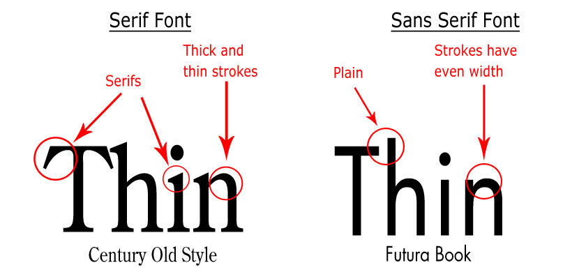
Print
Typefaces are originally designed with an intention to be printed out for
reading. Hence, a designer’s job is to ensure the text is smooth, flowing
and pleasant to read. Caslon, Garamond and Baskerville are the common
typefaces used in print. Their elegant and intellectual characteristics made
them pleasing to look at and highly readable in small font sizes. They are
also versatile which made typesetting easier to complete.
Screen
Typefaces intended for screen use are designed to be readable in different
resolution. So, their designs are modified from the common sans serif
typefaces to ensure a good legibility on screen. One important modification
is the increase in open spacing to improve reorganization of letters on
screen. Verdana and Georgia are typefaces designed specifically for screen
use.
|
|
Fig 1.1 Difference between Serif (usually used for print) and Sans Serif (usually used for screen) Source: https://www.studioseaside.com/blog/2014/1/15/type-for-web-vs-type-for-print |
Hyperlink
A word, phrase or image that leads user to another website page on click.
Text hyperlinks are usually blue and underlined.
Font size for screen
16px on screen is about the same size as text size printed in a book or
magazine. 12pt on paper is about the same size as 16px on screen.
20-24pt are good sizes for screen reading while the font size on book can be
either 10pt or 12pt (for arm's length)
Systems fonts for screen/web safe fonts
Open sans, Lato, Arial, Helvetica, Times New Roman, Times, Courier New,
Courier, Verdana, Georgia, Palatino, Garamond
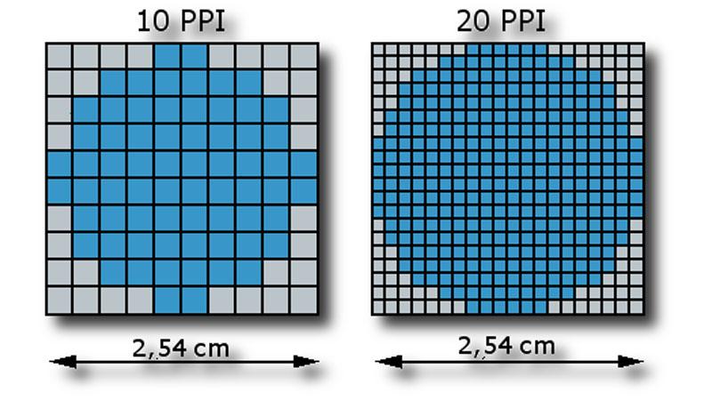
Pixel differential between devices
Different screens present text in different proportions. Two screens of the
same size but with different pixel per inch (ppi) count can create different
quality of renders.
|
|
Fig 1.2 Comparison between different ppi size in the same screen
size Source: https://www.scientiamobile.com/what-is-pixel-density/ |
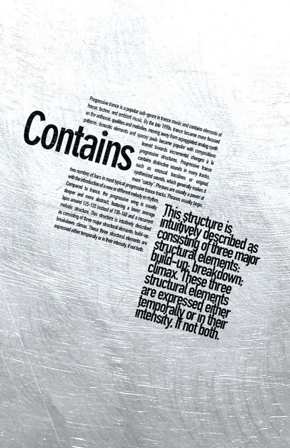
Static vs motion
Static typography, while can be made expressive, sometimes has limited
characteristics in mimicking motion. In animations and motion graphics, type
are animated to express a certain mood or feeling to the audience, or to
establish a brand identity.

|
|
Fig 1.3 Motion typography for branding purposes Source: https://www.invisionapp.com/inside-design/kinetic-typography-examples/ |
INSTRUCTIONS
Task 2: Typographic Exploration and Communication
For task 2, we are tasked to choose between 3 editorial textual content and
create a 2-page 200mm x 200mm editorial spread. The headlines should be
typographically expressed which aligns with the spirit of the text and the
editorial spread should have a good layout.
1. Layout Research

|
|
Fig 1.1 Research #1 (1/10/2021) Source: https://www.pinterest.com/pin/795659459139551471/ |
A layout that seems to follow a grid system and the body text are positioned in different high and low position to create a sense of movement and break the monotony.

|
|
Fig 1.2 Research #2 (1/10/2021) Source: https://www.pinterest.com/pin/827888343972157843/ |
Sub-headline in a big font size and positioned at the centre. While not the
usual way to position a sub-headline, but the size of the text and the white
space around it made it possible to draw the gaze of the readers first,
creating hierarchy.
|
|
Fig 1.3 Research #3 (1/10/2021) Source: https://www.pinterest.com/pin/16607092360460402/ |
The different weight and font style of the text creates visual hierarchy even though they are positioned close to each other with minimal space between paragraphs.

|
|
Fig 1.4 Research #4 (1/10/2021) Source: https://kottke.org/tag/Jessica%20Hische |
Headline reference for headline #2 in Fig 4.1. The words are aligned and distorted in a way that resembles the shape of the flag. The colours are also used to create a likeness to the USA flag and add more to the expression.

|
|
Fig 1.5 Research #5 (7/10/2021) Source: http://willmullery.com/Drawn-Words |
The right page with smaller graphics and more textual information balances out
the big block of headline in the left page. The text fields are arranged
rhythmically and has a natural reading flow to it.

|
|
Fig 1.6 Research #6 (7/10/2021) Source: https://raynedear.carbonmade.com/projects/6030894 |
While there's a larger white space at the left page, but the grey quotation
marks along with the bigger sized words gives an asymmetrical balance to the
layout.
I created several different layouts based on the ideas I had in my sketches. But most of them are different from what I sketched out as I had to make some changes and adjustments according to the page size and required line length.
2. Sketches

|
|
Fig 2.1 Layout sketches (1/10/2021) |

|
| Fig 2.2 Layout sketches (1/10/2021) |
I chose the editorial textual content titled "Visual Communicators, Unite!
Manifesto 2000", which is a text about changing the priorities of designers
to use their skills in areas other than advertising and marketing such as
books, magazine, films, campaigns, educations etc. I then sketched out some
possible layout and headline design and written short notes for each of
them.
3. Digitization of sketches
Text Formatting
I started out by formatting the body text first. After determining the point
size for the text, leading and paragraph spacing, I searched for any extra
hidden characters and remove them.

|
| Fig 3.1 Extra spaces found in the text (1/10/2021) |
I then noticed the name list uses paragraph space for each line. To remove
the spacing between names, I changed the paragraph spaces to forced line
breaks.

|
| Fig 3.2 Paragraph spaces (left) to forced line breaks (right) (1/10/2021) |
After that, I did some tracking on the body text to remove orphans and
obtain a smoother ragged right, since I'm using left justification for my
text.

|
| Fig 3.3 Tracked text overlay on top of original text (1/10/2021) |
Headline creation on Adobe Illustrator

|
|
Fig 4.1 Different version of headline for different layout
(1/10/2021) |
I then digitized the flag shaped headline idea in Fig 1.1. I used the flag
warp distortion to better express the shape of a flag. Headline #1 and #2
are direct digitization from the sketches I did while headline #3 and #4
were ideas that came later on when I was creating layouts on InDesign.
Creating layouts in Adobe InDesign

|
| Fig 5.1 Layout #1 (1/10/2021) |

|
| Fig 5.2 Layout #2 (1/10/2021) |

|
| Fig 5.3 Layout #3 (1/10/2021) |

|
| Fig 5.4 Layout #4 (1/10/2021) |

|
| Fig 5.5 Layout #5 (1/10/2021) |
I created several different layouts based on the ideas I had in my sketches. But most of them are different from what I sketched out as I had to make some changes and adjustments according to the page size and required line length.
After receiving feedbacks from Mr. Vinod and my peer, I decided to choose
layout #2 to further develop as my final outcome.
Further development of layout #2

|
| Fig 6.1 Comparison of leading sizes (7/10/2021) |
Before I make changes to the layout, I adjusted the leading size first as one
of my peers said that the leading seems to be too tight. I did a side-by-side
comparison between 11.5pt (the size that I originally used) and 12pt because I
didn't want the text to look too loose but 11.5pt also seem to look ok for me.
After reading both of the comparison word by word, I decided that a 12pt
leading size is more comfortable to read as the 11.5pt size looks too cramped
up and my eyes had a difficulty in focusing each line when reading.

|
| Fig 6.2 Different arrangement of the layout (7/10/2021) |
Then, I proceeded to make changes to layout #2 by slanting and resizing the
headline to be bigger and rearranging the body text along with it. I found
that if I keep using headline #1 (Fig 4.1), the word "unite!" has to span
across to the other page in order for "visual communicators" to fill up the
space. And if "unite!" is made to only occupy one page like in the third
layout in Fig 6.2, its position will look awkward. Plus, the layout would
look imbalanced as there's too less white space if when "unite!" is made
bigger and spanned to two pages. So, I changed from using headline #1 to
headline #3 to solve the problem.

|
| Fig 6.3 Changed to using headline #3 for the layout (7/10/2021) |
By using headline #3, it's able to fill up the space nicely and I was also
able to kept it within one page. The layout now has a better use of white
space. The headline and body text don't look too cramped up with each other
and there's enough space for the readers to "breathe" when viewing or
reading the layout.

|
| Fig 6.4 Comparison of two different text arrangement (7/10/2021) |
I then added shadow to "unite!" as I thought it was too plain. I also wanted
to try out if the text can be arranged differently so I made another layout
which is the one on the right in Fig 6.4. I then compared both of them
side-by-side and thought that the new layout has a more systematic
arrangement and better use of space. I decided to choose that as my final
outcome.

|
| Fig 7.1 Chosen final layout - JPEG (7/10/2021) |

|
|
Fig 6.5 Screenshot of chosen final layout with columns, baseline grid and hidden characters (7/10/2021) |
After receiving feedback from Mr. Vinod in week 7, I did some adjustment to the position of the text in my chosen final layout as it seems to look a little too static.
 |
| Fig 6.6 Amended final layout (8/10/2021) |
 |
| Fig 6.7 Screenshot of amended final layout with columns, baseline grid and hidden characters (8/10/2021) |
I took Mr. Vinod's suggestion and positioned the text more toward the bottom margin so the space below the body of text is lesser than the space above the body of text.
 |
| Fig 7.1 Final task 2 outcome - JPEG (8/10/2021) |
Fig 7.2 Final task 2 outcome - PDF (8/10/2021)
Typeface: Univers LT Std (bold, roman, light ultra condensed, bold condensed, light condensed oblique)
Point size: 9.5pt (body text), 13pt (sub-heading), 57.47pt; 107.1pt; 12pt (heading)
Leading and paragraph space: 12pt (body text), 15pt (sub-heading)
Line length: 55 (longest line length)
Alignment: Left alignment
FEEDBACKS
Week 6 - Typographic Exploration and Communication
General Feedback: Headline should grab the reader's
attention and it should be appropriately expressed. It should lead the
readers in to the sub-headline and body text smoothly too. It's also
better to not put the headline or any text at the middle of the page
as it will be eaten up when the page is printed out and folded. Make
sure to use a single main text box and create separate linked text
boxes from that text box.
Specific Feedback (Lecturer's feedback): The idea of
layout #2 is good, the headline has a revolutionary sense to it. Make
the headline bigger to give the expression more impact. Try to rotate
it in a slanting position and resize it to cover most of the page. The
body text can be positioned below the word "unite!" to create a flow
of reading from the headline to the body text, or the headline can
occupy one page and the body text can be put to another page.
Specific Feedback (Peer feedback): The ragging
looks okay but maybe the leading can be larger as it looks a bit too
tight. The layout of the page at the right in layout #3 looks too
simple, maybe something can be added there or the proportion of the
text can be changed.
Week 7 - Typographic Exploration and Communication
Specific Feedback: The headline expression and typesetting is good. But the layout looks a little static which may be because of the even space above and below the body of text. Try rooting the text more toward the bottom margin.
REFLECTIONS
Experience
For me, the challenging part of this project was coming up with an
expression for the headline and creating the layout composition for the
editorial spread. After doing the exercises before this project, they
definitely helped me in finishing the typesetting faster but expressing
the headline still takes some time as we’re not just focusing on one
word now, it’s a whole string of words. But I’m glad in the end that I
was able to think of an expression that doesn’t only fits the word in
the headline, but also the message of the body text. As for layout, I
often caught myself wondering if the layout I’ve done is too simple or
too static. Since we’re using a landscape orientation for this project,
it’s different from arranging a wall of text in portrait orientation as
I find that one of the page would end up having too much white space,
making the page to look too empty and throw off the balance of the
layout. But other than that, the tutorial videos and Mr. Vinod’s
feedback were helpful to me in further developing my outcome.
Observation
When doing layout research for this project, I observed that there’s a
lot of ways in arranging texts and other elements and there’s no “right
or wrong” in creating layouts. The possibility is endless but of course,
legibility comes first. If the body text is broken up and scattered
across the page then that wouldn’t be a legible layout. An effective
layout would be one where it’s able to guide the reader throughout the
page.
Findings
I found that in a layout, white space has to be balanced as too many of
it would make the layout look uneven and too less of it would make the
layout too packed. But in a layout with a big and heavy weighted
headline which spans a page, the layout can be balanced by filling the
other page with body text that are more loosely arranged. Furthermore, I
also found that a layout with a good reading rhythm and a variety in
pattern can make it look more visually interesting and encourage readers
to keep on reading. One way to do this is to arrange the body text in
different positions, but some layout would require a symmetrically
placed fields of text to establish a good rhythm and hierarchy.
FURTHER READINGS
Week 6
In this week, I've read "Typographic design: Forms and communication 6th
edition" by Rob Carter, Philip B. Meggs, Ben Day, Sandra Maxa and Mark
Sanders to help me in my progress of task 2. I choose to focus on "ABA form"
in chapter 5.

|
| Fig 1.1 Book cover |
Chapter 5: Syntax and Communication, ABA form (pg106-110)
ABA form - "Repeat-Contrast-Repeat"
Repetition and contrast are important principles to consider in
establishing a visual relationship through typography. The ABA form helps
in creating the two principles in a layout and in turns, enabling the
information to be presented with visual order and variety in rhythm.

|
| Fig 1.2 Example of the ABA form (pg106) |
Typographic elements that are similar in size are perceived as being
related to each other. The same goes for elements with the same texture,
weight, scale etc.
In the ABA form, rhythm is created through the intervals of space
separating the typographic elements. The rhythmic pattern can also be used
repetitively to created groupings.

|
| Fig 1.3 Example of creating grouping through spacing intervals (pg109) |
For example in Fig 1.3, the name for the instruments are separated from the
performer's name by 1 interval spacing, and each of these instrument-name
groupings are separated by 2 interval spacing. Other than that, groupings of
information are also done through the use of different font styles
and typeface choices.
Week 7
In this week, I've read "Typography Referenced" by Tyler Alterman,
Jason Tselentis, Kathryn Henderson, Ina Saltz, Richard Poulin, Allan Haley,
Gerry Leonidas and Tony Seddon. I chose the section about white space to
read.

|
| Fig 2.1 Book cover |
Typographic Principles: White Space (pg228-229)

|
|
Fig 2.2 Example use of negative space to create a focal point and adds
to the concept message of the book's content (pg228) |
Empty areas in a composition or layout, also called as negative spaces. White space can be used to add a sense of sophistication to a layout or to create focus on certain elements. It can also be used conceptually to deliver a message. But all in all, white space should be used sparingly and functionally because too much of it can make a composition look uninspiring.

|
| Fig 2.3 Example use of white space to balance out a composition (pg229) |
Effective use of white space can also create balance in a layout. In Fig
2.3, there's two examples of how a page or an area which has more white
space and smaller and lighter fonts is able to balance out the area beside
it which has larger and heavier typefaces.
Comments
Post a Comment