27.8.2021 - 24.9.2021 (Week 1 - Week 5)
Chung Yi Ki / 0345014 / BDCM
Typography
Task
1 / Exercises
LECTURES
Week 1 / Introduction & Briefing
- Typography is the act of creating letters, or in other words, creation of typefaces.
- Typography can be found in any design, from signboards and still images to motion graphics and animation.
- Typography doesn’t only mean creating a unique type family, but composition (the way how letters are arranged in a space) is also considered as part of typography.
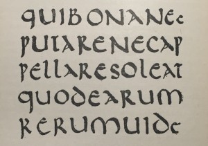
Uppercase forms (uppercase letters) are formed with circles and straight lines, much like the early Phoenician writing where it was written with sticks and chisels.
|
2. Hand script (3rd - 10th century C.E.)
Development of uppercase letterforms
The square capital letterform is achieved by holding the pen at
approximately 60 degree slanted angle when writing on paper.
Rustic capitals are written by holding the pen at an approximately 30 degree angle. It is a more compressed version of the square capitals but it is more faster to write and takes up less space, though the compression of the letterforms made it hard to read.
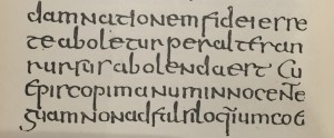
Development of lowercase letterforms
In the need to write words faster in everyday transaction, people
started to write letters in cursive. This eventually develop into
the uncial letterforms. The size of each letter in uncial is about
one inch high and the Roman cursive style is more prominent in the
shape of A,D,E,H,M,U,Q.
Half-uncials were later developed and it is the formal beginning
of lowercase letterforms.
Later on, Charlemagne issued a standardization of writing system, which then produced a script written using uppercase and lowercase letterforms, as well as punctuations. 3. Blackletter to Gutenberg type With Charlemagne’s standardization, there came regional variations of letterforms used in the script. One variation of the letterforms was called Blackletter (a.k.a Textura) and it was later on used by Gutenberg as a typeface in printing.
4. Text type classification
Week 2 / Typography Basics
1. Describing letterforms
Fig 5.1 PDF file showing terminologies of letterforms
2. The Font
When working with typography, we should make sure we are using a
type family with a full font. A full font includes:
1) Uppercase and lowercase letters
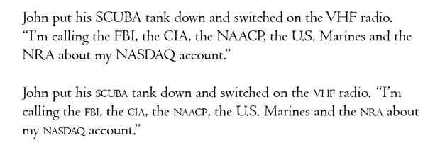
2) Small capitals
Used in text paragraphs where there’s a lot of capital letters
acronym. It avoids the acronyms sticking out from the paragraphs
when read, enhancing the ease of readability. It is also
important to use typefaces that includes a set of small capitals
and not computer generated small capitals.
3) Uppercase and lowercase numerals
Lowercase numerals are used in a similar fashion as small
capitals
4) Italics and Roman letters
5) Punctuations and miscellaneous characters
6) Ornaments
Not as commonly included in most type families, only a few
traditional typefaces contain ornaments. They are used as
decorations in invitations or certificates.
3. Describing typefaces
Terminology notes:-
Book – A slightly lighter stroke of Roman characters
Italic – A slanted font style based on the letterforms of
Italian handwriting
Oblique – A slanted font style based on Roman letterforms
(basically an angled Roman)
Week 3 / Text
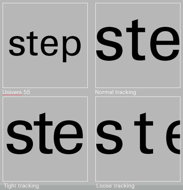
1. Tracking: Kerning and letterspacing
Kerning
Kerning is the automatic adjustment of space between letters.
Tracking
Tracking is the increase or decrease in letterspacings in a word
or sentence. It is often done in words typed in full capitals
and sometimes in lowercase words for stylization. But lowercase
letters within a paragraph shouldn’t have loose letterspacing as
it can decrease readability.
2. Formatting text
Flush left
Left to right alignment, meant to mirror the asymmetrical nature
of handwritten paragraphs. Has ragged right (the right side of
text isn't straight i.e justified)
Centered
Symmetrical alignment, important to adjust line breaks so the
readability won't be decreased. Better to use it for small
amount of text
Flush right
Right to left alignment. useful in captions/axial layout.
Usually used for small amount of text.
Justified
Symmetrical alignment, line breaks and hyphenation needs to be
adjusted to fix "rivers" (gaps)
In text formatting, it is important to focus on delivering the
author's message rather than expressing using typefaces. If
readers notice the typefaces first rather than the words, then
the typeface needs to be changed.
3. Texture
The typefaces choices need to be clear for readers and
appropriate for the message of the text.
Different typefaces will result in different texture in a
paragraph. This will affect the readability of the paragraph as
there is different contrast between letter strokes.
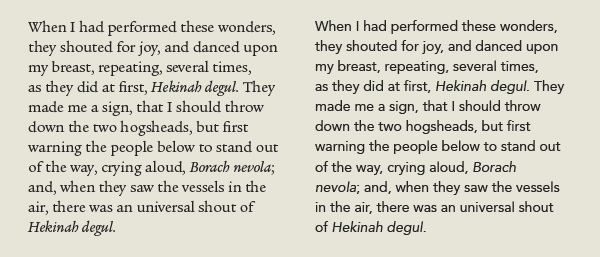
4. Leading and line length Areas of focus when formatting text:
5. Type specimen book
A book that shows typefaces in different sizes. It is used a as
a physical referencing for type size, line length, leading
etc.
A field of text should have a middle grey value and it should
also occupy a page or screen. It is useful to enlarge a text
field at 400% of its original size to check differences in
leadings.
Week 4 / Text
1. Indicating paragraphs
2. Widow and orphan
Widow
A short line of text left alone at the end of a column of
text, rebreak line endings to fix it.
Orphan
A short line of text left alone at the start of a new column
of text.
Widow and orphans should be avoided at all times during text
formatting. Kerning and tracking can remove widow and
orphans, but the text should not be kerned or tracked for 3
times (3 keyboard taps) to avoid the text being too loose.
3. Highlighting text
Ways to highlight text
For field of colour and typographic elements, extending
rather than indenting will keep the text within the reading
axis.
4. Headline within text
Heading can be created through using a bold font, extending
it to the left of the margin, using a larger font or small
caps.
A subheading within a heading can be typed in with a force
line break (following leading space), small caps, italics,
or bold using the same or different typeface from the body
text.
Another way to format subheadings is by using small caps,
italics or in bold font either using the same or different
typeface as the body text. It should be in the same
paragraph of the body text but there should be at least an
em space before the start of the sentence and after the lead
in text. It can be used as another lead-in text within a
subheading.
5. Cross alignment
Cross alignment is needed to maintain the vertical reading
rhythm within a page. It’s hard to maintain cross alignment
when the font sizes used are very different. But if the font
size is not too different from one to another, cross
alignment can be achieved by adjusting the leading to be
large for the bigger text so it’ll align with the smaller
body of text (double the leading from the smaller body of
text. E.g: body text leading 11pt, headline leading
22pt.)
Week 5 / Letters
1. Understanding letterforms
Letterforms may appear symmetrical, but with close
inspection, there are actually very slight differences in
each stroke. These variations may be for optical
adjustments or to create a harmonious design.
In creating letterforms, curve strokes should go above the
median or below the baseline. This is an optical
adjustment so that they'll appear as the same size as the
other letters with vertical strokes.
2. Counterform
Counterform (or counter) is crucial in making a letterform
recognizable. When a set of typeface has a well thought
out counterform, words strung together using the letters
from that typeface will have a good readability.
To understand how to create a letterform, it is important
to analyze exisiting typefaces to study the
characteristics of how each letter are formed.
3. Contrast
Basic design principle, such as contrast, can be directly
applied in typography. Contrast can be used to create
differentiation of information (i.e: visual hierarchy).
INSTRUCTIONSExercise: Type Expression
For Exercise 1, we are tasked to create type expressions for a set
of 4 words. The word "terror" is compulsory. As for the 3 other
words, we have the freedom to choose them out from a list of 7
words which are: space, glitch, water, abyss, broken, bark,
colossal. Very minimal graphic elements are allowed in our type
expressions and we are also limited to be only using 10 typefaces
which are: Adobe Caslon Pro, Bembo Std, Bodoni Std, Futura Std,
Gill Sans Std, ITC Garamond Std, ITC New Baskerville Std, Janson
Text LT Std, Serifa Std, Univers LT Std.
1. Sketches
Other than "terror", my choice of words are "glitch", "space"
and "broken". I did the sketches on paper first and under each
sketches I've written short notes on the idea behind each
sketch, for example the composition of the letters, graphic
elements used, opacity and gradient of the word or font
choices.
2. Digitization of sketches
I then picked one sketch out of each word to test out digitizing
them in Adobe Illustrator.
After receiving peer feedbacks from week 2, I went to make some
changes to the digitization of my sketches.
For broken, I changed to my third sketch in Fig 1.2 to digitize as
I think my first digitization was too common and not as strong. I
wanted to express the idea of different fonts having different
weights (in a literal sense) on letters. So, I started out with
finding the alignment I want for each letters and used Adobe
Caslon Pro for it. After that I wanted to try out if sans serif
typefaces would work better, but it felt a little too stiff and
modern so I went back to a serif typeface.
For terror, I tried adjusting the gradient, applying distortions
and using a different typeface to see which would work better and
would give a more dramatic effect to the word. At the end, I think
the Futura font choice and gradient effect still works best and
decided to make the gradient start at the top from black to white
to give the effect of a dramatic light source shining from below.
I also adjusted the kerning so that it would look more
consistent.
For space, I first changed to using Gill Sans Std Light Shadowed
as I thought the typeface design of using shadows to form letters
would be interesting to express the word "space". But the idea of
having a big letter spacing was still too common so I eventually
thought of testing out what will it look like if I decrease the
kerning and increase the size until it fills up the whole box. The
end result turns out to work well as the letters looks like
they're in a 3D space. And since the shadows are what define the
letterform, it gives the illusion as if the word itself didn't
take up any space in the box, instead it's the black shadows
that's using the white space to bring out the letters.
Final Type Expression Outcome
After listening to the feedbacks that Mr. Vinod and Dr. Charles
gave to my classmates in week 3, I've decided that I'm satisfied
with my second digitization draft and make it as my final
outcome.
Fig 3.2 Final outcome for type expression - PDF (17/9/2021)
3. Type expression animation
During practical class in week 3, we are tasked to create an
animated gif of one of the words in our type expression outcome
using Adobe Illustrator and Adobe Photoshop. I decided to animate
glitch as I like it the most and I think it'll be fun animating
it.
After that, I went to improve my first animation attempt and added
more movement and variation in position of the word to further
exaggerate the glitching effect. I also added motion blur and
adjusted the timing for some of the frames to enhance the
glitching animation too.
Following week 4 feedback, I changed the frame delay for the last
frame from 0.4 to 0.6 seconds to give the animation a sense of
closure.
Final Animation gif
Exercise: Text Formatting
For Exercise 2, we are given paragraphs of text and are tasked to
format it in Adobe InDesign through adjusting the point size,
leading, paragraph space, line length, kerning and tracking, and
also remove any widows, orphans, forced line breaks and extra
spaces. We also need to layout the formatted text.
We are given a total of 5 tutorial videos to watch and for the
first and second video, we are given a kerning and tracking
exercise. We are tasked to type out our names using the 10 given
typefaces and are allowed to use any fonts we like. Then, we need
to kern and track the words appropriately.
After that, the subsequent 3 videos are about guiding us on how to
format the text in Adobe InDesign. I started with pasting the text
in InDesign and adjusted the point size, leading and paragraph
spacing. I first used 10pt for the body text, and 12pt for both
leading and paragraph spacing.
But I noticed there's a lot of widows and orphans so I adjusted
the body text point size to 9pt and leading and paragraph spacing
to 11pt to solve the problem.
After that I did some tracking on the body text to obtain a
smoother ragging since I used left justification for the
text.
Then, I try out different arrangement of the body text, headline,
sub-headline and the picture given.
I decided to choose Layout #5 as my final layout because I find that having everything left aligned is more comfortable to read. So, I did some
further adjustment of the text in that layout. I kerned the
heading a bit so that the spacing between each letters are even
and I also checked for any extra hidden characters in the body
text.
Final type formatting outcome
Fig 6.2 Final type expression outcome - PDF (24/9/2021) Typeface: Univers LT Std (bold, oblique, roman) Point size: 9pt (body text), 8pt (caption), 10pt (sub-heading), 18pt (heading) Leading and paragraph space: 11pt (body text and caption), 22pt (heading) Line length: 63 (longest line length) Alignment: Left alignment
FEEDBACK
Week 1 - E-portfolio
General Feedback: Resist on customizing our blog themes and only do it
perhaps at the end of our semester. And when we are customizing
our blogs, be careful on our choice of typefaces and colours to
make sure our blogs have an ease of readability.
Week 2 - Type Expressions
|


|
| Fig 1.1 Early Evolution of Roman Letters by Allan Haley from fonts.com |
- Attempts to mimic letters carved on stone
- Used exclusively to produce formal books and documents
- Used to save space and time as they are narrower and simpler to draw
- Used to produce less important books and documents
- Cursive meaning "running" in Latin
- Used in ordinary daily writings
- The ascending and descending parts on some of the letters (which probably came about because of the speed in writing in cursive) eventually helped in developing lowercase letterforms

|
| Fig 1.2 First Alphabets by Allan Haley from fonts.com |

|
| Fig 2.1 Book cover |

|
| Fig 2.2 Examples of how semiotics can be used in typography (pg 115) |
Using ornaments in a typographic design is able to make the end result more expressive and also create an innovative solution.

|
| Fig 2.3 Example of expressive and ornamental use of letterforms (pg 119) |

|
| Fig 3.1 Examples of two high saturation colours in use: orange and blue (pg56) |
An exception to this are highly saturated analogous colours. For example, in fig 3.2 the green colour is lighter in value and brighter in saturation, thus resulting in an adequate contrast. But if the chosen analogous colours are too close to each other on the colour wheel, adjustment is needed to gain contrast.

|
| Fig 3.2 Analogous colours: blue and green (pg56) (10/9/2021) |

|
| Fig 3.3 Analogous colours that are close on the colour wheel: blue and violet (pg57) |

|
| Fig 3.4 The effect of different line spacing in legibility (pg58) |

|
|
Fig 4.1 A beginner's guide to kerning like a designer by
Janie Kliever from Canva Source: https://www.canva.com/learn/kerning/ |

|
| Fig 4.2 Actual equal spacing vs perceived equal spacing |
- Slanted letters: A,K,V,W,Y
- Letters with arms or cross strokes: F,L,T
- Letter combinations: W or V + A (in any order of combination); T or F + a lowercase vowel (a,e,i,o,u)
- Giving more space to two letters with a straight stroke
- Giving a slightly lesser space to two letters with a straight and round stroke
- Giving an even more slightly lesser space to two letters with round strokes

|
| Fig 4.3 The kerning principle recommended by Ilene Strizver |

|
| Fig 4.4 The kerning principle in use |

|
| Fig 4.5 Example of flipping the word to know where to kern |
Week 5

|
| Fig 5.1 Book cover |

|
| Fig 5.2 Use of four column grid in arranging text and visual (pg 60) |
- Able to create rhythm, drama, movement and tension through the arrangement of visual elements.
- Hierarchy and contrast can be formed through scale, orientation and position
- Too many white space and activity can result in confusion and disorder

|
| Fig 5.3 Example use of multiple-column grid (pg 64) |

|
| Fig 5.4 Example use of three-column grid (pg 65) |
Comments
Post a Comment