15.10.2021 - 29.10.2021 (Week 8 - Week 10)
Chung Yi Ki / 0345014 /
BDCM
Typography
Task 3A / Type Design & Communication
LECTURES
Lectures 1-5 were documented in
Task 1 / Exercises
Lecture 6 was documented in
Task 2 / Typographic Exploration & Communication
INSTRUCTIONS
Task 3A / Type Design & Communication
For task 3A, we are tasked to design 11 western letters and 3 punctuations
which are: a i m e p y t g d o b ! , .
We need to create a typeface that has the characteristics of a good
typeface: subtlety, character, presence, legibility, readability. We also
need to adhere to the anatomical structure of letterforms when constructing
our letters. After we've done our sketches, we'll need to choose one
typeface from the 10 typefaces given to us at the start of the semester as
reference point for our letterforms digitization.
1. Typeface research
Glyphic serif (Newtext)

|
|
Fig 1.1 Glyphic serif analyzation (14/10/2021) Source: https://www.toptal.com/designers/typography/typeface-classification |

|
|
Fig 1.2 ITC Newtext typeface (14/10/2021) Source: http://www.identifont.com/show?6HL |
Rigid and wide appearance. Triangular shaped serif gives the letterform a
pointed end look. Very minimal contrast in strokes.
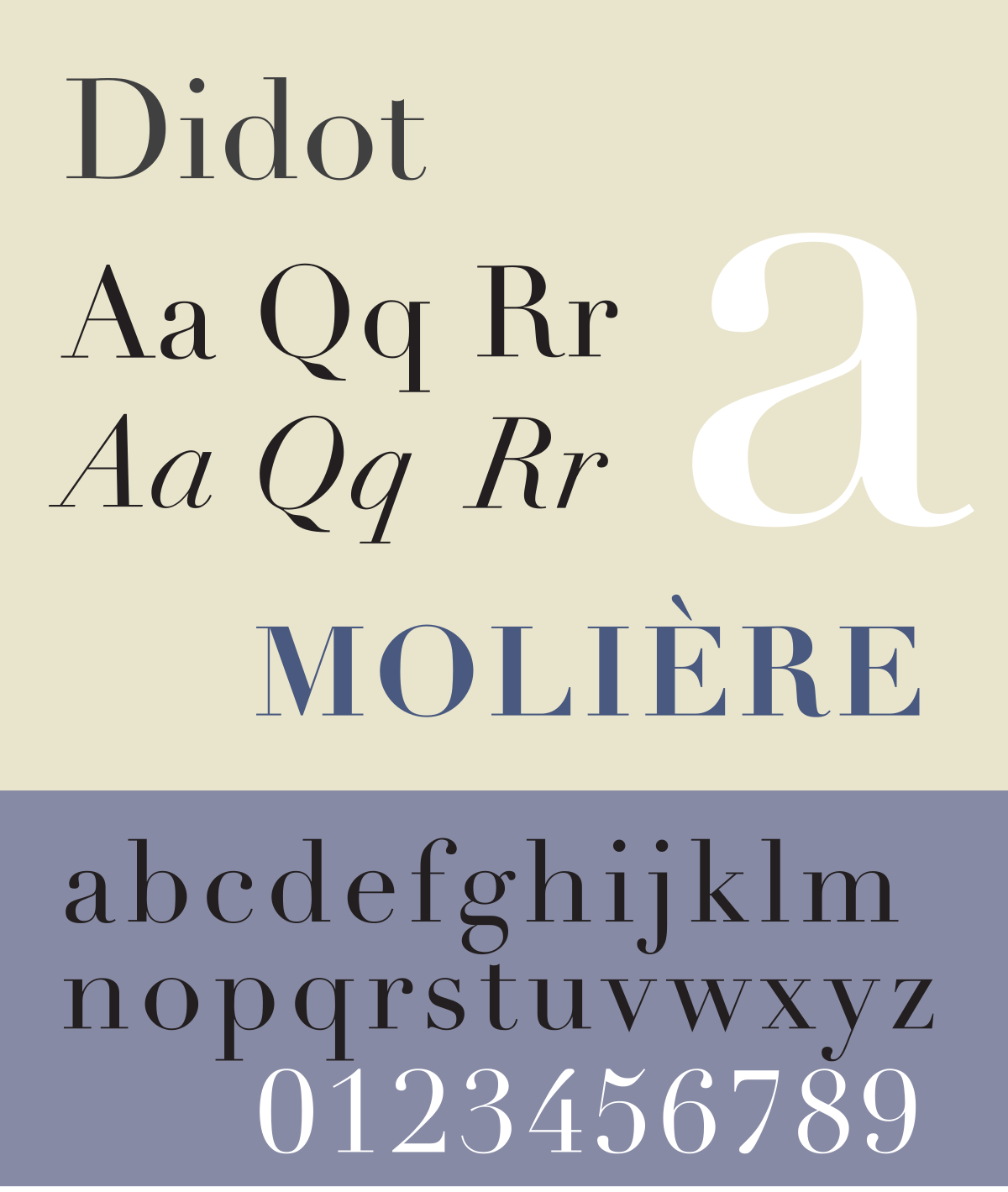
Modern serif (Didot)

|
|
Fig 1.3 Modern serif analyzation (14/10/2021) Source: https://www.toptal.com/designers/typography/typeface-classification |
|
|
Fig 1.4 Didot typeface (14/10/202) Source: https://en.wikipedia.org/wiki/Didot_(typeface) |
Strong contrast between strokes. The strokes are either one-line thin or
a-pen-stroke thick to achieve the result of the strong contrast. Serifs
are simplified to a line and ball terminals are used.
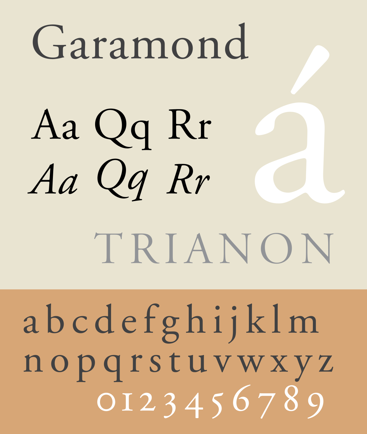
Old style serif (Garamond)

|
|
Fig 1.5 Old style serif analyzation (14/10/2021) Source: https://www.toptal.com/designers/typography/typeface-classification |
|
|
Fig 1.6 Garamond typeface (14/10/2021) Source: https://en.wikipedia.org/wiki/Garamond |
Diagonal stress in letters like “o”. Contrast between strokes are minimal.
Serifs are bracketed, reflexive and with angled strokes to mimic
handwritten letters on ink using a pen.
Display typefaces (Cup and Talon, Stencil)

|
|
Fig 1.7 Cup and Talon typeface (14/10/2021) Source: https://www.jotform.com/blog/a-crash-course-in-typography-the-basics-of-type/ Full typeface link: https://www.fontspace.com/cup-and-talon-font-f1378 |
Display typefaces are made for headline and title usage, and is not
recommended to use as body copy. It can be formal or informal and are
often used as decorative letterforms. The example “Cup and Talon” has very
stylized strokes which resembles wood carving.

|
|
Fig 1.8 Stencil typeface (14/10/2021) Source: https://en.wikipedia.org/wiki/Stencil_(typeface) |
Stencil mimics the letterforms often painted on wooden boxes. Most of the
letters in the typefaces like “A,C,E,F” etc. features a detached stroke
characteristics to it. But while the strokes are detached, the space
between them are close enough to be viewed as a complete letter.
2. Additional inspirations
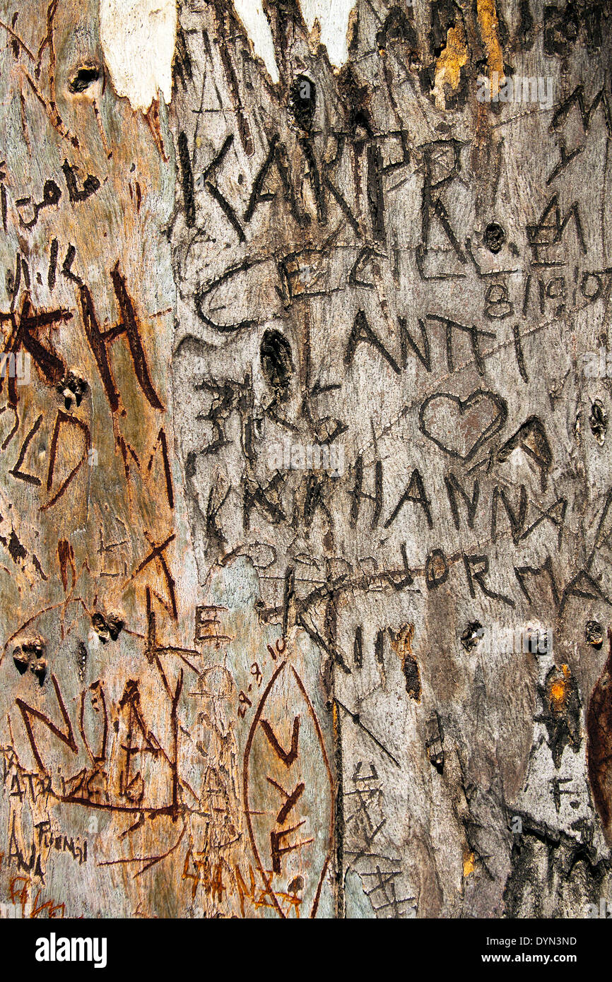
Wood carved letters

|
|
Fig 2.1 Words carved into wood with lowercase and uppercase
(14/10/2021) Source: https://www.dreamstime.com/stock-photo-names-carved-wood-park-image42328485 |
|
|
Fig 2.2 Words carved into wood mostly uppercase letters
(14/10/2021) Source: https://www.alamy.com/stock-photo/words-carved-into-wood.html |
After looking at Cup and Talon, I wanted to create a display typeface that
resembles rudimentary letter carvings on wood. The letters strokes in Cup
and Talon has a lot of curves, so I wanted to mimic actual carved letters
more closely, where there are hardly any curves and the letters strokes
are made up of straight lines with a lot of edges.
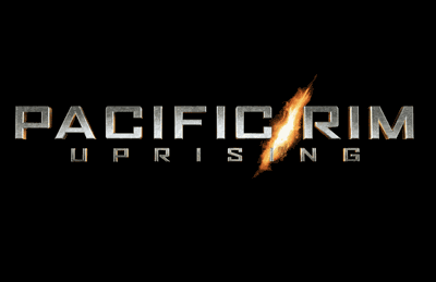
Pacific Rim movie title typeface
|
|
Fig 2.3 "Pacific Rim" movie title (14/10/2021) Source: https://www.redandblack.com/culture/movie-review-pacific-rim-uprising-robots-fighting-aliens-with-some-plot-i-guess/article_e44ea1f2-3186-11e8-b5d7-9ba40c54d06f.html |
The letterforms used in this movie title are rigid, wide and has a blocky
feeling to it. It gives a sci-fi and futuristic look to it.
3. Sketches

|
| Fig 3.1 Sketches #1 (14/10/2021) |

|
| Fig 3.2 Sketches #2 (14/10/2021) |

|
|
Fig 3.3 Sketches #3 (14/10/2021) |
After doing some research, I went to sketch some typeface ideas I have which
are influenced by the research I’ve done. I’ve also written down short
description and the main reference or influence for each sketch.

|
| Fig 3.4 Reworked sketches (22/10/2021) |
After receiving feedbacks from Mr. Vinod, I redid my sketches using the
guidelines for the baseline, mean line, ascender line and descender line. I
decided to choose the display typeface to digitize in Adobe
Illustrator.
4. Deconstruction of typeface
After looking at my sketch and the 10 typefaces given to us at the start of
this semester, I choose Futura as my reference to deconstruct because its
letterforms are more similar to my sketches, especially with the kind of
letter "a" that I'm going for.

|
|
Fig 4.1 Deconstruction of typeface (22/10/2021) |
We were asked to choose 3 letters to deconstruct but I chose 2 more for my
deconstruction analysis. I chose 'd' for its ascender, 'y' for its
descender, 'a' for a letter within the x-height and 'e' and 'm' because I
want to know how they are constructed.
Observations
Overall takeaway
Strokes are the same width, except the stroke width at the joints are
thinner. The circular strokes may seem like a perfect circle, but it's
actually squashed or elongated depending on the letters. The counters are in
the width of the letter 'o', but slight adjustments in heights and stroke
widths are made for different letters. The curve strokes are connected to
the stems with a very short horizontal stroke.
Specific takeaways
The crossbar of 'e' is above the centre line of the letter. The left
n-stroke of the 'm' has a longer width than its right n-stroke, but both of
the counters have the same width. Other than that, the joint of the left
n-stroke is higher than the joint between the two n-strokes. The two strokes
of 'y' are not flipped, and while the stroke width look the same, it's
actually narrower when meeting at the joint.
5. Digitization of sketch

|
| Fig 4.2 Placing the guidelines (22/10/2021) |
I started with placing the guidelines for the baseline, median line, cap height, ascender and descender line following the demonstration recording by Mr. Vinod. The typeface used is Myriad Pro at 1031.93pt. The x-height was fixed at 500pt x 500pt and a box at 1pt stroke is used as a guideline for it.
|
|
| Fig 4.3 1st attempt - clean construction (22/10/2021) |
Then, I proceeded to construct the letters based on my sketch. I plan to
create imperfections in the strokes like the ones in Fig 1.7 but retain the
jaggedness of wood carved words. So, I started with creating a clean
constructions of the letters for me to base on. I created two forms of the
letter 'o', the one on the very left follows the sketch that I did and the
one beside it is a form that I thought of when I was digitizing the sketch.
But the 2nd one seems out of place with the other letters so I went back to
the 1st one.
|
|
| Fig 4.4 2nd attempt - refined construction and added imperfections (22/10/2021) |
After that, I refine the clean construction and made some changes from my
sketch so each letters would look consistent with each other. I then used
the brush tool to draw out some suitable looking shapes and used the
pathfinder tool to create the imperfections in the strokes. I also rounded
some corners of each letters so that they won't look too boxy and jagged,
which would be tiring to read. I kept the corners within the range of
10-15pt to keep it subtle.

|
| Fig 4.5 3rd attempt - further corner rounding (22/10/2021) |

|
| Fig 4.6 Close up of the guidelines on the letters (22/10/2021) |
Later on, I used the brush tool to draw out some more shapes and used them to create some textures within the letter form to give them a more wooden look to it.

|
| Fig 4.7 Brush strokes made using the brush tool (22/10/2021) |
After receiving feedbacks from Mr. Vinod, I made some more adjustments and
changes to the typeface construction.

|
| Fig 4.8 4th attempt - stroke consistency and "y" adjustment (28/10/2021) |
The right stroke of the letter "y" was slanted too aggressively, its vertex
should be on the baseline too. So, I decreased the slant by rotating that
part of the letter and made some adjustments to keep it within the
guidelines, and also resizing the left stroke so the bottom meeting point
with the left stroke will lie on the baseline. I also adjusted the stroke of
"g" and the arm of "m" since they were thicker than the others, making them
inconsistent.

|
| Fig 4.9 Measurements of each guideline from the baseline (28/10/2021) |
After that, I measured the height of the median, cap height, ascender and
descender line from the baseline so I can continue my progress in generating
my typeface in Fontlab. The decimal points are for accuracy since it's the
value Adobe Illustrator presented for me when I was measuring it.
6. Fontlab 5 progression
 |
| Fig 5.1 Copy and pasting "o" from Illustrator to Fontlab (28/10/2021) |
In Fontlab 5, I keyed in the values for each guideline in the font info menu
and copy and pasted the letters into the application. After that, I begin my
work for kerning.

|
| Fig 5.2 Process of setting the left and right bearings (28/10/2021) |

|
| Fig 5.3 Kerning using the word "pet" and "ape" (28/10/2021) |
I first made the left and right bearings both 50 as shown in Mr Vinod's
pre-recorded demonstration and proceeded to use random words to kern the
letters individually. When I was using the word "pet" and "ape", I noticed
that the "t" and "e" looks smaller than the other letters, and the top
stroke of "a" looks too thick, the right stroke of "y" seems to be a little
bit too slanted as well. And this is when I went back to Adobe Illustrator
to make some changes to them.

|
|
Fig 5.4 Changes done to "a", "t", "y" and "e" (28/10/2021) |

|
| Fig 5.5 5th attempt - Final letter construction (28/10/2021) |

|
| Fig 5.6 Outline and anchor points of final letter construction (28/10/2021) |
So I made the "e" wider, its crossbar slightly thicker and its eye higher.
The slant of the right stroke of the "y" is decreased again and the top
stroke of the "a" thinner. Finally, the "t" is made thicker in both of its
strokes, so it will be visually the same when paired up with the other
letters. The amount and proximity of anchor points are due to the
imperfections made by using the brush and pathfinder tool.

|
| Fig 5.7 Retry of "pet" and "ape" (28/10/2021) |

|
| Fig 5.8 Some of the words used for kerning (28/10/2021) |

|
| Fig 5.9 Kerning and bearing values as shown in this set of letters and punctuations (28/10/2021) |

|
| Fig 5.10 Generated font file (28/10/2021) |
|
|
| Fig 5.11 Typed out font (28/10/2021) |
After that I generated the typeface on Fontlab 7 because Fontlab 5 for some
reason put a watermark thingy on the exported font. Then I used the properly
exported font to make my black and white poster.
7. Basic black and white poster progression

|
| Fig 6.1 Poster #1 and Poster #2 (28/10/2021) |

|
| Fig 6.2 Poster #3 and Poster #4 (28/10/2021) |

|
| Fig 6.3 Poster #5 (28/10/2021) |
I named my typeface "Wood" because it's woody and created different layouts
for the poster using different sentences. Poster #1 looks messy and Poster
#2 seems a bit too static. I think my typeface would be better presented in
a large font size so that the details can be seen more clearly, so Poster #3
is out. Between Poster #4 and Poster #5, I think Poster #5 is better since
its layout is more organized and it looks more dynamic compared to all the
others. So, I chose that as my final poster.
Font tester
Font tester using final generated font
How much wood would a woodchuck chuck if a woodchuck could chuck wood?
As much wood a woodchuck chuck if a woodchuck could chuck wood.
So, how many letters or sentences can you form from the set of 11 letters
and 3 punctuations (a i m e p y t g d o b ! , .) using this woody typeface?
Chuck your ideas and test them out by typing in the font tester below!
Final outcome of Task 3A
Downlod the font here: https://drive.google.com/file/d/1UK8JWMG-8GnMjdEqv9BQ85WSbL-ELZ1j/view?usp=sharing

|
| Fig 7.1 Final letter construction artboard strip from Illustrator - JPEG (28/10/2021) |

|
| Fig 7.2 Final typed out generated font - JPEG (28/10/2021) |

|
|
Fig 7.3 Final basic black and white poster - JPEG (28/10/2021) |
Fig 7.4 Final letter construction, generated font, and black and white
poster - PDF (28/10/2021)
FEEDBACKS
Week 8
Specific Feedback: Some sketches can be easier done using other
tools. For example, the blocky sans-serif sketch can be easily done with a
marker or using the side of a pencil lead. The baseline, median line, cap
height, ascender and descender line should be drawn whenever sketching to
know how the typeface is going to look like in reality. Redo the sketches
but I don't have to sketch all letters, choose the letter 'o', a letter with
an ascender, a letter with a descender and a letter within the x-height.
Mimicking real word carved letters might not be a good direction as they
don't really have a form in them, except for their sharp edges. But I can
try to mimic the imperfections in the letter strokes of the Cup and Talon
typeface.
Week 9
General feedback: The tail of the comma can't be too short or its
form wont' be
prominent enough. If the dot of the "i" and "!" is a circular stroke, make
sure its size
is larger than the stem.
Specific feedback: Rotate the right stroke of the "y" as it's too
slanted, and move the
left stroke down until the vertex is on the baseline. Make the comma
bigger and make
sure the tail of the comma is below the baseline. Also, make sure to check
for consistency in each letter strokes.
REFLECTIONS
Experience
This project was interesting and also challenging for me. I didn’t know
where to start first but after looking at other typefaces and
understanding the differences and characteristics between them, I
eventually managed to come up with some ideas for my typeface sketches.
And while the sketch idea that I choose to digitize was fun in some way
but it was also very time consuming. Since the letterforms have their
jagged and blocky form, there wasn’t a lot of typefaces which shares the
same characteristics that I could reference and analyze, so I had to spend
more time in figuring out how to balance out the strokes and spaces when
constructing the letters using shapes. And there’s also the problem of
making it not too look too jagged as it won’t be pleasing to look at as a
type. So, rounding the corners of the letters took some time too. But
making the imperfections was the fun and interesting part as that’s when I
could see that I’m on the right path. And finally generating the font was
a good experience because I can finally see the letters that I’ve made in
Illustrator working as a type.
Observation
I observed that there’s a lot of nuances and considerations when it comes
to creating a typeface. The design creates the look, but the nuances are
what makes the typeface workable. They are significant in making the
letters legible and creating a pleasing readability when the typeface is
used to type out words. Even if the nuances aren’t noticeable at a small
font, they have a big impact on the overall type construction.
Finding
I found that although there are conventions in typeface design, there are
some typefaces that doesn’t follow the common rule and instead went in
their own way. An example of this is Futura with its y vertex not lying on
the baseline. But even so, it is better to follow the rules before
breaking them, they are there for a reason after all. I also found that
designing and constructing a typeface is not an easy task, and I
experience that first hand. It takes a lot of time, determination, and a
whole lot of attention to details in making sure every stroke is tapered
where necessary and is consistent enough.
FURTHER READINGS
Week 8 & Week 9
In both week 8 and week 9, I've read "Lettering & Type: Creating Letters
and Designing Typefaces" by Bruce Willen and Nolen Strals to help me in
this the process of completing this project.

|
| Fig 1.1 Book cover |
Week 8: Chapter 2: System and Type-ologies, Letter structure (pg31-32) Type
and lettering classification (pg33-35)

|
| Fig 1.2 Types of serifs and terminals (pg31) |
Serif and terminals
Serif and terminals are the marks that indicated where the pen is lifted up
when the letter is written. The different types of serifs emerged from
different writing styles, tools, pens, angles and the amount of pressure
applied. But in the 18th and 19th century, serifs are treated as ornamental
elements rather than calligraphic marks.

|
|
Fig 1.3 x-height of letterforms (pg32) |
X-height
X-height is the height of the lowercase letter's main body and it differs
from typefaces to typefaces. Increasing the x-height will improve legibility
at small sizes but excessive increment will hinder the readability
instead. X-height that is too small will result in the letters looking
stunted.
Letterforms with rounded strokes and pointed serifs would need to have an
overshoot. Overshoots are when these strokes go slightly over the line of
x-height. Without overshoots, these letters will look smaller than the rest.

|
| Fig 1.4 Different classifications of type (pg34) |

|
| Fig 1.5 Different classification of type (pg35) |
Type classifications are made to enable us to better understand the traits,
forms and history of each class of types. However, these are just guidelines
and a type design doesn't have to accurately fit into a certain category.
Experimentation can be made by mixing different styles in a design.
Week 9: Chapter 4: Making Letters Work, Letterform analysis: Lowercase
(pg100-105)
This section in the book illustrates the basic principles, nuances and letter
design considerations found in the Franklin Gothic typeface. Although the
conventions listed here are true to most typefaces, some typefaces don’t
adhere to the rules as the designer knows which guidelines can be ignored when
designing a particular typeface. But all in all, the basic understanding of
the conventions found in Franklin Gothic can be applied when designing other
typefaces.

|
| Fig 2.1 Focusing on "o", "e", and "a" analysis (pg102) |
How the stroke is emphasized in the letter “o” determines the axis the
typeface is going to use. In this case, the “o” has a vertical axis. The
shape of its counter and curves also determines the rounded forms throughout
the letters in the typeface. A circular “o” would need overshoots, but a
flat sided “o” can reduce it or remove the need for overshoots.
The crossbar of the “e” is above the centerline. For “a”, its top part being
thinner avoid it from looking unbalanced. Thinning and tapering of strokes
at certain parts are needed when constructing these letters to avoid them
from appearing too dark.

|
| Fig 2.2 Analysis of "y" (pg103) |
The stroke of the letter “y” tapers when meeting at the joint. The joint is
above the baseline and the slightly thicker left diagonal stroke reflects the
stroke emphasis used in Franklin Gothic.

|
|
Fig 2.3 "p", "q", "b", "d" analysis (pg105) |
For the letters “p”, “q”, “b” and “d”, although they all look similar but separate adjustments are made to each letters to ensure they are consistent and has the same legibility. Thinning and tapering when the circular strokes meet the joints is important as it gives an even colour to the letters. In Franklin Gothic, these letters are narrower than the letter “o” and their counters are slightly more condensed.

|
| Fig 2.4 "g" analysis (pg106) |

|
| Fig 2.5 "n" and "m" analysis (pg101) |
In the letter “g”, its top bowl is rounder and narrower than its lower loop, while its lower loop is more elongated. For the letter “m”, the open counters have optically the same width and one of its counter space is almost the same as the letter “n”.
Comments
Post a Comment