11.1.2022 - 25.1.2022 (Week 3 - Week 5)
Chung Yi Ki / 0345014 / BDCM
Information
Design
Project 1: Instructable Infographic Poster
Lecture
Lecture 1 of Information Visualization was documented in Exercises
Lecture 2 of America's Misinformation Crisis by Tom Patterson was documented in FLIP Classroom
Instructions
Project 1: Instructable Infrographic Poster
Idea development
Visual research
Fig 1.1 Chosen video from Pasta Grannies (18/1/2022)
Fig 1.2 Recipe breakdown from video (25/1/2022)
Before I start sketching the ideas for the poster, I broke down the recipe
information according to their categories and simplify how the steps are
written.

|
|
Fig 1.3 Infographic poster reference #1 (25/1/2022) Source: http://thewonderlustjournal.com/reimagining-the-recipe/ |

|
|
Fig 1.4 Infographic poster reference #2 (25/1/2022) Source: https://www.finedininglovers.com/article/cinnamon-rolls-visual-recipe |

|
|
Fig 1.5 Infographic poster reference #3 (25/1/2022) Source: https://aif.ru/ny/nyfood/1412450 |
I then went to find some recipe infographic examples which I could reference.
Giovanna is very straightforward and clear in the video and I wanted to
reflect that in my poster design. so I focused my reference findings on that
thought. Fig 1.3 has a great use of information chunking with how the steps
are categorized and how the ingredients are cluster together in an arrow box
to save space. Fig 1.4 presented a complex multi-step recipe into
easy-to-digest infographic where the visuals tells the steps at a glance and
the words are there to add on details only. The same goes for Fig 1.5 but with
more variety and detailed visuals, as well as a more traditional looking
layout.

|
| Fig 1.6 Colour palette reference from Adobe Color (25/1/2022) |
Next, I went on Adobe Color website to pick some colour palette choices that
refelects the mood in the video, where Giovanna wears a dark blue shirt and
white apron, and her house are filled with orange and neutral colours.
Sketches
 |
| Fig 2.1 Thumbnail sketches (25/1/2022) |
 |
| Fig 2.2 Digital sketch of sketch #3 (28/1/2022) |
After that, I started brainstorming some layout ideas by sketching and eventually came down to 3 ideas in which I've chosen the last one to develop
more as I think that works best for the amount of information I have. Each descriptions with be paired up with relevant graphics so readers would remember the details better and the general information can be understood at a glance.
Digitization of sketch

|
| Fig 3.1 Creating vector elements by tracing sketches (6/2/2022) |
I started my digitization by tracing my sketches in Adobe Illustrator to create the needed vector assets. I then copy and pasted the assets into another file to arrange them in a layout and also make some colour adjustments where needed.

|
| Fig 3.2 Digitization process with regular weight words (4/2/2022) |
I arranged the elements according to the layout sketch and added details to further explain each steps. I also used letters to indicate which section comes first and numbers to indicate which steps comes first in the details area. The colour choice are based on Fig 1.6 and the use of orange squares is to mimic the orange mosaic that's in Giovanna's kitchen wall. The picture border frame is also to mimic the picture frames and door frames in Giovanna's house.

|
| Fig 3.3 Digitization process with bolded words and rearrangements (4/2/2022) |
I kept the word in regular weight in Fig 2.3 but felt that it's too thin. So, I bolded all the words for clarity purposes and used different point size to create hierarchy. I rearranged the letters inside the picture frames title border so it would have the same level of attention as the title words. I also rearranged the elements in order to keep the same point size for most of the typed out details.
 | |
| Fig 3.4 Correction and alignment (6/2/2022) |
I noticed I wrongly stated out "chopped garlic" in my poster when it should be "chopped spring onion", so I made the necessary changes and did some slight rearrangements so everything would be aligned to each other. I also changed the marjoram to accurate represent what was shown in the video, which is actually minced marjoram.
 |
| Fig 3.5 Rearrangement of layout (12/2/2022) |
After receiving feedback from Ms. Anis, I increased the margin of my poster and rearranged the elements following the new margin. I also increased the size of the final dish illustration so the readers would have a view of it at the first glance of the poster. The illustration is also tucked into the corner to balance out how the ravioli in the title is placed. I also darkened the red colour of the sauce a little bit so it doesn't look too red. The link to the YouTube video source is also added to the title.
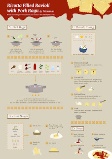
Final Instructable Infographic Poster
 |
| Fig 4.1 Final Infographic Poster (12/2/2022) |
Feedback
Week 4
The sketch is self-explanatory which is good as it's understandable. But
adding additional descriptions in the adding filling to the pasta dough
process would make it much clearer. Also, think of a way to indicate that the
next step of making the pasta dough is followed by the filling up
process.
Week 6
The poster has a nice flow and separation but the sauce seems very red. The space between the the left and right section is a bit too much, increase the margin and rearrange the elements so everything is centralized. Also make the final illustration of the dish bigger, it can move out from the margin as it balances with the upper corner of the poster.
Reflection
Experience
This project was interesting to do as it was my first time creating a recipe infographic and the contents must be taken from a video too. Through doing this project, I did get to learn more about the chunking process and how to utilize it practically in creating a poster outcome. There was no doubt a challenge in figuring out how to include an 8-minute worth of information into one single poster but I’m glad that I was able to come up with a way to do it.
Observation
I observed that a well-planned out margin is able to help in creating a poster with a good flow of information and it is able to create sufficient white space to a point that borders won’t necessarily be needed. I find this useful when there’s a lot of elements in a canvas and adding boarders would make things too packed.
Findings
I found that describing information with visuals (pictures, illustrations, icons etc.) is very useful in shortening the original source of information as well as making the details easier to remember for the readers. While there are a lot of kinds of infographic out there, I personally find that when it comes to information that has a lot of steps, simple step-by-step illustrations paired up with additional details is the most effective way in getting the idea across to the readers and they would also be able to understand what the poster is talking about at the first glance.
Comments
Post a Comment