4.1.2022 - 21.1.2022 (Week 1 - Week 3)
Chung Yi Ki / 0345014 / BDCM
Information
Design
Exercises
Lecture
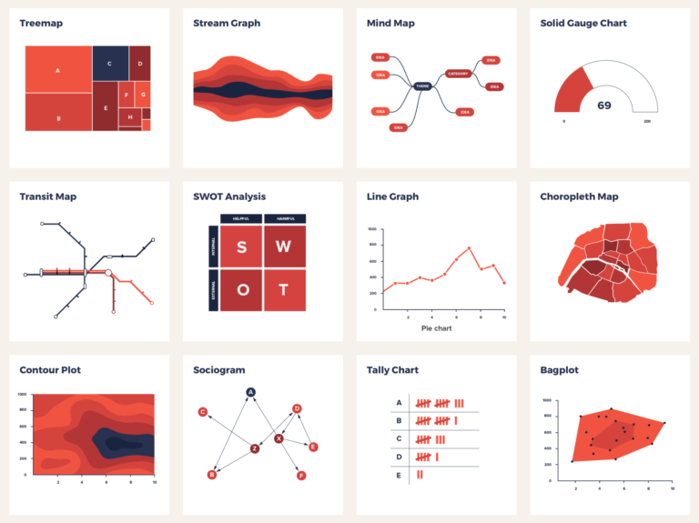
Week 1 / Introduction to information visualization

|
|
Fig 1.1 Statistics on how different kinds of information are
absorbed Source: https://www.segalbenz.com/blog/visual-communications-grab-attention |
Presently, we live in a visual information culture where information are
presented visually everywhere. (e.g: billboards, video advertisement etc.)
This is because people tend to remember and process visuals quicker than
text.
The goal of visualizing information is to deliver a complicated information
in a simple and quick-to-understand way. Information design is to display
data through spatial, quantitative, and chronological solution.
To kickstart the ideation process when making an infographic, making
mind-maps is a good way to segregate data and help to form an idea on how to
visualize it.
|
|
Fig 1.2 Examples of data visualization methods Source: https://datavizproject.com/ |
When creating data visualization, think about how to use charts or all the
data visualization method to deliver the data in a simple manner.
Fig 1.3 Video analysis on Charles Minard's 1869 infographic
An example of an effective infographic that breaks down complicated data into
easy-to-understand visualization is Charles Minard's 1869 chart about
Napoleon's army journey to Moscow. The brown colour section in the infographic
shows the route the army is taking to Moscow, while the black colour section
signifies their return route. The width of these two section represents the
number of men left in the journey. Map lines can be seen connecting to these
two section to visualize location and the temperature chart below shows the
change of temperature in each location during their return trip.
Instructions
Exercises
Exercise 1: Quantify and Visualize Data
Idea development
Choice of data and breakdown

|
| Fig 1.1 Randomly chosen Lego pieces (5/1/2022) |
For the object I chose to use for my exercise 1, I decided to go with Lego
bricks. I asked my cousin to help me randomly choose a few bricks from a box
of Lego as a kickstart for me for this exercise.

|
| Fig 1.2 Bricks sorted through type and studs (5/1/2022) |

|
| Fig 1.3 Information sorting written down on paper (5/1/2022) |
I then started to sort out the bricks by categorizing them by their number of
studs and the type according to the studs. I also written and drew out the
information on a piece of paper so it'll be easier for me to think of the
layout later on.
Layout organization

|
| Fig 1.4 Layout of information gathered (5/1/2022) |
After that, I arranged the Lego bricks with a statistical layout in mind. I
tried to make the layout more visually appealing by adding colour dots to
represent "studs" as decorations.

|
| Fig 1.5 Final layout of information gathered (6/1/2022) |
After receiving feedbacks from Ms. Anis, I went on to label each miscellaneous
blocks in the infographic and took a clearer picture for my final
submission.
Final Quantify and Visualized Data

|
| Fig 2.1 Final visualized quantified objects (6/1/2022) |
Exercise 2: L.A.T.C.H
Idea development
Data research and sketches
 |
| Fig 3.1 Data tabling and poster sketches (15/1/2022) |
I chose to use Pokemon data to create an infographic. While I was
researching on which information in Pokemon to include and how to arrange
them, I found out that in the Pokemon Sword and Shield game, the in-game
weather affects the kind of Pokemon that will appear. Since we need to
include at least 4 L.A.T.C.H principles in our infographic, I decided to
focus on using information from the Pokemon Sword and Shield game in which I
retrieved from these websites:
-
Main reference:
https://www.ign.com/wikis/pokemon-sword-shield/Lake_of_Outrage#Tall_Grass -
Reference on Espeon's location and Galvantula's location:
https://bulbapedia.bulbagarden.net/wiki/Lake_of_Outrage
https://bulbapedia.bulbagarden.net/wiki/Lake_of_Outrage/Den
|
|
Fig 3.2 Lake of Outrage map reference #1 (15/1/2022) Source: https://game8.co/games/pokemon-sword-shield/archives/273713 |

|
|
Fig 3.3 Lake of Outrage map reference #2 (15/1/2022) Source: https://gamewith.net/pokemon-swordshield/article/show/13924 |
|
|
|
Fig 3.4 Lake of Outrage map reference #3 (15/1/2022) Source: https://bulbapedia.bulbagarden.net/wiki/Lake_of_Outrage/Dens |
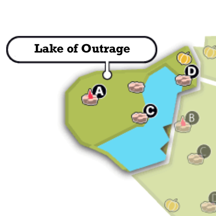
I also searched for some pictures on the map of Lake of Outrage so that I can sketch and digitize the map out based on it.
Digitization of sketch
As I was searching for Pokemon type symbol images to use in my infographic, I found Fig 3.6 which matches the style that I'm going for in my infographic. I also found an image of the game logo to include in my infographic. For the weather symbols, I referenced back to the ones used in the game while drawing it out in Adobe Illustrator. The sources for each of the Pokemon images will be listed at the bottom of the blog post.

|
| Fig 3.5 Landscape orientation tryout (19/1/2022) |
After that, I moved on to create the infographic digitally on Adobe
Illustrator. I first made the infographic in a landscape orientation and
then drew out the map based on the picture references I found, with Fig 3.2
being the main reference for the shape, and included the necessary elements
in the map. I colour coded each of the Pokemon's "bubble" according to their
type colour and placed weather symbol indicator beside them to show which
weather will they appear in. Then I used an arrow shape to create the rarity
chart.

|
|
Fig 3.6 Pokemon type symbols from Pokemon Sword and Shield
(19/1/2022) Source: https://www.reddit.com/r/pokemon/comments/o9u29a/oc_the_type_logos_introduced_in_swsh_are_my/ |

|
||
|
Fig 3.7 Weather symbols from Pokemon Sword and Shield (19/1/2022) Source: https://www.reddit.com/r/pokemon/comments/dxowsf/sword_and_shield_weather_cheatsheet/ |

As I was searching for Pokemon type symbol images to use in my infographic, I found Fig 3.6 which matches the style that I'm going for in my infographic. I also found an image of the game logo to include in my infographic. For the weather symbols, I referenced back to the ones used in the game while drawing it out in Adobe Illustrator. The sources for each of the Pokemon images will be listed at the bottom of the blog post.

|
| Fig 3.8 Portrait orientation tryout (19/1/2022) |
I then thought the landscape orientation doesn't work that well since it
feels quite empty so I tried out a portrait orientation version. All
the elements included are the same but just with the addition of the
labelling for the weather symbols. The rarity chart is also changed to a
different visual representation where I used a staircase line chart
concept.

|
| Fig 3.9 Rearranged elements and gradient addition (21/1/2022) |
After receiving feedback from Ms. Anis, I decided to further develop the
portrait orientation version for my final outcome. I rearranged the elements
to follow a margin of 2 pixels and changed the background of the rarity
chart to a gradient colour to further show the change from common to rare. I
also included a title to label the chart and rearranged the type symbols in
an alphabetical order for easy navigating. The background is also added a
subtle gradient colour so that it won't be too plain and act as a subtle
separator between the map and the rarity chart.
Final L.A.T.C.H Infographic

|
| Fig 4.0 Final L.A.T.C.H Pokemon Infographic (21/1/2022) |
Feedback
Week 1 - Exercise 1
The data organization is not bad, clear enough. Label the miscellaneous
bricks so that the reader will know why they are classified as such.
Week 3 - Exercise 2
The rarity visualization is nice, give it a title, maybe "rarity level" or
"rarity chart". And the background of the chart can be a gradient where
the colour changes from common to rare, gold could be used to indicate
rare. When arranging elements in a poster, remember to always follow a
margin, as now the spaces between the left and right side are imbalanced.
For this infographic, a 2 pixels size margin would be suitable.
Reflection
Experience
These exercises were interesting to do as it taught me the different ways
and methods to organize data and create an infographic. Creating an
infographic wasn’t something that I thought need technical knowledge on
but after doing these exercises, I realized that infographics aren’t just
about stating the facts and information out, but they also need
organization knowledge and creativity to create a poster that’s easily
understandable and appealing to look at. This can be shown especially
through Exercise 1 where we have first-hand experience in sorting out data
and using our creativity to make an interesting infographic out of
physical objects. The L.A.T.C.H method of data organization is very useful
to learn about too, and I’m glad that I was able to learn how to apply it
through making my Pokemon infographic in exercise 2.
Observations
I observed that by including visualizations for data such as icons or
stylized charts is not only able to let the audience remember the
information written in the infographic better, but they also serve as an
indicator on what the associating information will be talking about, much
like a cue card. This gives the audience a brief moment to prepare and
anticipate for the upcoming information.
Findings
I found that for ease of navigation and understandability throughout an
infographic, data should be organized with a specific order in mind where
possible (e.g: alphabetical order, a particular categorization etc.).
People tend to naturally follow an order so having data organized in this
way would increase the ease of readability of the infographic.
Pokemon images sources:
-
Beheeyem
https://sg.portal-pokemon.com/play/pokedex/606 -
Espeon
https://www.seekpng.com/ipng/u2q8o0w7u2u2t4a9_pokemon-espeon/ -
Quagsire
https://www.pngitem.com/middle/iwwoJm_quagsire-pokemon-hd-png-download/ -
Galvantula
https://www.ign.com/wikis/pokemon-sword-shield/Galvantula -
Pelippe
https://pokemon.fandom.com/wiki/Pelipper -
Abomasnow
https://sg.portal-pokemon.com/play/pokedex/460 -
Kinklang
https://www.nicepng.com/ourpic/u2e6w7u2r5r5r5q8_do-you-like-seel-and-dewgong-pokemon-klinklang/ -
Rhydon
https://www.vhv.rs/viewpic/bxRbRm_base-attack-130-whos-that-pokemon-rhydon-hd/ -
Milotic
https://www.pngitem.com/middle/ixwhRRT_pokemon-milotic-png-transparent-png/
Comments
Post a Comment