20.9.2021 - 18.10.2021 (Week 5 - Week 9)
Chung Yi Ki / 0345014 / BDCM
Digital
Photography and Imaging
Project 2
Quick links
Lecture
Week 5 / Poster Design Development
We were briefed about our second project which is about creating a PSA poster
one week early from the scheduled date. In this lecture, we are introduced to
the subject of conceptual poster design, specifically posters designed using
photography and text.
Posters are a medium to convey a message to a target audience, whether it be a
brand advertisement or an awareness message. A PSA poster is specifically
designed to raise awareness on a certain social issue to the general public.
More often than not, creative posters are the most effective way to
communicate the intended message as they're straightforward and visually
striking.
There are 4 key features that make up a creative poster:
1) Title
The title should complement the visuals in the poster, as it is essentially
the caption of the graphic elements. It should not exceed two lines of
text.
2) Graphic
Same as title, the graphic should also complement the texts in the poster. It
should be exported in a high resolution (300 dpi or higher).
3) Text
The text should describe the intended message of the poster clearly. There are
no limits to how long the text should be but it should not be too
overloaded.
4) White space
White space provides the poster some room to "breathe". A sufficient use of it
can avoid audience being overwhelmed with the information presented in the
poster.
In addition to the above, layout, flow and colour are also important
consideration in making a poster as it'll affect the order and style of the
poster. A graphic-centered layout is suggested for a PSA poster. A good visual
hierarchy will create a smooth flow of elements where the audience's eyes can
be directed through the poster. Finally, colours can be used to create focal
points and divide sections within a poster.
Week 6 / Poster Design Execution
When making a PSA poster, once we narrowed down on the topic we want to work
on, we can start the design process by first researching about our topic,
defining our poster concept and finally developing our design project.
1. Research about our topic
-
Reflect on the topic through our own experience as well as others'
- Study and gather information about the topic and write a summary
- Highlight the key points of the summary
- Define the title, slogan, details and call for action
2. Define our concept
-
Create a section for each contents in the poster (title, slogan,
details, call for action)
- Sketch a mock up poster
-
Decide on an idea and approach. Think about how emotions are evoked and
how a strong impression can be created:
- Creating a brutal shock
value
- Provocative by making the graphic upsetting
-
Sensitive by being heart warming
- Artistic by being subtle in the
delivery of the message
A PSA poster does not sugar coat the issue it discusses. Though most
mental health posters take a gentle approach ad the target audience are
already vulnerable. A gentle approach would be empathetical.
Week 7 / Colour Theory
Colour theory explains how humans interpret colours and how they are
used to communicate a message.
RGB vs CMYK
RGB (Red, Green, Blue) colour system is used for computer
screen display. It is an additive color mixing model where colours are
created by mixing red, green and blue light of different intensities
CMYK (Cyan, Magenta, Yellow, Key) is a colour system used for printing.
It is a subtractive colour model where colours are created by the
subtraction of light.
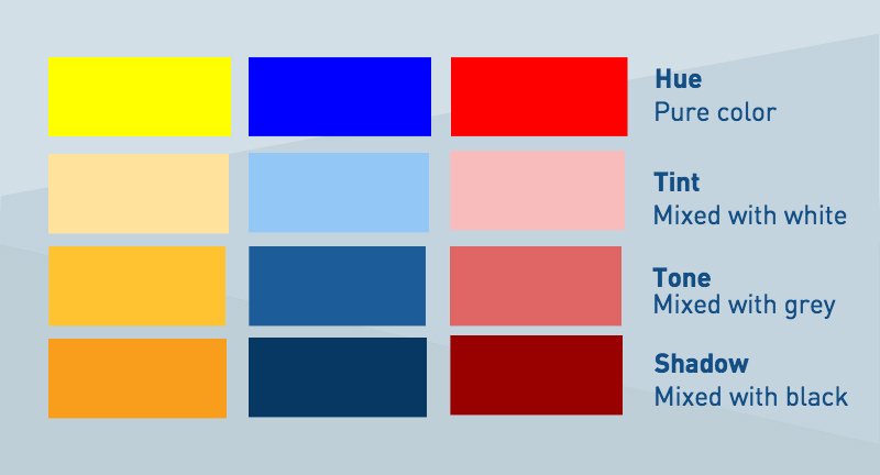
Hue, shade, tint and tone
- Hue: meaning an object's color
- Shade: a hue when black is added
- Tint: a hue when white is added
- Tone: a hue when grey is added
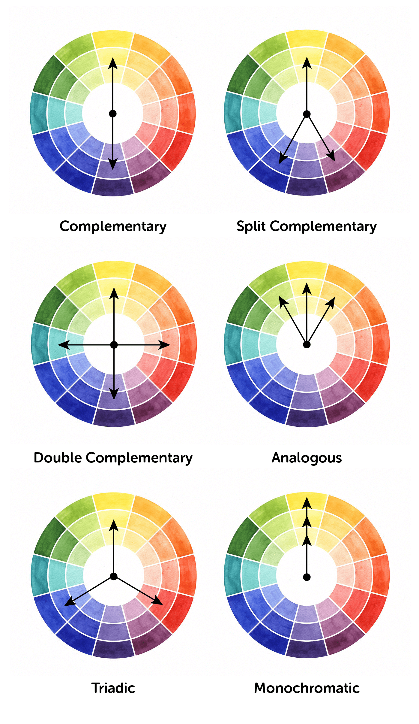
Colour harmony
Colour harmony explains the most attractive and effective way to
arrange colours in a design.
Notes on some colour scheme:
Monochromatic colour scheme
Hard to make a mistake and hard to create a distasteful colour
scheme
Complementary colour scheme
Aims to produce high contrast. It can make imageries pop but will be
tiring if it's overused
Triadic colour scheme
Tend to be very bright and dynamic
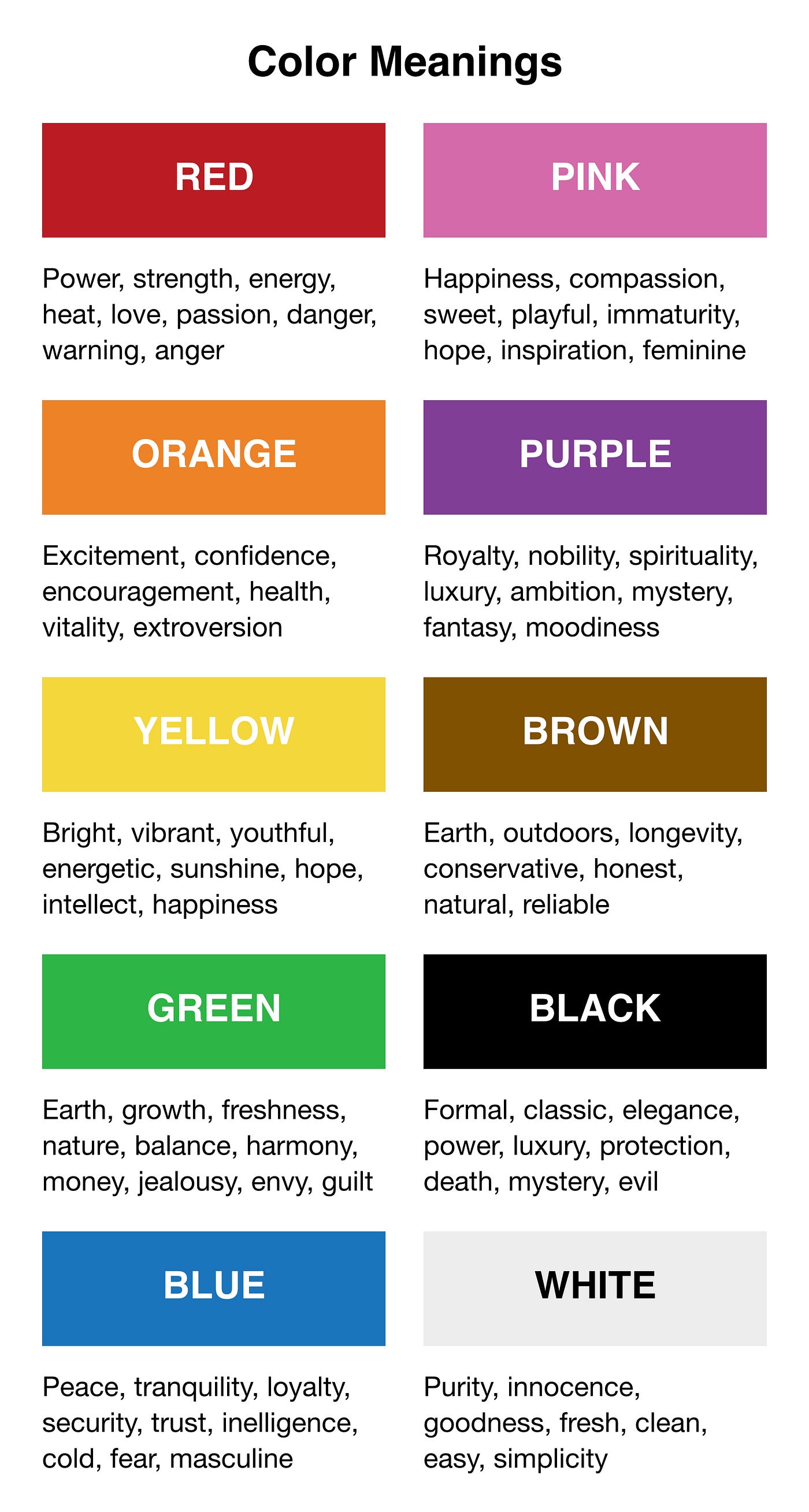
The psychology of colour
Colour can provoke specific emotions, attract people's attention and
create harmony at the same time. While how colours are perceived are
subjective, but some meanings are universal.
Warm vs Cool
Warm colours
Evoke happineess, optimism and energy. But red, yellow and orange can
have an effect to grab attention which could cause to mean signaling
danger.
Cool colours
Usually used to give a calming and soothing effect but can also
express sadness. Purple is often used as a means to spark creativity
because it's a mix of blue (calm) and red (intense).
Black
Often used sparingly but it actually works well as a primary colour
element in a design composition. It adds an air of sophistication,
elegance, mystery and confidence.
White
White pairs well with almost any colour, so it's a good choice as a
secondary colour. But as a primary colour, it gives off a sense of
purity, cleanliness and healthiness.
Tasks
Project 2A
Week 5 (20/9/2021): Digital imaging
Digital imaging - My reflection
Following the
tutorial and practical activity
that was given to us in week 5, we are tasked to use the same method we learnt
from that tutorial and digitally insert ourselves in a given image of Hearst
Mansion. We are required to take a full body photo of ourselves with a right
sided lighting so it'll match with the environment in the Hearst Mansion
picture.

|
|
Fig 1.1 Given picture of Heart Mansion
|

|
|
Fig 1.2 Picture taken of myself
|
Fig 1.3 Process of digital imaging
Final digital imaging outcome

|
|
Fig 1.4 Final digital imaging outcome - JPG |
Fig 1.5 Final digital imaging outcome - PDF
(Yes, that's a mosquito catcher. Thought it'll be funny getting to go to a
mansion with a big pool just to catch mosquitoes. Even mansion needs some pest
control.)
Week 7 (4/10/2021): Digital imaging
Digital imaging - Recolouring black and white
Following the
practical activity
done in week 7, we are tasked to recolour a black and white picture using the
technique we learned from the activity. We are given the choice to choose 1
picture from a set of black and white pictures. We also need to find reference
image to use in the process of recolouring.

|
|
Fig 2.1 Chosen black and white picture from the set of given pictures
|
Fig 2.4 Process of recolouring
Final recolouring black and white outcome

|
|
Fig 2.5 Final recolouring black and white outcome - JPG |
Fig 2.6 Final recolouring black and white outcome - PDF
Project 2B
Week 5 (20/9/2021): PSA poster topic research
PSA poster topic research
As a kickstart for our project, ,we are tasked to do some research and
thoughts on our PSA poster topic, "Young adult/student's mental heath affected
by COVID19". We also need to search for some posters designed with photography
and text and compile them with brief explanations on why we like them.
Personal view on the topic
"How are you, as an individual affected by COVID19? Physically and mentally?
Are they related?"
As an individual, physically speaking I tend to be more sedentary and do
lesser physical activities during the pandemic. I don’t have to walk to
class or go to the supermarket so it has made me to just sit at home for
almost all day. Ironically, even though I know I’m lacking exercise and I
can feel myself getting physically weak, I don’t have the motivation to
actually do them either. As for mentally speaking, to be honest I’m quite
fine being by myself as I’m not much of a social butterfly but without all
those daily physical social interactions, it has made me loose some
confidence in my socialization skills. And it does get a bit tired and
lonely at times without seeing friends for months. In the end, I guess both
aspects are somewhat related as keeping myself in a pessimistic thought
would lower my motivation to do anything else that I deem unimportant for
the time being.
Article research
Summary of article:
The COVID-19 pandemic has caused college student to be unable to participate
in their usual social gatherings, which caused an increase in mental health
issues such as depression, anxiety and loneliness in the age group,
specifically those who are 18-24 years old. While some did physical
exercises to combat their negative thoughts and improve their mood, others
have suffered in their increase feeling of loneliness by being sedentary,
stress eating or having no appetite at all. They also reported to have
strained relationships with their families or friends due to the pandemic,
and this in turns became a contributing factor to their declining mental
health.
Summary of article:
College students have reported to experience increased stress and anxiety
due to the COVID-19 pandemic. One of the major worries are health concerns
about oneself and also towards families and friends. Though lockdown
measures were imposed to help control the spread of the virus, it has in
turns caused a limit in any kind of physical social interactions. This has
resulted in relationship changes between family and friends. While some
students reported on having less academic stress due to schools being more
lenient, a majority of them reported to experience depressive and suicidal
thoughts. To be more specific, some of the problems mentioned are
concentration difficulty and sleeping habits change. Unfortunately, they
have also stated about hesitancy in seeking help for their mental health
because of lack of trust in counsellors and the stigma surrounding mental
health problems.
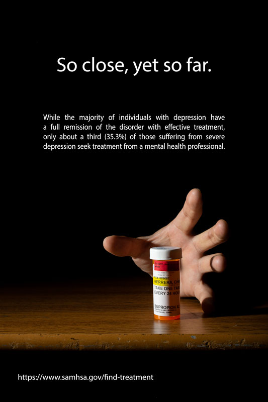
Visual research on poster designed with photography and text
The concept for this poster is brilliantly and creatively shown. It
portrays a small boy building a Lego fireman inside the structure, which
conveys that he is building his ambition to become a fireman. The lighting
is aesthetically pleasing too, going from a warm tone from the left to match
with the orange Lego bricks and gradually transition to a cool tone to the
right. The lighting also captures the texture of the bricks clearly
too.
This poster might be simple but it delivers its message in a smart way. It’s
3 different pictures stacked on top of each other with the first one being
what seems like a cracked egg shell, the second one showing a gorilla and
the third one are human hands. These pictures are arranged to show forehead,
face and body respectively and it brings out the message of evolution, which
is suitable for a poster about the natural history museum. The rigid
composition also sets a serious and old-fashioned tone to the poster.
I like the dynamic composition this poster has implemented. Everything is
slanted and rotated but each elements work well enough that the poster stays
balanced. The dynamism also communicates the vigorous life of a paparazzo.
The blue, red and yellow pictures can symbolize the light rays from the
camera flash and they show perspective as well.
I really like the use of gestalt theory through photography in this poster.
There’s a strong sense of contrast between the background and the
foreground. It’s an eye-catching travel advertisement and what’s fun about
this poster is that it can be seen in either an upright or downright
position, showing the street of Paris and the Eiffel Tower respectively.
A simple concept but the execution is done really well. It shows a
self-portrait painting by Vincent Van Gogh in the background but the picture
changes to a real life photograph of a person in the lens of the glasses. Much
like letting you know with this glasses you can see anything in UHD graphic.
The message of the advertisement poster is delivered very directly and so,
people can understand what is being advertised in just a second.
Visual research on PSA posters
I always find posters using shadows to depict a different scenario
interesting to look at. In this poster, the first thing you noticed is
obviously the boy playing with the doll, but with a closer look the “shadow”
of the subjects shows a man who is about to beat up a woman, who can be
considered as the boy's parents. This graphic conveys the caption nicely and
the backdrop being a plan white colour pulls attention to both of the
subjects immediately.
The dark tone and terrified expression of the boy creates an impactful
delivery of this poster about second-hand smoking. Making the smoke to look
like a plastic bag covering the boy’s head is a clever representation of
suffocating in a smoker’s smoke. The vignette effect helps viewers to
instantly look at the focal point of the poster.
This cover features a strong photograph of a plastic bag submerged in water,
with the top part looking like the tip of an iceberg. The usage of the
plastic bag to substitute the iceberg creates an impactful message to the
audience. It is also a straightforward representation of the sentence “tip
of the iceberg” in the caption, which creates an instant and strong relation
of the picture to the captions. The photograph also complements the title
“Planet or plastic?”.
A simple cut and stitch editing but the delivery of the message is well
executed. It shows all the alternatives of each weapon of warfare leaving no
room for doubts from the audience. The photos in the right side completing the
form of the weapons in the left side creates a seamless transition and further
convincing the audience.
The balloon rhinoceros might suggest a light-hearted visual at first but
the hand on top holding a needle directing at the balloon serves as a sudden
plot-twist in the poster. The message if delivered creatively and the large
heading further emphasize it. The typeface choice for the headings is also
suitable and adds to the poster as it is commonly used in graphics relating to
forests.
Week 7 (4/10/2021) - PSA poster planning and digital drafts
In this week, we started our process in forming an idea for our
PSA poster and plan to execute it. We are given a template to work on as a start for our PSA poster. Our poster needs to be A4 size in portrait orientation. The maximum size for out final PSA poster file is 2MB.
We started out by filling in our mood board until our digital
poster draft from week 7 to week 8. Since the theme is "stay positive during
this pandemic", I wanted my poster to have a light of hope rather than the
usual dark and gloomy mental health PSA poster. So, before I finalize my mood
board, I filled in my research summary based on the articles I've read in week
5.
Research template
Summary about my topic with key points highlighted in bold
INTRO | College students have been experiencing stress, anxiety, depression and loneliness during the COVID-19 pandemic. |
PARAGRAPH 1 | Lack of social interactions has cause college students to have a strained relationship with their friends and families. Worries of their loved ones or themselves contracting the virus adds to their anxiety too. Even though colleges and universities are now more lenient towards the workload of students during the pandemic, but students still find themselves having difficulty in concentrating during online classes and often staying up late, causing a change in sleeping habits. |
PARAGRAPH 2 | Some college students turns toward exercising to relieve their stress, but some give in to it by being sedentary or stress eating. This has made them to lose motivation in doing certain things and in turns, causing their mental health to be worse. Some of them are hesitant to seek help from others because of their lack of trust towards counsellors or friends as well as the problem of mental health stigma surrounding this topic. |
SUMMARY | College students are facing mental health problems due to lack of physical social interactions between their friends and families during the pandemic but are hesitant to seek help. |
Details to be included in the PSA poster based on the key points taken from the summary
Mood board
After I understood the direction I want to go with, I searched for posters
that relates to the idea I have in mind: either a brighter background using objects
as subjects or a darker background using people.
Then, I proceeded to sketch
out my ideas and draft them digitally in Photoshop using a mix of stock images
and my own self-taken images.
Sketches
 |
| Fig 6.1 Sketch and font planning for the details in the PSA poster |
 |
| Fig 6.2 Idea sketches for the PSA poster |
Both sketches in Fig 6.2 shows the message of helping someone who is suffering through mental health problems but done in a different way. Either objects or human subjects will be used for sketch #1 and the background will be a white background. Sketch #1 shows a person sitting alone under a mask (to relate to the COVID-19 pandemic) with dark cloud above him while another person is sitting just right outside letting the person under the mask know that he's there for him if he's ready to find help.
In sketch #2, a dark background will be used and other than the tangled lines, the person and the hand will be human subjects. The depiction of the message in sketch #2 is rather straightforward with the tangled lines representing the thoughts of the person-in-need and the hand represents another person helping him to "untangle his troubles".
Digital drafts
Digital drafts for sketch #1
 |
| Fig 7.1 Progress #1 |
 |
| Fig 7.2 Progress #2 |
For the digital drafts of sketch #1, I tried out using both human subjects and Lego figurines to see which might work better. To me, I think that Fig 7.2 would work better for this idea as the proportion is believable and using Lego figurines in a way, makes the poster more interesting to look at than using human subjects.
Digital drafts for sketch #2
 |
| Fig 7.3 Progress #3 |
 |
| Fig 7.4 Progress #4 |
For the digital drafts of sketch #2, the images used stay the same. Only the words alignments are different as I wanted to test out which would work better. Though the centre alignment of the bottom details in Fig 7.4 seems nicer, the title alignment in Fig 7.3 works better than in Fig 7.4.
Sources for the photos used in the digital drafts

|
|
Fig 7.5 Stock photos used in the digital drafts
|
Stock photos source

|
|
Fig 7.6 Self-taken photo (Progress #1)
|

|
|
Fig 7.7 Self-taken photo (Progress #3 and #4)
|

|
|
Fig 7.8 Self-taken photo (Progress #2)
|
Week 8 (11/10/2021) - Further development of progress #3
After receiving feedback from Mr. Martin in week 8, I decided to choose
progress #3 to further develop as my final poster design. Since the rope stock
image I used isn't free, I went to take my own photograph of messy string. I
also took another picture of my hand to suit the thinness of the string.

|
|
Fig 7.9 Self-taken photo of hand for further development of poster
|

|
|
Fig 7.10 Self-taken of messy string for further development of poster
|

|
|
Fig 7.11 Development of progress #3
|
Week 9 (18/10/2021) - Final changes on final PSA poster design
In week 9, Mr. Martin suggested that I also use my own self-taken photo to
replace the stock image of a boy in the poster. So, I went to take some
pictures of myself in a similar pose and lighting as the stock image, and then
choose the most suitable photograph result to use in my poster.

|
|
Fig 7.12 Self-taken photo of myself for final poster development
|
I wore a mostly white colour beanie so that it will contrast with the black
background in my poster.
Fig 6.3 Process of final development of PSA poster design
Final outcome

|
|
Fig 8.1 Final PSA poster design -JPG |
Fig 8.2 Final PSA poster design - PDF
Description:
The message of the poster is to tell people who is suffering with mental health problems to find the help that they need and should not be hesitant to do so. They don’t have to suffer alone even during this pandemic and it’s ok to ask for help. The messy string symbolizes the person’s thoughts (frustration, anxiousness, depressive etc.). The hand taking hold of one end of the string to untangle it symbolize another person helping the one who is sitting on the floor to get through this dark time.
Feedback
Week 6 (27/9/2021) - Digital imaging (My reflection)
The lighting matches the photo of Hearst Mansion and it's a good choice
to add noise to the picture of myself too as it makes it not that sharp,
which fits the background photo. The final edited outcome is ready for
submission.
Week 8 (14/8/2021) - PSA poster design
Posters are nice, definitely go for progress #3.
Week 9 (18/8/2021) - PSA poster design
Good improvement. The composition is good and the elements fit well
together. The messy string is better than the rope too. Try and replace
the stock photo of the boy with my own self-taken photo.
Reflection
This project was very fun to work on for me. I always like to play
around with Photoshop but this was my first time using my own picture,
or picture of a different source to merge with a background. So, it was
really enjoyable to learn how to blend two (or more) different
photographs together so it looks like it’s one picture. For the
recolouring task, I did a similar exercise before but not as effective
as this. It was fun to get to learn an effective technique to recolour a
black and white picture while keeping the colour realistic. As for the
PSA poster, it was also my first time using my own picture to create a
photographic poster and I’m glad the final result turned out well,
especially with the messy string. Taking my own pictures took some time
but sometimes, it definitely is quicker when I can’t find the right
photo I want from the Internet. I get to try out creating my own
artificial lighting using ring light and the lamps in my house when I’m
taking my pictures too since the backgrounds I used are “studio
photoshoot” kind of backgrounds.
Overall, it was really interesting to get to know more about the
functions in Photoshop and how to use them to create a photographic
poster and carry out digital imaging tasks. I also got to learn about
compositional and visual communication skills through looking at other
PSA posters too.


Comments
Post a Comment