25.5.2023 - 8.6.2023 (Week 8 - Week 10)
Chung Yi Ki / 0345014 / BDCM
Motion
Graphics and Compositing
Task 3: Channel Identity
Lecture
Week 9 / Storyboard to motion design
When making storyboard, it's basically making the style frames and that can be an animatic, and in the animatic, it's vectorizing the storyboard and add some simple effect to get the idea right.
 |
| Fig 1.1 Style frames example Source: https://images.app.goo.gl/q74t3XXw5YtBEZiY6 |
Style frames are visuals that are done to show the finished look of a video, so that everyone involved will know clearly what is the design direction the video is going for.
Week 10 / Motion tracking
Adding objects onto the walls in a video
- Add a track plane in after effects to track the object.
- Then create solid from camera to create points on the position of the item on the wall.
- Then double click on the solid and make a composition from it to put the video or image file you want to put.
- Delete the solid and replace the solid with the new composition.
Tasks
This task is a continuation of our Task 2. We are required to expand the idea
from Task 2 and develop a promotional motion graphics advertisement for the
brand we chose.
Idea development

|
| Fig 2.1 Rough thumbnail storyboards from initial idea of Task 2 |
Fig 2.2 Animatic from initial idea of Task 2

|
| Fig 2.3 Rough sketches of extra scenes |
Links of motion graphic transitions references:
-
Defenders of Wildlife “Wolf Awareness Week”
https://vimeo.com/641592115 -
4 Types of Transition in Motion Graphics
https://medium.muz.li/4-types-of-transition-in-motion-graphics-3ec29ffa3e19
Then, based on my visual reference, I thought of making the transitions more
narrative where an element existing in one scene will act as a lead to another
scene. So, I drew some rough sketches for the extra scenes of that idea, where
it will start with a watchmaker ready to fix a watch and then end with a
person looking at his watch and rushing away.
Creating the assets
Fig 2.4 Assets to be used in After Effects
I created the vector assets needed using Adobe Illustrator, and then organized
and rename the layers to prepare for animation in After Effects. I choose to
mostly only use vectors since it is infinitely scalable and I can further edit
them by converting them into shape layers in After Effects if needed, so that
I can animate them using shape paths. For scene 5 where the watch covers drop
onto the digital watch, I 3D modelled the watch cover (without the glass) in
Blender since I find it easier to composite an animated 3D model into the
scene rather than animating the cover using shape path in After Effects. To
make it easier to composite the 3D model, I applied a material shading style
that gives it a more 2D effect, and also made sure the colours would match
that in the digital watch vector.
As for the extra assets, I thought I included a scene of a hand reaching to
grab a watch from the ground before scene 6 and a row of watches which will be
animated quickly in camera pan before scene 2 to give a better transition and
make the whole animation narrative more established.

|
| Fig 2.5 Creating smoke using shape layers in After Effects |

|
| Fig 2.6 Creating bigger smokes in a separate composition to animate as transition |

|
|
Fig 2.7 Creating a shape layer from the Adobe Illustrator cloth vector file to animate it using shape path more easily |

|
|
Fig 2.8 Creating the glass using shape layers and composited and keyframed it to be in time with the 3D cover |
Some assets were created in After Effects directly since the main objects in
the scene would need to be finalised in position and size in order to know
where the assets would land. For the glass layer in Fig 2.8, it's complete
white in colour and the opacity is adjusted to get a semi-transparent effect,
and the shape path is adjusted to be in size with the watch cover. For the
cloth in Fig 2.7, since I used stroke in the original cloth AI vector file,
After Effects read the stroke as a shape and created a lot of anchor points
for it. So, I created a shape layer from it instead and replaced the stroke
shape with a grey colour shape made using pen tool in After Effects so I can
animate it using shape path more easily.
Animation process
Fig 3.1 After Effects grain shading tutorial

|
| Fig 3.2 3D enabled layer of cog wheel, to allow for 3D space manipulation |

|
| Fig 3.3 Grain shading with a dark grey colour and softer setting |

|
| Fig 3.4 Grain shading with a black colour and harder edges |

|
| Fig 3.5 Keyframes of forceps with screw parented to forceps |

|
| Fig 3.6 Cog wheel vector asset |
Fig 3.7 Test animation on scene 2
I first started with animating for scene 2 to test out the animation and
style. As like in Task 2, I followed a tutorial (Fig 3.1) on how to create a
grainy shading in After Effects and used that method in scene 2. The grain
shading colour changes from shade of greys to pure black depending on the
lighting needs for that particular part. For the cog wheel, I created a flat
perfect circle of it in Adobe Illustrator and enabled 3D layer for its layer
in After Effects and adjusted the scale, position and rotation to match the
perspective of the mechanical watch body. The forceps are animated by
manipulating its position and rotation, the keyframes are eased to produce a
smoother motion. The screw is parented to the forceps and once it's on the
watch, a duplicated layer of the screw plays which is not parented to anything
so it stays still. I then used adjustment layers to give the scene a more
bluish and high contrast look, and this also applies to the other scenes as
well, but the colour changes depending on the scene.
Fig 3.8 Keyframes and effects of some composition
Fig 3.9 After Effects bubbles tutorial
Fig 3.10 Animation of the 3D watch cover exported from Blender
Fig 3.11 First draft of animation
A lot of the assets are animated as like the forceps, by manipulating
position, rotation and scale, and the keyframes are eased according to the
needed timing or not eased at all and stay as a normal keyframe for a quicker
action. Though, for scenes such as the perspective change of the watchmaker in
scene 1, shape path is used for the body and hand while the head is
manipulated with position and scale. A camera layer is also added to give that
wide angle effect on the objects by adjusting its orientation. For any shine
effects, a white colour shape layer with add blending mode is set matted to
the target layer and the opacity and position is adjusted. Gaussian blur is
added to the shine if a more soft shine is needed. Then, to composite the
watch cover with the watch body, the animation from Blender is exported as a
PNG sequence as I needed the transparent background. The image sequence is
then imported directly to After Effects as footage and masking is used to
remove any unwanted parts so the cover would look like it's coming from behind
the watch body.
I also went to search for an After Effects bubble tutorial to create bubbles
for an extra scene that I thought of that would play after the watch cover
scene. They're to represent an underwater scene which is meant to visualize
the watch's waterproof capability.
Further development of animation

|
| Fig 4.1 Completing adding shading and shadows, with random seed loop |

|
| Fig 4.2 Using CC spotlight effect to create a spotlight lighting |
After receiving feedback from Mr. Fauzi, I then continued to finalize and refine everything for the final composite. I continued to finish adding the grain shading and shadows to where needed and rework some a bit to make them look nicer. I also applied a looping expression for the random seed of the roughen edges effect (the effect used to create the grainy shading) by following the tutorial in Fig 3.1 to make the texture change for every designated number of frames. I used time*8 for every moving objects and time*10 for every shadows. The higher the number, the quicker the texture changes. I also used CC spotlight effect for scenes that suits a spotlight lighting, so I don't need to create and matte a lighting effect manually.

|
| Fig 4.3 Using set matte to mask the words to the smoke |

|
| Fig 4.4 Using wave warp to create different wavy motion on the words |

|
| Fig 4.5 Overlay blending mode on sudden big size words so it doesn't stand out too much |
After getting the visual side done, I then proceed with the text animation. I
used masking, position, scale and the text animation presets in the effects
panel for the text. In some scenes, big letters would fill up the screen for a
short while to give it a bit of tech style vibe. I also used wave warp effect
to give a water wave motion to words or a noise filled shocking wave
motion.

|
|
Fig 4.6 Grunge texture image Source: https://benmarriott.gumroad.com/l/DOFSr |

|
| Fig 4.7 Creating variation of the texture from different rotation of the image |

|
| Fig 4.8 Curve settings for the texture composition |
Other than that, I also added a new scene where it shows a clock hand dropping
after one tick in the intro as shown in Fig 4.8, so that it would tie to the
ending message "we keep your time" better. For the texture of the video, I
followed a
YouTube tutorial on how to add a coarse grain/grunge texture in After Effects. I
downloaded the texture image from the link in the video description, and
created a new composition to create different versions of the texture for it
to loop over later. Then in the main composition, I added a loopOut expression
in the time remap settings of the texture composition so the entire texture
playback will loop, as well as adjusting the curves of the texture images to
get a clearer highlight of the grains. The texture composition opacity is also
keyframed to give some flashing effect at certain emphasis part of the
video.
Editing the motion graphics animation

|
| Fig 5.1 Adobe Premiere Pro workspace |
After finishing up in After Effects, I exported the video using Adobe Media Encoder and brought it into Adobe Premiere Pro to edit it with music and sound. I also did a bit of colour correcting by brightening up the video a bit and added a noise effect to add subtle grains throughout the video. The video, music and sound effects clip are edited to match each other in terms of music beat and speed. One part of the video is sped up to match the beat of the music and the music is cut short by taking parts that suits the visual of the video. A ticking clock sound effect is slowed down to give a feeling of a broken clock.
Music and sound effects sources
-
Energetic Upbeat Lo-Fi Hip Hop background | Hot Pepper by
Alex-Productions
https://freemusicarchive.org/music/alex-productions/music-for-commercials-v1/energetic-upbeat-lo-fi-hip-hop-background-hot-pepper/ -
Ticking Clock, A.wav by InspectorJ
https://freesound.org/people/InspectorJ/sounds/343130/
-
Automatic Wrist Watch Ticking by bySeb
https://freesound.org/people/bySeb/sounds/326478/ -
Multiple Organ Scratches.wav by LiftPizzas
https://freesound.org/people/LiftPizzas/sounds/610670/
-
Glitching, Vinyl Record Player, A.wav by InspectorJ
https://freesound.org/people/InspectorJ/sounds/427848/
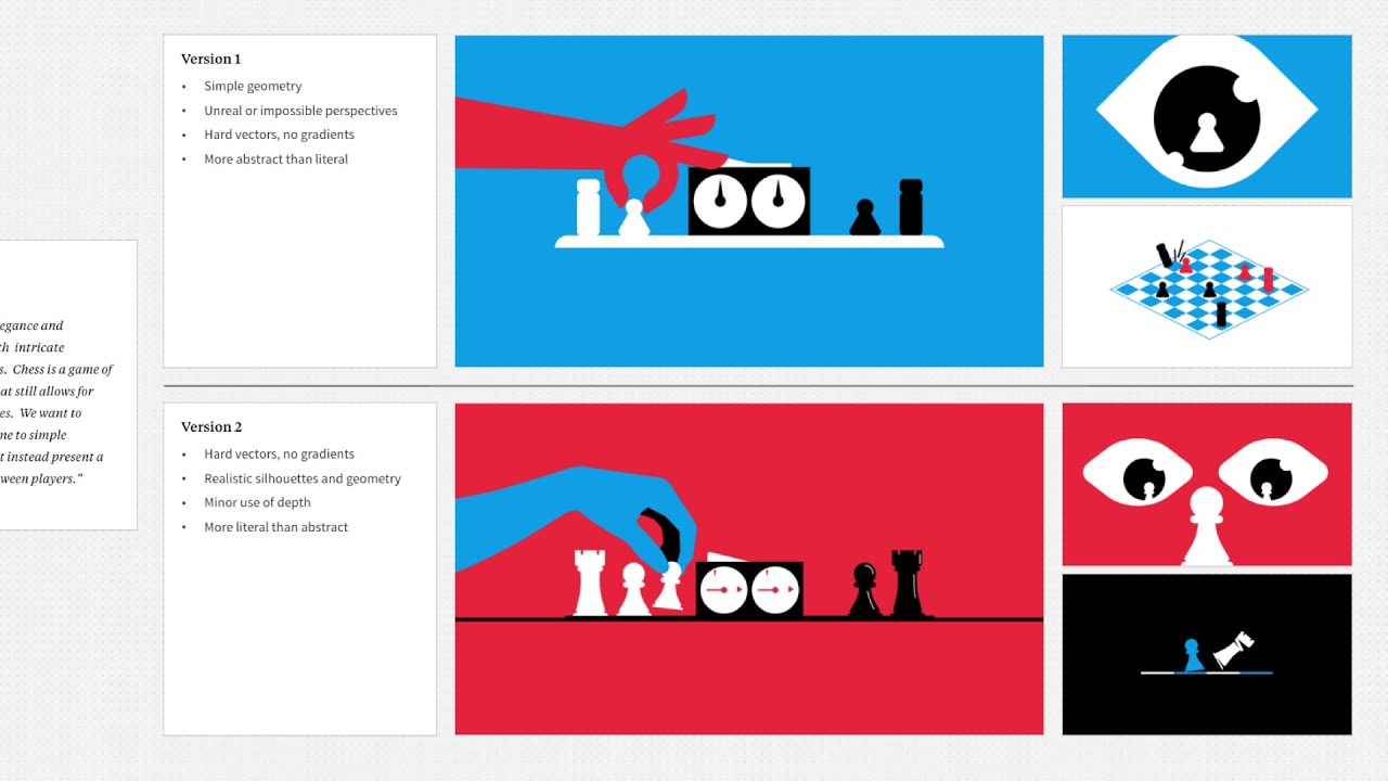
Fig 6.1 Frist attempt of Channel Identity
Further refinement on the motion graphics animation
 |
| Fig 7.2 Changing the typeface to Forza |
 |
| Fig 7.3 Keyframing the scale of the row of watches composition so that it would be bigger and fill up the negative space in the middle of the composition playthrough |
 |
| Fig 7.4 Adjusting the opacity of the Casio logo to not overlap with the time |
After receiving feedback from Mr. Fauzi, I went and made some adjustments on the motion graphics animation. I changed the typeface used in the video to Forza (downloaded from this website) since it looks similar to Casio but not as wide so it would be more suitable as body text. Then i adjusted the scale keyframes of the row of watches composition so that when it plays in the middle it would fill up more negative space. I also keyframed the position so that the last watch would be about the same position and appears in the same frame as the masterful craft watch. The opacity of the Casio logo in the outro is also adjusted to not overlap with the time text.
 |
| Fig 7.5 Swish pan transition |
To hide the motion blur when the quality assured scene is transitioning to the durable build scene, a swish pan transition from the Universe plugin by Red Giant is added so that a long motion blur would cover the whole frame, which acts like a splash screen. The video is then exported again for submission.
Final Channel Identity
Fig 8.1 Final Channel Identity
Feedbacks
Week 9
The composition for the 3d watch cover and the 2d illustration is good, like the reflection. The hand wiping the watch would need some motion blur to make it more realistic. Overall good progress. After getting each pre-comp done, the thing to focus now is how to transition between each scenes. Make the transition unpredictable so people would keep watching. Go on Pinterest and search for transitions inspiration and copy exactly the transition but change the content to yours.
Week 10
Add some effects in the background for all the other scenes, since the underwater scene has bubbles, so make the others consistent, give some texture, like maybe noise or grunge etc. Can take the works in this website as reference: https://www.impactist.com/.
Week 11
The documentation of the after effects workspace screenshot is good documentation because people can look at the keyframes and so on. In animation, the eye flow is important, how you make people's eye stay at one point to another point. And if you have a good composition, no matter at which second you pause, the composition is still nice. Timing is also important to avoid having two actions happening at once and people don't know where to focus on, your masterful craft scene have a good timing where people can choose to focus on the visual or the text, and by default people will focus on the text. Make the row of watches bigger to fill up the negative space, and end near to the next scene. In the quality frame, the ty is too long, but if you want to tease the viewer about the text, make the ty to QA so it relates to "quality assurance". The Casio outro, try to not overlap words on the logo. Make sure the font is similar to the font that they are using for their brand. Try a splash screen to cover up motion blur transitions like the quality assurance to durable build scene. Splash screen can be one second or half a second of full white background, so it's like a brief flash. The texture is nice.
Reflection
Although this project took me a lot of time to get done, mostly because of the style and idea I chose to do, but I still enjoyed the process and I'm glad to be able to get it done. One thing that helped me in the process of creating the idea for this project is already having an initial idea of it thought out in Task 2. Because of that, I have some assets ready and can focus on how to further develop it. The thing that frustrates me the most is probably the countless layers in my After Effects. Though, it is expected with the method I chose to shade my illustrations but it still slows down my progress a bit. The shading part sometimes is also a challenge since I had to have different shape layers just so I can layer them with the other asset layers, and there's a very visible rectangular border for some reason when the border value is too high up so I had to try and fix that by masking or change the shading area.
Thinking of transitions are also tricky, and the kinetic typography took some time as well because I had to think about how to arrange them with the visual and how to animate them. But working on this project really gave me a way to practice all of this and I'm glad it did because it helped me refresh and practice all the things I learnt in my past semester.
Comments
Post a Comment