6.4.2023 - 27.4.2023 (Week 1 - Week 4)
Chung Yi Ki / 0345014 / BDCM
Motion
Graphics and Compositing
Task 1: Technical and Motion Graphics
Sensibilities
Lecture
Week 1 / Introduction to module
For the first week, we are given an introduction to the module and overview as
well as expected outcomes for the tasks throughout the semester. We are
encourage to use 3D elements in our projects and utilise the campus's AR
facility if needed.
Week 2 / Introduction to motion graphics
Fig 1.1 Motion graphic for branding
Fig 1.2 Motion graphic in tv series title sequence
Motion graphics is a style of animation that focuses on graphic design,
especially on typography. It is a way to communicate to the viewers and add
text to a story. Together with nicely chosen music and an effective copy, it
can deliver a message.
Fig 1.3 Motion graphic for storytelling
Fig 1.4 Motion graphic for product marketing
Motion graphics are widely used for advertisements, title sequences for
films, shows and videos, and as an infographic video.
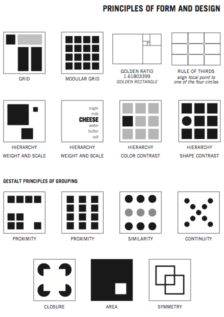
Week 4 / Compositing toolkit
Composition in art means the way how different visual elements in a space is
arranged according to the principles of art and design.

|
|
Fig 2.1 Design principles Source: Lecture slides |
Among the design principles, 6 of them were discussed in class which
are:
- Unity
- Balance
- Movement
- Rhythm
- Focus
- Contrast
Unity
To create unity in an artwork, all the elements in the composition needs to be
arranged in a way that creates a sense of harmony and wholeness, that is, in a
way that brings them all together. One way to do this is to use similar
elements within the composition.
Balance
To have balance in a composition, the visual weight on each side of the
composition must be the same, it shouldn't feel heavier on one side. A
symmetrical arrangement can achieve this, and it adds a sense of calmness. For
an unbalanced or asymmetrical arrangement though, it would give a more dynamic
feeling.
Movement
A composition where the element(s) feel like it's moving means the composition
has a sense of movement. This can be achieved by adjusting the arrangement and
position of the elements and adding "moving" elements such as a river flowing.
Rhythm
Similar to music, rhythm in a composition means the composition is able to
lead the viewer's eye through the artwork at a certain pace, or in other
words, at a certain rhythm.
Focus
Giving a focal point, or the most important thing for the viewer's eyes to
rest on in the composition give the composition focus.
Contrast
A composition that has a high contrast means the composition have a strong
difference between light and dark area or elements.
Tasks
Exercise 1: Mixed material collage
For our first exercise, we are tasked to create a collage using different
materials. We are encouraged to apply 3D objects into the collage and create a
sense of 3D space in it.
Visual reference

|
|
Fig 1.1 Reference #1 Source: https://www.pinterest.com/pin/813814595186028548/ |

|
|
Fig 1.2 Reference #2 Source: https://www.pinterest.com/pin/813814595186024793/ |

|
|
Fig 1.3 Reference #3 Source: https://www.pinterest.com/pin/813814595186028248/ |

|
|
Fig 1.4 Reference #4 Source: https://www.pinterest.com/pin/813814595186024784/ |

|
|
Fig 1.5 Reference #5 Source: https://www.pinterest.com/pin/813814595186007230/ |

|
|
Fig 1.6 Reference #6 Source: https://www.pinterest.com/pin/813814595186007227/ |
I looked through Pinterest to find some references and inspirations for my
collage. I referred to collages using mostly 2D elements, collages using a mix
of 2D and 3D elements in different amount and collages using predominantly 3D
elements. I wanted to see how they layered their elements to give it a sense
of 3D space even when 2D elements are mostly used, and how they composited
their collages to create a focal point.
First idea of collage layout

|
| Fig 2.1 Tryouts to get the first idea of the layout |

|
| Fig 2.2 Tweaking the first idea and trying out putting 3d objects onto the layout |
I first started with cutting out potential and interesting elements from different magazines that I have laying around my home. I then tried out different ways of compositing them as shown in Fig 2.1 to test which positions and patterns of the elements would give a good flow in the layout without making it too messy. I used Lego pieces on the quote cutout to give focus to it.
I thought the first idea of the layout is still lacking something so I tried
putting clothes clip onto the layout in Fig 2.2 as they kind of remind me of
airplanes because of their "A" shape. It obviously didn't work but the
clothes clip led me to another idea.
Second idea of collage layout

|
| Fig 3.1 Rough layout of second idea to test the concept |

|
| Fig 3.2 Putting the layout on A3 paper |

|
| Fig 3.3 Putting cotton and trying out different positions of the elements |
The clothes clip and the quote led me to think if the clips could act as a
sort of tail object on the bird. So, I tried it out together with different
elements, and with the concept that the bird, together with the car, is a new
level in aircraft. I added strips of patterned paper in front of the bird to
create a secondary focal point since the bunch of clips would take up the
first attention along with the quote. I also used black rope taken from a
paper bag and arranged them in a wavy shape to give some movement to the
layout.

|
| Fig 3.4 Further developed layout for second idea of collage |
Since I used cotton for clouds, I thought I could stick to the theme and use
blue fabric for the sky. I cutout the fabric from a piece of clothing and
sewed it to the A3 paper. I then tried filling up the bottom part of the
canvas with a bunch of cotton to give more sense of clouds in the sky, and
arranged them to be out of canvas to give a sense of 3D. I then trimmed the
patterned paper strip a bit to make them more balanced.

|
| Fig 3.5 Changing the car paper cutout to an actual toy car |
I still felt that the collage is lacking something to make it feel 3D. Then, I
tried out replacing the car cutout to an actual toy car I found around my
house and repositioned the cotton and added more around the base of the car to
make it look like it's on a cloud and match the whole composition. I then
trimmed out a few edges in the patterned paper slip and took pictures for
final submission.
Final mixed material collage

|
| Fig 4.1 Final mixed material collage |

|
| Fig 4.2 Final mixed material collage - Perspective view #1 |

|
| Fig 4.3 Final mixed material collage - Perspective view #2 |
Exercise 2: Digital collage and animation
For this exercise, we are tasked to create three A4 size digital collages with
the given design elements and choose the best one to animate in Adobe After
Effects.
Digital collage

|
|
Fig 5.1 Given design elements |

|
| Fig 5.2 Digital collage #1 |
For the first collage, I wanted to play a bit with perspective so I chose the old building picture and the train station picture as the main elements. I used the rubber leaf and mountain picture to add texture to the background. To get different colouration and overlaying effects, I tried different blending modes for the pictures. The colouration change from the mountain picture was done by using saturation blending mode to make the rusty texture picture black and white and overlaying it on top of a part of the mountain picture in hard light blending mode.

|
| Fig 5.3 Digital collage #2 |
For the second collage, I decided to try a silly idea I have which is a fencer
getting ready to battle on a vicious shark. I used the mountain, rubber leaf
and rusty texture picture to add some textures to the background, different
blending modes were also used to achieve this. The mountains also act as a
focal point to the fencer and drop shadow was also used on the fencer picture
too.

|
| Fig 5.4 Digital collage #3 |
For the third collage, I had the idea to combine the ideas used in the first
and second collage. I used the second collage idea of having a full textured
background and the first collage idea of perspective but now with scale. As
like the first two, blending modes were used to give different colouration and
overlay effects, though for the third collage I also used masking to create a
smoother transition of the elements coming out from the retro television. The
projectors are placed there to direct focus to the car and arranged in a
crowded way to feel like a group of paparazzi/journalist cameras.
Animating the digital collage

|
| Fig 6.1 After Effects work space |

|
| Fig 6.2 Layer keyframes - Part 1 |

|
| Fig 6.3 Layer keyframes - Part 2 |
For the animation, I planned to make the elements in front of the tv to jump out from it and the old projectors would be acting as cameras taking pictures of the car after it has jumped out. I increased the scale from 0 to 100 for the elements bouncing into the frame, and included a keyframe that has value over 100 in between the 0 to 100 keyframes to give the objects a bounce feeling. Since the video needs to last for 15 seconds, I made the tv to shake in the middle of the frame at the beginning of the video before it moves to the right right before the elements bounce out to give a sort of anticipation.
Fig 6.4 Sparkling star animation tutorial

|
| Fig 6.5 Sparkle/light flash keyframes |

|
| Fig 6.6 Shape layer and glow effect settings on sparkle/light flash |
I wanted to create a flashing light effect around the old projector pictures
to make it look like they're taking pictures of the car. So, I went on YouTube
to find a tutorial for a sparkling star animation and followed it while
tweaking some settings and adding a glow effect to make it look more like a
light flash. I later pre-compose all the shape layer and sped up the
pre-composition in Fig 6.3 by enabling time remapping so that it acts more
similarly to camera flashes. I also used some of the shape layers here around
the car to give it a sparkling effect but at a slower speed and with rotation
keyframes as shown in Fig 6.1.
Final animated digital collage
Fig 7.1 Final animated digital collage
Project 1: Technical and Motion Graphic Sensibilities
For this project, we are required to create 4 motion graphics of design
principles using simple shapes based on the already given template. Then, we
are required to use the motion graphics of design principles to create a 16
seconds composition. The given motion graphics are based on the design
principles: movement, hierarchy, balance, and direction. We are tasked to
create the motion graphics for the principles: symmetry, focus, scale, and
rhythm.
Visual reference
|
|
Fig 8.1 Reference #1 Source: http://teaching.ellenmueller.com/figure-drawing/resources/elements-principles-of-design/ |
|
|
Fig 8.2 Reference #2 Source: https://www.interaction-design.org/literature/article/symmetry-vs-asymmetry-recalling-basic-design-principles |

|
|
Fig 8.3 Reference #3 Source: https://www.pinterest.com/pin/34621490865252245/ |
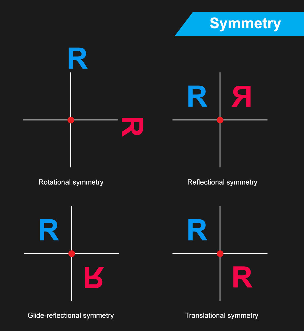
Before starting the project, I went to search on some info on design
principles, especially for symmetry and rhythm, to refresh my understanding of
it and to inspire some ideas. I understand that symmetry can be achieved by
either a reflectional symmetry where both sides are the mirror of each other,
or by a diagonal symmetry, or by a rotational symmetry. As for rhythm, it can
be achieved by have variety in the design and it acts in a way to guide the
viewer's eyes in a certain rhythmic fashion.
Part 1: Precomp
Design principles motion graphics
Fig 9.1 Focus - First attempt
Fig 9.2 Scale - First attempt
Fig 9.3 Rhythm - First attempt
Fig 9.4 Symmetry - First attempt

|
| Fig 9.5 After Effects timeline for scale, focus and rhythm |

|
| Fig 9.6 After Effects timeline for symmetry |
Reworking of symmetry, rhythm and focus
Fig 10.1 Rhythm - Second attempt
Fig 10.2 Symmetry - Second attempt
Fig 10.3 Focus - Second attempt

|
| Fig 10.4 Adobe After Effects timeline for second attempt of rhythm, symmetry and focus |
For my second attempt on rhythm, I thought of the volume bars that music application uses where the beat or volume syncs with the music, and that gave me an idea to incorporate it into my motion graphic for rhythm. To make the rhythm principle more prominent, I added circles which act as bouncing balls being bounced rhythmically by the volume bars. As for my second attempt on symmetry, I decided to go simpler with plain circle and squares, and used them to present a reflectional symmetry. To make things interesting, I switched up the shape with every turn and give the animation a little bounce before it stops. I also tried out another idea I have for focus which is kind of like a ripple effect that focuses the viewer's eye to the center.
After that, I replaced the pre-comps in the template with the right ones for
my project and exported the sequence in mp4 format using Adobe Media Encoder.
Final Part 1 - Precomp
Fig 11.1 Final Part 1 of Project 1
Part 2 - Composition
Compositing process of the design principles motion graphics
Fig 12.1 First attempt at composition

|
| Fig 12.2 Adobe After Effects timeline of first attempt at composition |
After the motion graphics for the 4 design principles were done, I started to see how they can be arranged in a way to make a good flowing composition. At first, I started the composition in the same way as the example given in the template, where different pre comps will pop out one after the other. I then tried to make a smooth transition from the opening scene to the next scene showing other principles in action. I used my first attempt at focus for this composition as it can be transitioned smoothly from the scale motion graphics. But after finishing with arranging the pre comps, I found that the composition seems to be lacking some excitement and it felt empty. So, I went to try another attempt.
Fig 12.3 Video reference
Source: https://vimeo.com/84157014
Fig 12.4 Second attempt of composition

|
|
Fig 12.5 Adobe After Effects timeline of second attempt at
composition |
After viewing the video in Fig 12.3, I got inspired by the part at the 0:38 mark and wanted to see if I can make something similar using what I
have at hand. I utilized the boxy design of the movement motion graphic to act
as a kind of border, and manipulated its scale to get bigger and bigger with
motion blur until it's out of the frame to create a sense of distance. I also
applied alternating rotation on each of the movement pre comp so that there's
a sense of movement to it. Then, I added my second attempt at focus to make it
more interesting with a pulsating feeling at the center of the
composition.

|
| Fig 12.6 Rotation values of the direction pre comp |
I enabled 3D layer for the direction pre comps in the following scene so that
I could slant their position forward and back, instead of left and right, to
create a sense of space or distance between the elements.

|
| Fig 12.7 Graph editor of one of the scale keyframe for the balance pre comp |
Aside from using motion blurs and easy ease keyframes where necessary, I also
used the graph editor to create some snappy motions for some of the pre comp
keyframes so that the transition is smoother. For all the other scenes, I
arranged the elements in a way that would make sense in transitioning to each
scene. For the last scene though of the balance pre comp and the symmetry pre
comp, I kept the way I composed it in my first attempt as I think symmetry and
balance go hand in hand, so it would make sense to put them together in a kind
of comparison view to see their similarities.
Final Part 2 - Composition
Fig 12.8 Final composition of Part 2 of Project 1
Feedbacks
(updated 27/11/2023, too late to notice but I can't just leave this part blank)
Exercise 1
Nice composition, it feels 3D.
Exercise 2
The texture background in the first collage is good, good foreground, good manipulation. Maybe add some drop shadow in collage #2. Number 1 is the best in Mr Fauzi's opinion, but it's up to me to choose which one to animate. The final animation is nice.
Project 1
The 4 element motion graphic is good, the symmetry motion is nice, it shows the symmetry, and the take on focus shows the focus too, the fast motion of scale is nice, and the kinetic movement of rhythm is good as well. The composition remix is also good, it shows that you learnt how to go from part 1 to part 2 by compositing and layering what you have in part 1 to make a good composition.
Reflection
(updated 27/11/2023, too late to notice but I can't just leave this part blank)
These exercises have really helped me refresh back on my motion graphics knowledge and act as a composition warm-up practice. They have helped bring me into the right mindset to carry out Project 1. And in Project 1, animating the design principles was a good refresher on my understanding of them, and how to implement them in motion. Project 1 was also the first time the I used only graphical elements that are already in the scene to create compositions that transitions well, and it was a great practice for me to tackle Project 2 and 3 later on.
Comments
Post a Comment