4.4.2023 - 16.7.2023 (Week 1 - Week 15)
Chung Yi Ki / 0345014 / BDCM
Minor
Project
Task 1: Propose an innovative project proposal as a group
Task
2: Devise and produce design management protocols relevant with industry
practice
Task 3: Produce the final presentation of the proposed solution
to a panel of reviewers
Quick links
Lecture
Week 1 / Introduction to module and design thinking
For week 1, we are given an introduction to the module and overall briefing
and expectations for the tasks throughout the semester. We are also given a
lecture on design thinking.
Design thinking
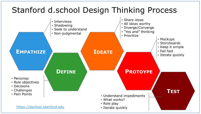
|
|
Fig 1.1 Stages in design thinking Source: https://www.theagileelephant.com/what-is-design-thinking/ |
Design thinking focuses on human-centered problem solving, that is designing
a solution by putting yourself in the customer's shoes.
To start in define stage, think about "who?" "what?" and "why?". who they
are, what they want and why do they want it (their motivation).
Designers are focused in creating solutions for problems to the users, they
are not creating for themselves. This is the opposite for artists.
Always be specific about your statements. For the ideation stage, we should
have 2-3 how might we questions.
Tasks
Task 1: Propose an innovative project proposal as a group
Week 1: Topic Selection and Contextual Research
Fig 1.1 Apothecary brief by Brandialogue
Our project for this module is to collaborate with a brand and come up with a
brand identity design solution to market their products. We are also required
to form a group of 6-7 people from different specialisation to carry out this
project. I grouped with Adena and Adeline who is from Graphic Design, Alicia
who is from UI/UX design, Adlina who is from Digital Animation and Sasilvia
who is from Entertainment Design. From the list of collaborators given to us,
we chose to carry out Brandialogue's brief to create a brand identity for a
apothecary brand consisting of TCM, ayurveda herbs and agarwood
products.
Fig 1.2 Compilation of revies on competitors' products with source links

|
| Fig 1.3 Notes on Miro board |
To kickstart the project, we started with doing contextual research by finding
information on the internet about our topic. We discussed on which areas to
search on and decided to search about future and past trends as well as size
and growth of the herbal market, competitors and customer reviews on them. We
separated the task among ourselves and my task was to search for customer
reviews on our competitors' products. I focused on finding reviews
stating both pros and cons of the competitors’ product so that we can know the
opportunities we have in our branding design. After compiling the information
I found, I typed them down on our group Miro board that Mr. Mike provided us
with.
Week 2-3: Persona and interview questions
After receiving feedbacks from Mr. Mike, we continued with our progress to
define persona and come up with interview questions.

|
| Fig 2.1 Persona profiles on Miro board |

|
| Fig 2.2 Draft questions on Miro |
We first define our persona in a simple way that would help our research,
which are people who uses herbal products, those who are new to it, those who
don't and mothers of newborn. We discussed together to create profiles for
each persona followed by the questions for them. There's also a block of
general questions for us to get a general overview for each persona. After we
received feedbacks from Mr Mike about our persona, we used different colours
to highlight the questions in the sticky note block that we want to put in our
final Google form. We also listed down some potential interviewees to ask the
questions too.
Fig 2.3 Old (Week 2) and new (Week 3) draft questions for Google form
Fig 2.4 Screenshots of the full questionnaire
After we received our feedbacks from Mr Mike in week 3, we decided to change
our Google form format to a questionnaire that's open to everyone instead of
for a interviewee as not all of our interviews can be done face to face. Aside
from following Mr Mike’s feedback in amending the sentence structures of some
of the questions, multiple choice answers, checkboxes and short plus long text
answer format is included in the Google form to avoid making the questionnaire
too long and troublesome to answer. The questionnaire was set in a way where
respondent will be led to their respective persona group questions based on
the answer they chose in question 8 of the general questions section. If the
respondent doesn't know and use herbal products, then they will submit the
form directly.
We also included a short introduction about herbal products at the start of
the questionnaire to define herbal products for our respondents. Pictures were
also included. I helped with searching pictures for Ayuverda herbs, while
Alicia searched for TCM herbs and Sasilvia searched for agarwood and other
examples. Sasilvia later collaged all the pictures together and made the form
pleasing to look at.
Fig 2.5 Online platforms where the questionnaire link was shared
After finalizing the questionnaire, we each shared it to our personal
contacts, social media, online platforms and wherever we can. I shared the
link to the questionnaire to my friends, family, on my social media, to survey
exchange Facebook groups, Reddit forums and a few online forum websites
targeted at mothers so we can have more responses for our persona 4
group.
Week 4: Data analysis and site visit
Fig 3.1 Data analysis notes
At the start of week 4, we received 164 responses on our Google Form. I helped
in doing some data analysis of the responses we gathered so that it's easier
to show Mr. Mike the findings we got during class. I did the analysis by first
sorting the raw data by age and persona group on Google Sheet and typed down
summaries and my findings of them on a Google Doc. We kept the questionnaire
open until Friday of week 4 and I then updated my data analysis with the
latest responses. Alicia helped in sorting the latest data received by age and
persona group in the Google Sheet too.

|
| Fig 3.2 Picture taken by Mr Damien during the site visit |
Other than that, we also did a site visit to D'advance Agardwood Solution
store in Bukit Jalil with Mr. Damien. During our time there, we were
given an introduction by Ms. Zaiqi and Mr. Damien on the company’s agarwood
brand, Nan Yang Chen Xiang (NYCX), and their insights on the agarwood market
in North America. Unfortunately Mr. Damien had to leave early so Ms. Zaiqi
continued with the remaining introduction of their products and creation
process.
Fig 3.3 Photos taken by me and Alicia
We were able to ask them questions about their products, marketing, future
planning and product packaging, and we’ve received valuable insights for them,
which would help us in building the brand identity later. The whole exchange
was very conversational and casual. We also got to try their agarwood oil,
skincare and tea to get a hold of what their product is like. Furthermore, me,
Adeline and Alicia also took videos and pictures of their products for further
referencing in our designing stage later on.
Week 5-9: Insight statements, how might we, brand details, user journey map
and presentation slides
Ideations and insight statements

|
| Fig 4.1 Categorizing ideas |

|
| Fig 4.2 Defining key themes and insight statements |
Over the days in week 5 to week 9, we worked on the insight statements, how might we questions, brand details, user journey map and our presentation slides. There were a lot of changes back and forth as we tried to make them as clear and unique to our brand as possible based on Mr. Mike's feedback. For the insight statements, we first list down all the ideas we came up with based on the results we received from the survey and categorised them into different groupings. We then identified the key themes and came up with 5 insight statements, where we further refined as we've gotten feedback from Mr. Mike. The first 3 insights were chosen as they are more specialized towards our brand's aim.
How might we questions

|
| Fig 5.1 How might we questions |
We then discussed on the how might we questions based on our insight
statements. We focused on making the questions as clear as possible so that we
can use as a guideline for us to solve the problem. The first, second and
forth how might we questions were chosen to be final as the third felt
repetitive.
Brand name

|
| Fig 6.1 Brand name brainstorming |

|
| Fig 6.2 Brand details suggestions |

|
| Fig 6.3 New brand name suggestions after feedback |
We each also came up with suggestion on our brand name and details including
brand description, key words, objective and purpose, vision and mission,
positioning statement, brand values, target market and unique selling point.
The brand details were further refined as we get to the presentation slides.
For the brand name, we first voted for "Miyu Herb" (Me + You = Miyu) as we
thought it's a nice sounding name which is easy to remember and has a meaning
that suits our brand. But later on, after receiving feedback from Mr. Mike, we
each suggested different brand names again to make sure the name won't reflect
any countries and at the end, we voted for "Haelan Herbs" to be our new brand
name since it has a suitable meaning, rolls off the tongue nicely and is
unique.

|
| Fig 6.4 Pinterest board |
Adena also created a Pinterest board for us to put in all our moodboard and inspirations for all of us to refer to throughout the project. For the products of our brand, we decided to go with the 3 products requested by Brandialogue in the brief, which are OUD incense sticks, essential oil and wood chip, and we add another 2 more extra products after our visit to NYCX, which are OUD tea and hair treatment oil.
User journey map

|
| Fig 7.1 User journey map |
We then discussed about the contents for the user journey map and revised it
to make sure all the contents are specific based on Mr. Mike's feedback. We
also made sure all the contents matches the stages on where it should
be.
Presentation slides

|
| Fig 8.1 Solving the problem section in presentation slides |
For the presentation slides, we divided slide roles among ourselves and I was
responsible to present and create the slides for the solving the problem
section which includes the problem statements, insight statements, how might
we questions and UNSDG goals. I made sure the contents are as concise as
possible and easy to read through. I also had help from Alicia for coming up
with the title for the how might we questions slide, and Adena for including
the brand's graphical elements in the slide design. The graphical elements
were made by our art director Adeline. Adeline also came up with the brand's
colour palette which we followed in our slides. Later in week 9, we had our
presentation with Mr Mike, Ms Zae and Mr Damien over zoom.
Final Task 1 Presentation slides
Fig 9.1 Final Task 1 Presentation slides
Group Pinterest board link (for reference throughout the tasks progressions):
https://www.pinterest.com/tofukyn/minor-project/
https://www.pinterest.com/tofukyn/minor-project/
Task 2: Devise and produce design management protocols relevant with industry practice
For this task, we are required to continued with our project progression and
move on from brand proposal to idea development. We need to come up with
designs for products, merchandise, website, Kickstarter page, social media
advertisement posts and anything relevant to our brand needs.
Week 10 - Week 15: Content planning, copywriting and design
execution
Fig 10.1 Social media content calendar
Link:
https://docs.google.com/spreadsheets/d/1AlwRZ3qRzGCvbvfa97Peg1e760GIjDXb2XjSrgUFvDA/edit?usp=sharing
Moving to our idea execution stage for Task 2, we first started with planning
the tasks that needs to be done and finalising our design direction. Sasilvia
came up with most of the content ideas in the social media calendar, while I
added in a few ideas that I think might attract more audience to the brand.
The tasks assigned to me were creating the mockup and social media posts for
the first Kickstarter post, subscription box, creating the quiz posts, work
with Adlina for all video contents for social media and do the copywriting for
the brand's website and curated journey quiz.
Copywriting
Fig 11.1 Website and curated journey quiz copywriting draft
I started with the copywriting work for the website and the curated journey
quiz for customers to quickly choose the most suitable products for them. I
wrote the content based on the brand identity proposed in our brand proposal
slides, and also based on our user personas. For the FAQ content, I also
included suggestions on which local sustainable packaging manufacturers to
sourced out to which are
O-I BJC GLASS MALAYSIA for glass and Malaysia Smelting Corporation Berhad
for tin. I also mentioned that all our paper packaging should be
FSC approved and Brandialogue
could use
Stripe
as a third-party payment platform on the website since it allows multiple
currencies transaction a wide range of payment methods, and the payment page
is customisable too.
For the curated journey quiz, I worked on it with Adena to write a draft on
the question content, flow and choices the customers can make to make the
experience as personalised as possible.
Social media content
Logo animation
Fig 12.1 Logo animation #1
Fig 12.2 Logo animation #2

|
| Fig 12.3 Keyframes and composition timings of logo animation #2 |

|
| Fig 12.4 A closer look on the masking used on the ae reveal in the logo |
I then animated the logo in After Effects using the Adobe Illustrator file
provided by Adeline. For the circles and the H at the bottom, I converted
the vector layers into shape layers and used trim paths to animate their
reveal. For the ae in the logo, I used masking to animate a writing reveal
on it since it provides more accurate editing. Logo animation #1 was the
first version I made with timing ideas given by Adlina, then Sasilvia
suggested me to offset the timing for different parts of the logo, revealing
the circle first, and then ae and then the H. So, I made logo animation #2
which is the final version of the logo animation. The logo animation will be
used as an outro for most of our social media videos, and I shared the After
Effects project file to Adlina so she can use it as well in her
videos.
Fig 13.1 Agarwood introduction test video with graphical elements
implemented outro
Fig 13.2 Agarwood introduction test video with only logo outro
Fig 13.3 Agarwood introduction test video with old film transition

|
| Fig 13.4 Graphical elements implemented outro keyframes and blending mode |
I then decided to do some test videos to test out a video style I have in
mind. I made the test video to be an introduction to agarwood, which I think
can be a possible topic in our social media content or be used in a part of
another content. The first two videos are the same just that the first one has
a tryout in implementing one of our brand's graphical element (provided by
Adeline) overlaid subtly as the transition to the outro, and the second one
solely has the logo fading in only. The third video is a tryout on whether
using an old film grainy transition would be suitable for our brand or not.
For the video content, it's mostly just finding suitable stock videos and
stitching them together to see if they make sense, and colour correcting them
to the photo editing style of Haelan Herbs branding, which is a tinted brown,
washed out, desaturated look. Though, I'm not satisfied with the colour
correction in this.
Fig 13.5 Brand identity test video
Another test video I did is a short video that relates to brand identity,
showing that the herbs are sourced organically and processed in Haelan Herbs'
lab. I followed Mr. Mike's feedback on using only fade ins and fade outs as
transition for the video and test, so, this video will be a point of reference
on the mood of our other videos. The stock footage are not colour graded in
this test video.
Social media posting videos
Fig 14.1 Lab test - shorter variation
Fig 14.2 Ingredients sourcing / Production process - shorter variation
Fig 14.3 Final lab test video
Final 14.4 Final ingredients sourcing/production process video
Fig 14.5 Stock video, music and sound effects source links for the final
videos
Later on, I started to work on the videos for our social media postings. The
videos I did was the lab test video, the ingredients sourcing/production
process video and I worked together with Adlina for the 5 products showcase
video. For the lab test video, I focused on explaining that every production
phase in Haelan Herbs is overseen by science, proving that the brand is
science-based. As for the ingredients sourcing/production process video, I
focused on showing that all the ingredients and process used to create Haelan
Herbs product are organically and ethically sourced, promoting our
environmental-friendly brand value. Film dissolve and custom light transitions
are the main transitions I used for the videos, though the lab test video has
a zoom in transition since it is needed for the storytelling in the video
content, but I made sure the zoom in still looks soft enough by increasing the
blur and making sure there's no drastic change in position throughout the
zooming in. The custom light leaks I used are downloaded from a
YouTube tutorial and the zoom in transition is done by using the Warp transition from
the Universe plugin by Red Giant. For the text, I manually keyframed the
opacity instead since I want the text to fade out as the scene fades out
without overlapping with the next text.
The shorter versions of the videos weren't chosen as final since the longer
versions felt more informative, which are Fig 14.3 and Fig 14.4.

|
| Fig 14.6 Colour grading settings for a scene in the lab test video - Basic correction |

|
| Fig 14.7 Colour grading settings for a scene in the lab test video - Creative |

|
| Fig 14.8 Colour grading settings for a scene in the lab test video - Curves |

|
|
| Fig 14.9 Colour grading settings for a scene in the lab test video - Colour wheel and match |
I colour graded the scenes by referencing to the updated colour editing of Haelan Herbs photos done by Adeline. The brown is still one of the prominent aspect in the colouring but it should be more cooler now, and the other colours should be seen as well instead of tinting them in brown. There should also be strong contrast but the overall look should still have the washed out feel. I used the temperature, tint and colour wheels to edit the colour of the stock videos, and all the other parameters to adjust the amount of contrast, blacks and whites in the video. All video clips start from the same base and tweaked accordingly based on the look of the original stock footage.
Fig 14.10 5 products showcase video

|
| Fig 14.11 5 products showcase video After Effects composition - Part 1 |

|
| Fig 14.12 5 products showcase video After Effects composition - Part 2 |

|
| Fig 14.13 5 products showcase video After Effects composition - Part 3 |
For the 5 products showcase video, I used the products mockups done by
Adeline, Adena and Sasilvia to animate in After Effects. I brainstormed the
idea with Adlina and we thought going for a simple scale and position snappy
animation with motion blurs and masking would be the best route for the Haelan
Herbs brand identity, and also to quicken our project progress. I then
proceeded to animate the full video and added a light ray shining on the
products at the end for a final Haelan feel.
Music used:
Indie Rockin' 6.1.wav by mareproduction
Subscription box mockup
Fig 15.1 Subscription box mockup design variations

|
| Fig 15.2 Final box mockup - opened |

|
| Fig 15.3 Final box mockup -perspective view |

|
| Fig 15.4 Final box mockup - top view |

|
| Fig 15.5 Final box mockup flats |
Amidst creating the videos, I also created the subscription box mockup designs
using a
free delivery box mockup PSD file. After receiving feedback and suggestions from my group members on the
design, I went to further develop the design of box 1 to our final
mockup.
Social media posting images and graphics
Kickstarter post

|
| Fig 16.1 Final first Kickstarter post |

|
| Fig 16.2 Final second Kickstarter post |
Although I am in charge of creating the first Kickstarter promotional post for social media, Adlina and I ended up working together and did the 2 Kickstarter posts in class while we were waiting for feedback from Mr. Mike. Since we're working together, we were able to discuss on how to make the design for the 2 posts consistent with each other. I then continued to refine the typesetting by following the design guideline that Adeline set and then added a paper texture which Adeline also provided.
Subscription box sneak peak and reveal posts
Fig 17.1 Social media posts progressions for subscription box and quiz

|
| Fig 17.2 Final subscription box sneak peak post |

|
| Fig 17.3 Final subscription box reveal post |
|
|
| Fig 17.4 Subscription box reveal post - Variation 1 |

|
| Fig 17.5 Subscription box reveal post - Variation 2 |
For the subscription box posts, after finalising the mockups, I looked for
images online and photoshopped them into the scene. Except for the
subscription box reveal post where there's variations of having just a plain
background and the products floating above it. Since the products in
variation 2 of the subscription box reveal post doesn't really blend in well
enough for them to look realistic, and the light background in variation 1
doesn't highlight the products and box as well as the dark background in the
final one, Fig 16.3 is chosen to be final. The Haelan Herbs logo placements
are a copy from a template done by Adeline so that all our posts can be
consistent.

|
|
Fig 17.6 Original photo used as the background in the final
subscription box sneak peak post Source: https://www.pexels.com/photo/photo-of-a-gift-box-on-wooden-surface-6832992/ |

|
|
Fig 17.7 Original photo used as the background in the variation 2 of
the subscription box reveal post Source: https://www.pexels.com/photo/stack-of-boxes-on-wooden-table-4498113/ |

|
| Fig 17.8 Photoshop screenshot of final subscription box sneak peak |

|
| Fig 17.9 Photoshop screenshot of final subscription box reveal |
The subscription box sneak peak post was done by pasting the subscription
box perspective view mockup into the picture in Fig 16.6 and colour
corrected it to match the contrast and colours in the original picture.
Then, shadows and highlights are added by using the brush tool and lens blur
effect is also applied to a duplicated layer of the mock up, and part of the
duplicated layer is erased in place where there shouldn't be a lens blur
effect. Shadows, highlights, and colour correction are also applied in the
same way for the final subscription box reveal post.
|
|
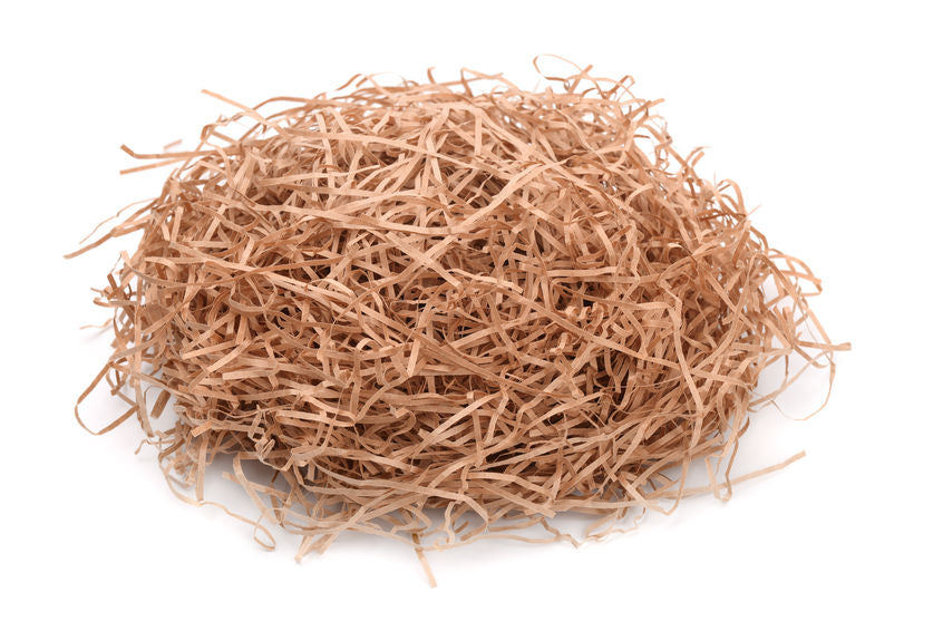
Fig 17.10 Shredded paper image Source: https://sineopackagingstore.com/products/shredded-brown-paper-10kgs |

|
| Fig 17.11 Photoshop screenshots of variation 2 of subscription box reveal |
As for the variation 2 of the subscription box reveal, the PNG pictures of
the product mockups are pasted and arranged in the box, and then shadows and
highlights are done with the same way as before. Then, the shredded brown
papers are inserted by using the image in Fig 16.10, and layering them in
the box and around the mockup, to cover the harsh edges of the bottom of the
mockups. Everything is colour corrected to match each other and the
background.
Curated journey quiz posts

|
| Fig 18.1 Final curated journey quiz post - 1 |

|
| Fig 18.2 Final curated journey quiz post - 2 |

|
| Fig 18.3 Final curated journey quiz post - 3 |

|
| Fig 18.4 Final curated journey quiz post - 4 |
Final Task 2 Copywriting, Social Media Contents and Mockup Designs
Fig 19.1 Final Task 2 Submission - Individual / Group effort work
Note: The curated journey quiz copywriting in the copywriting submission is
still draft form, Alicia further improved on it on the website. The website
link is available in the Task 3 Final Submission presentation slides, or you
can look at Alicia's e-portfolio post.
Task 3: Produce the final presentation of the proposed solution to a panel of reviewers
For this task, we are required to compile everything we've done in Task 2 into
a presentation slides to present to Ms. Zae and Mr. Damien.
Week 15: Final presentation preparation
Final presentation slides content preparation
Fig 20.1 Content inputted into slides
For our final presentation slides, I was assigned to present the social
media contents from week 7 - week 9 and the Kickstarter page mockup. But for
the slides content, I helped in putting in the contents for the Kickstarter
page mockup and the qr code and links for both the website and Kickstarter
page. The qr codes are generated from a qr code generated website with a
shortened link of the URL it leads to. Adena then changed the slide designs
to match the Haelan Herbs brand identity.
After we received feedback from Mr. Mike and finalised the slides, we
prepared our script and presented our final slides to Mr. Mike, Ms. Zae and
Mr. Damien on Week 15, Friday 2pm.
Final Task 3 Presentation Slides
Fig 21.1 Final Task 3 Presentation Slides
Links to my group members' blog post
Feedback
Week 2 (Taken down by Alicia)
On the information gathered about Arabian Oud, think about what makes their
packaging luxurious, is it because of the design or the material used, and
think about what experience do they provide their customers that makes them so
unique. Think about the brand personality that they want to convey, and keep
in mind that physical stores are important too, don't just focus on online.
One potential weakness is that their website is only available in Malay, so
it's not very accessible for international customers. Do SWOT analysis for the
competitors.
Consider a mood board that the word "apothecary" belongs to, think about the
images that the word invokes, the colour palette, typography, packaging design
etc. Look for specific colours and shapes that would make it stand out from
other competitors and make it appealing to the international market. Consider
to reference the branding and marketing of China based TCM brands that broke
into international market. Think about if "apothecary" brand personality
belongs in the same sector as the three oud competitors listed in our Miro
board. Try to choose and combine between the competitors branding and brand
personality.
In our define stage, come up with 3-4 personas of our products in our Miro
board. Create a set of questions to ask them, and keep in mind that the
questions cannot be manipulative or biased, and ask only important questions.
Have at least 2 interviewee for each persona, and list down the potential
interviewees. A suggestion for TCM user persona is an elderly Chinese
lady.
Week 3 (Taken down by Adeline and me)
For persona 4, "mixologist" as an occupation is too rare, use "naturalist" is
better since naturalists prefer natural treatments for post partum. As for the
survey questions, create the Google Form first and arrange the sequence of the
questions, make sure there is a flow. Think about what happens if the
respondents say no to the questions. It's good that we took information from
our personas, target audience and challenges to create the questions.
If we're doing Google Form, then it's a survey instrument, and it needs to
have a lot of respondents. Interviews should be done in face to face so that
deeper questions that require longer answers can be asked. Normally
researchers carry out surveys first and blast them to a lot of people. If
the survey answers are clear enough then they'll just depend on the survey
answers to carry out their research, but when the survey answers aren't enough
then they'll target a few ppl to do interviews with to ask deeper questions.
Survey should have short questions as people tend to get annoyed doing long
ones that last 15-20 minutes.
Week 4 (Taken down by me)
Good that we sectioned the results to their persona group in the
questionnaire responses Google Sheet. Seeing that most of the respondents
said their healthy habits are encouraged/motivated by others, we should look
into building a community for the brand so that people can learn from each
other about herbal products and motivate each other to keep using it. Maybe
we can look into pulling influencers like medical practitioners or legit
health influencers to give assurance and education about the efficiency and
benefits of the products. Maybe this can be done by printing QR code on our
packaging that would lead customers to our website which explains all of
this stuff. Also, social media is a big thing in influencing people.
Following the previous point, since people are influenced by each other, we
could look into creating combo packages or gift packages for people to buy
as gifts to influence other to use herbal products, or a package for their
health issue so they don't have to scour the internet endlessly to see what
herbal ingredient they should buy. We can also think about custom made
packages for the new mothers market because according to our survey, our
pregnant and new moms all make their own herbal mix. So, by letting them to
create their own herbal mix in our website, it saves them time and they can
just pick, buy and consume.
For product pricing, we have to make sure our packaging design follows the
same theme, i.e: our packaging has to be sustainable since we're selling
organic stuff (also the respondents of our survey all care about the
environment). Since a few respondent stated that they would like to be able
to see inside the packaging so that it gives them assurance on authenticity
of the product, we can keep that in mind too and find ways to let people
know what is inside (maybe a flip-lid on the packaging to see the inside;
illustration of the herbs; qr code; poster on store aisles; samples).
Since a lot of our respondents say that herbs are expensive, we can think
about subscription packages too. Because it also saves time for people to go
out and buy them again/choose brands again. This also have the same
influence as the gift/combo packages. On the topic of pricing, we don't have
to worry about marketing expenses since there's no set limit for this
project, so we can go wild on our ideas.
Mr Mike suggestions on our brand proposal: build trust with customers and
build a story that focuses on "prevention is better than cure". Because
(with support from our survey responses) pharma is for quick cure and gives
more side effects. Think about building trust as in "a brand who is a
friend", a brand who is loyal to its customers. e.g: package for pregnant
you, package for new mom you, package for your next pregnancy
Find out how the questionnaire respondents who age 24 and below and is in
the persona 1 group get money for their herbs to understand their market
better. Since one respondent said he wants to bulk buy herbs for his family,
we can think about having different sizes for our products, e.g: big portion
to small portion. People often have the psychology that small size =
fresher.
Week 5 (Taken down by Sasilvia)
If you have a lot of products, catagorise the products into different grouping
so as to limit the product range. For the product range Ms. Zae shared with
you, based on the 3 products that they mentioned do you have 3 reliable
suppliers with reliable prudential support. Brands might have another company
that is linked to them in China, China is the OEM, and they produce the parts,
agarwood. D'Advanced they are the OEM for agarwood, they sell it to Europe
brands and rebrand them and they change the packaging, Depending on the
branding the price will become more expensive.
If we have a specific target age group then we will have a specific target
ambassador. We are facing with a wide range of age group and different
experience customers. What is the percentage of the age group, break them
out. We can only market and advertise existing products. Take and then lock
down age group by segments. How do we want to divide the 25-40++ age group
into different segments, example 4 segments. Consult with you graphic design
group members, they might have learnt this before.
Week 6 (Taken down by Alicia)
Need to make a specific, exact list of products (emphasise the key ones that
will be at the top / primary brand sales) and get it approved by Mr. Damien,
Think about what is the innovative experiences for customers?
For the insight statements, they don't sound important enough. The top 2
insight statements are priority as they differentiate the brand from other
competitors but go with the first as it is more viable. Problem statement
needs to be short enough for each group member to memorise (shorten it). HMW
(How might we questions) needs to directly answer the problem statement -
use the HMWs to build the user journey maps. Refine information to be more
specific with details and amounts. Fresh take on ancient wisdom and natural
remedies + Loyalty comes with trust = put this into your HMW. Take out
bottom row: opportunities and activities.
To be more specific, for HMW 1, curate it so that it is educational enough
but not boring (e.g. too much text), design their journey based on a
persona. For HMW 2, be aware that all the solutions may not apply to every
persona. For HMW 3, don't worry about weight, just focus on size and reuse
of packaging (say why we think it is important), but it is not really needed
because it is understood. For HMW 4, it is regarding trust and credibility.
How do you make this sustainability certification understandable in layman
terms? Think about positive reviews & hire influencers to build trust.
Week 7 (Taken down by Adeline, Adlina and me)
For the advertisement part in the User Journey Map, have to decide the basic
brief for advertisement to decide types of social media. Things like: message,
type, amount, demographics, where is leads to after (call to action), how long
until they are completely aware (make it as if it's a story). Set ads to
target the correct audience for it because it costs a lot to do ads on social
media. Needs to be at least 3-4 weeks long ads. For its touchpoints, list them
under "pre-launch" and branch them out to points like social media ads,
offline ads.
Develop "Haelan Herbs" for the new brand name. Have "The Herbarium" and
"Botanical Herbs" as back-up in case Ms. Zae and Mr. Damien wants a different
option. But search what does the letter "ae" stands for, how does
it link to our brand identity. Because if you choose to put that out of
all the letters in your brand name, you need to have a strong justification
for it. The ae ligature doesn't look nice on the poster because the typeface
used is probably too thick and makes the ligature looks mot smooth, maybe try
out a less thicker typeface if you want to keep the ligature. (Another
solution is to keep the ae letter in the logo mark but type it normally in the
name, because he says non English speaker can probably pronounce haelan but
not old English haelan cuz they didn't see the ae letter before). The current
Haelan Herbs logo chosen does look prestigious.
Focus on making the design to reflect our brand identity of being based on
science even though it's natural products. Geometric elements is heading in
the right direction, keep developing. Try to copy other reputable herbal
brand's poster design and put our logo on it and see whether it works and if
our brand can look just as premium, everything must be coherent. Also make
some black and while poster mockups with black and white photos like Gucci,
Channel magazine layout to see how well the logo fits with the geometry.
Justify the use of geometric elements as well.
For the brand proposal presentation slides, replace HMW heading in slides to a
tagline related to brand name/ We need to act as an agency in our Brand story,
no mention of Taylor's or any uni project. Take out keywords and UJM slides.
Show UJM in a presentable structure as if we're showing to a client
(descriptions, images and such), not in the table form like in the Miro board.
Week 9 (Taken down by Alicia)
Ms. Zae
The insights are good (particularly the first insight). Looking to see
something (solution) that would highlight the first insight. Visual identity
that is very typical of beauty and spa type brands. Worry is that brand
would disappear under that kind of identity (colour palette and graphic
elements). Aesop is a good example - luxury skincare brand with laboratory
aspect. How can we do a similar approach but with herbs? We need to think
how to use the insights we have and apply it to how we think about the
design. How can we cultivate a community for the Kickstarter. Check if
domain name or logo are too similar to anyone else out there.
Mr. Damien
Product perspective - do some legwork on price point and costs for client
acquisition (e.g. types of ads and their costs). What kind of costs are we
looking at for the whole project?
Look back into our insights to make sure it translated to your art visuals.
The sans serif text kerning in the website is weird, why are some of them
looser and some tighter, double check them. The website will be your main
medium so it has to be perfect. Look at Oak and Eden's website their font is
very brave. Go fancy for your fonts, serif makes your brand looks fancier
and premium, about readability, it doesn't matter much because it would be
only 2-3 words for the heading, look at similar type to reflect a high
quality feel in art direction. But if sans serif fonts still need to be use
for the headings, find a fancy looking one.
For the images on the website, don't just add it in, try to understand it
add hues or a focal point. Fonts looks kind of off now, photos are good
quality but do u want to push it a little further by letting it bleed a
little, give it an arch etc. You can probably incorporate the graphical
design , make it watermark-ish to appear slightly in the website
background. All successful brands have consistency, they have a system
in how they organise their visuals and information. If they promote their
products with only a heading or heading + caption, or heading + subheading,
or all etc. We have to think about our system.
Revise the website design, it looks a bit normal, u need a unique signature
look that when people look at it they will be like "Ah, Haelan Herbs". Look
at 696 NYC's website as well, it has a really good approach in a
minimalistic design. Minimalistic is all about how to say a lot of things in
a very limited space, how you contrast your different colours (like brown
and then move to a more neutral colour). This is where graphic design
shines.
The choice to move away from green and use brown for the brand primary
colour is a bold move. Aesop's branding is to refer back to their
cultural roots, that is their philosophy. So, do we have a philosophy for
our brand.
Week 11(Taken down by Adena and me)
Imagine the applications as a new person you're being introduced as, think
of how you want the brand to be presented. (Classy, Down-To-Earth,
Environmentally Conscious). Look at each of the qualities and elements in
the design, does it give the feeling of the person you’re trying to
describe, does the layout overall show that. It needs to be
consistent. When it comes of down-to-earth and classy, think of Julia
Roberts & Taylor Swift. For teasers, awareness, create something
that is more simple, that something bigger is coming. Hint of the
characters, doesn’t state the whole thing right away. The third stage of
the user journey map is more suited for the current posters that
Adeline has created, as they will inform consumers, rather than feeding
too much information as they are seeking the information during this
stage. Ensure that every design showcases the brand personality.
We’ve done incredible on our insights but it doesn't translate to our
applications.
The tree bark idea is cool, use natural elements, play around with them.
It is both geometry and nature, play around with those in graphical
designs and photographs. This is to show that your brand is based on
science and you're not shy to show it. Designs do not need to be
flashy, simple but approachable. We are premium, classy but down-to-earth.
How you show these kind of models. Choose those kind of stock photos. The
stock photos can be watermarked, just make sure they are in high
resolution.
The vectors have to be soft. You create distance but create that
transparency. Think about how the solids and line vectors will be
meshed. Think if they can feather out. The current vector solids look a
bit off since they aren't photo or geometry. But when mixed, they will
be more out of the box. Type out an ingredient list to be more rational
of the vectors. Make sure the brand personality comes out from the
visual.
The following posters will show more, as the process goes down the line.
Think about what we want to say in the long run. It’s all about using
the whole artboard to communicate the personality that you want to
reveal in time. If we reveal too much at first, we just end up scaring
the consumers in the early stages. Think of this as for social media.
Try different layouts so that we can see our design direction in more.
Use more photos so that we can see the design direction for when we
utilise photos. Fairtrade, showcase we support farmers,etc. Showcase in
our photos. Get copywriting done by CHATGPT. For the payment, make sure
you refer to an existing site as people like to log in using google,
etc.
The updated website looks cool already, just the identity needs to be
focused more in depth. We can add in more for just our portfolio.
For social media calendar, the flow is there and it makes sense. For the
abstract images, make sure it looks like the ingredient you're going for.
yes abstract with lines and stuff, but make sure an abstract agarwood
picture looks like agarwood and not other stuff. Make sure the quotes etc.
are coming from valid sources, from herbalists or from books or journals
etc. Can get any stock videos from any source, even if it's watermarked.
If you use kinetic typography like
this video, make sure that the other design direction follows the same style or
it'll be weird to suddenly have words like that popping out.
Week 12 (Taken down by Adena, Adeline and Sasilvia)
The copywriting is ok. Needs a selling point by describing product. But then
should be provided by Ms. Zae so just go with whatever for now.
Put into the art direction the overall imagery concept such as high-contrast,
cropped shots, shadow.
For the test videos, the colour grading needs to be improved as like the
posters as well. To make the video look more luxurious, it is advisable to
slow down the shots. Suggest to not do the rapid cutting make it steady, use
fades, soft going in and out of text, colours and music (no rapid cutting) The
slide transition is bad, just do fading. For the website, the overall look is
there, it is pretty cool, you have a prestige look there. The mood is already
there. Just have to see which elements can be made richer, like the tree rings
can be added more, add more elements. Make sure that we put in our
presentation that we have other products that we are planning in the future,
whether our design will be suitable for the others that are coming in.
Week 13 (Taken down by Alicia and Sasilvia)
The art direction is ok. Beginning weeks awareness posts are good (3 times a
week is good). Week 5 is okay. Social media calendar makes sense it's not too
ambitious. Assign individuals do to certain posts now to create the content.
Full speed ahead start working now.
Week 14 (Taken down by Adeline and Sasilvia)
The essential oil packaging is good. Have to follow the government standard
size. Can get the actual bottle to test. Make sure logo is visible. Include
colours so the blobs don't look like mold. The text looks awfully
small, get a real label and measure the size of the text/ logo. Have an
unwrap version with the barcode and QR code because currently afraid that
the barcode and QR code might be blocked.
For the incense sticks packaging, Blossom, and Serenity looks very, very
nice. Meadow's graphical element can be more "3D", the tea leaf looks a bit
flat
The wood chip packaging looks cool, especially the first one.
Not sure about the colour for the tin tea packaging. Could put something on
the top lid so consumers could still see logo when it is stacked up.
The hair oil packaging is good. Double check the size also for this one as
well (like essential oil).
The delivery box is ok, just let the client choose.
The video is ok.
For the website, position the landing page image better (use photoshop and
ai, could move the subject towards to left more). Side menu is really good.
Excellent. The text size is too small, for the body text, force it down with
'enter' and make them bigger. So keep the body text in quiz page same as the
ones in the buttons. Can submit/ show the run-through
About the Kickstarter, for more flexibility, don't use their box/ blocks
(the Kickstarter's own webpage format), design in images and post the
images. Prioritise top 3 information on the Kickstarter.
The social media feed is looking nice. The visuals looks exquisite looks
premium already.
For the brand guideline, it is ok, but this is beyond guideline already, the
target audience should be separated, only include logo and colours in. Plan
on which products will be released first (other groups are doing this). Put
the social media images in and explain by schedule, (only include logo,
colours, typeface in the brand guideline).
The brand stationary is ok.
The updated incense sticks packaging looks consistent. Tea refill packaging
and tea strainer are ok.
For the quiz posts in social media, be mindful of your drop shadows for the
images, sometimes like this you don't have to overdo it. Since the hair oil is
about eye level, the drop shadow is almost non-existent. For incense sticks,
soften the shadow. For the information about herbs post in social
media, don't use minus sign bullets.
All the contents are there, just have to put them in slides.
Week 15 (Taken down by Adena and me)
Mr. Mike
Shorten the product descriptions slides, there's too much text. Only use
keywords and take out everything else. The text should be kept as notes for
you to present and not on-screen text. The same goes to the typesetting
slides. Flash quickly and only give a brief explanation of the social media
calendar and the FAQ slides during the presentation.
Ms. Zae
All good.
Mr. Damien
This is the most likely project to launch the brand since the manufacturer
is in Malaysia. Like the overall tone and feel. Launching the brand is
something we can do to get the experience with Mr. Damien. It is low risk
and won't cost too much as an experiment.
Reflection
This project, although can be hectic, was interesting for me to carry out. I
got to collaborate with my group members who are in different specialization
and learn from them through their work and feedback. Since this project is
more graphic design centric, I got to learn more on the graphic design field
and workflow and refresh on my typography skills learnt back in semester 1 and
2. Also, although it's not a full experience, but I think this project is a
kind of exposure on how it's like working with clients and their brief, and
learn how to build something extensive from scratch. I'm also really proud and
grateful for my group members on producing such stunning work and providing
valuable help and suggestions whenever I'm stuck with a problem. Even though I
got my part done, I did had to rush a bit nearing the end of the semester
since I have other modules final project to work towards in the same deadline
and an exam to study for, which I felt bad about. Nonetheless, our final
presentation went smoothly and we received positive feedback, and I feel very
glad for our effort and very appreciative for all my group members have done
in this project.
Fig 22.1 Weekly reflections compilation as in project management document
Link to project management document:
Comments
Post a Comment