7.2.2022 - 25.2.2022 (Week 6 - Week 8)
Chung Yi Ki / 0345014 / BDCM
Intercultural Design
Final Project: Research and Reflect
Lecture
Lecture 1 and 2 were documented in Project 1: Proposal
Instructions
Idea development
Sketches

|
| Fig 1.1 Final design conclusion draft (10/2/2022) |
 |
| Fig 1.2 Explanation on major arcana deck choice (11/2/2022) |

|
| Fig 1.3 The Lovers and Death sketch (10/2/2022) |

|
|
Fig 1.4 The Emperor and Justice sketch (10/2/2022) |
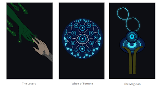
After going through our data collection, we decided to further develop our tarot card idea from our proposal and pair it up with our brand design with pamphlet ideas as well. I helped with writing out the final design conclusion of our decision and the reason on why we choose to make a major arcana deck. Since we decided to create all 22 cards from the major arcana deck, we then each choose 4 cards from the newly added cards to sketch out to divide the works. I chose to sketch out death, the emperor, justice and the lovers.
Further development of sketches

|
| Fig 2.1 Edited final design conclusion (14/2/2022) |

|
| Fig 2.2 Coloured tarot cards design (14/2/2022) |
|
| Fig 2.3 Coloured tarot cards design (14/2/2022) |

|
| Fig 2.4 Coloured tarot cards design (14/2/2022) |
After receiving feedbacks from Ms. Anis, I edited the final design conclusion to explain more on how tarot cards work, so it’ll be clear on why we think the tarot cards idea is the most suitable to use as our design outcome. We also divided works among ourselves for the final output development. My task was to help colour all 22 cards after Sasilvia line art the sketches.
Since we wanted a dark and mysterious feeling to the cards, I planned to use
dark base colours with high contrast produced by bright colours for the
cards, in other words, a neon glowing feeling to it. Contrast is added on
the elements that we want to emphasise in each cards.

|
| Fig 2.5 Description draft (20/2/2022) |

|
| Fig 2.6 Description draft (20/2/2022) |

|
| Fig 2.7 Description draft (20/2/2022) |
After receiving feedbacks from Ms. Anis, we decided to change the pamphlet
idea in our brand design to a booklet guidebook for our tarot deck instead.
I helped out in writing the descriptions for each cards in the booklet with
Kai Jun. For the descriptions of each cards in the booklet, I focused on
writing down the narrative behind the cards while also pointing out the
general meaning of the cards.

|
|
Fig 2.8 Coloured tarot card design and reworked The Lovers card and The Hierophant card (21/2/2022) |
I also continued on with my colouring progress and added some green glow on
Medusa's hand in The Lovers card and made the horns bigger in The Hierophant
card based on Miss Anis's feedback.
After we’ve completed our parts for the final design outcome, we compiled
everyone’s work and finalize the presentation slides, as well as recorded
our presentation.
Final Project presentation slides and video
Fig 3.1 Final Project presentation deck (23/2/2022)
Fig 3.2 Final Project presentation video (23/2/2022)
Feedbacks
Week 6
The sketches and what we have now looks alright, but the rationale/final design conclusion needs a bit more detail on why tarot cards are chosen. Read this website to refer to when re-writing it: https://www.nbcnews.com/think/opinion/tarot-cards-don-t-predict-future-reading-them-might-help-ncna1158311
Week 7
Try adding a grainy texture to the background of the card and change the colour to a lighter shade of black. Make Medusa's hand glow more or change to a lighter shade of green in The Lovers card since it's very dark now and it's blending with the background. The Oni's horns in The Hierophant card can be bigger for emphasis. Poor Richard maybe will be more suitable since it has a medieval feeling to it, while constantia has a more modern look. The company pamphlet idea is better to change to a booklet guidebook for the tarot cards. We can use back the existing visuals to make the guidebook. Canva can also be used to design it if we don't have enough time to make it from scratch.
Week 8
Nicely done on the design outcomes. Do try out putting texture in the background of the cards.
Reflection
Experience
At the final leg of this project, it’s exciting to finally produce a design outcome after going through our proposal and data collection we gathered. From start to finish, it’s interesting to learn about how the belief in evil for protection came about and read on the perception of people on this concept in current times. It was also fun to learn more about tarot cards and their uses as well as coming up with a design for each of them.
Observation
I observed that colours can make a lot of difference in the mood of a design as well as how the lines are drawn. Bright colours with curled line borders would create a more playful tone while dark colours with straight lines would create a more serious tone. Setting the tone of a design is important to make sure the audience perceive the design as how it was intended.
Findings
I found that there are a lot of ways to bring awareness and in a way, preserve a culture in people’s mind other than doing exactly what the culture originally practices. For example, the artefacts of oni, medusa and evil eye are masks, various depictions on objects and pendants respectively but incorporating them in other things with similar characteristics, such as tarot cards, is able to deliver the message too. Through this, the concept of the culture itself can also be preserved.
Comments
Post a Comment