16/9/2021 - 29/10/2021 (Week 4 - Week 10)
Chung Yi Ki / 0345014 /
BDCM
Illustration and Visual Narrative
Task 2 / Decisive Moment
LECTURE
Week 5 / Rhythm and movement, Chiaroscuro
Rhythm and movement
Rhythm and movement is about creating a flow of elements that will direct
the viewer's eyes to a certain focal point.

|
|
Fig 1.1 Flow of movement in a composition Source: Lecture slides |
The basic visual elements to create movements are shapes and lines. By
overlapping different elements in a composition, a flow of movement can be
created.
By including repeating elements of different sizes and/or different shapes,
variety is added to the composition and a rhythm/pattern is created.

|
|
Fig 1.2 Repetition and overlapping to create variety and visual
interest Source: Lecture slides |
Composition grids such as the rule of thirds grid and the golden ratio
spiral can be used as a guideline in creating a flow of movement, rhythm,
and a strong focal point within a frame.

|
|
Fig 1.3 Golden ratio and rules of third in use in illustration Source: https://www.conceptstart.net/art-tutorial/the-rules-of-composition-and-structure-in-art-design |
Chiaroscuro
- The use of light and dark to create aa 3D illussion on a 2D surface
- Used to create dramatic tension in a scene, form and value, and a balance between positive and negative space
|
|
Fig 2.1 Illustration using the chiaroscuro technique Source: https://dribbble.com/shots/5307828-The-play-of-light |
Week 7 / 3-acts structure
Storytelling basics
Central theme
The main idea on what the story is about, or the underlying meaning of it. It is often the author’s personal opinion on the subject matter. A story can either have a major theme where the idea is presented throughout the story or a minor theme where the ideas appears more subtly and doesn’t necessarily repeat.
Conflict
Conflict is what drives the story. An intriguing conflict creates tension and suspense. It engages the audience and makes them wonder if the protagonist is able to overcome the obstacle being set up. It can be a delivered gradually or abruptly.
Characters
Central characters
Important to the story development as the plot revolves around them.
Protagonist
The protagonist have a goal to achieve or a problem to overcome. They don’t have to be admirable, but they have to be relatable to create an emotional involvement from the audience.
Antagonist
The antagonist opposes the protagonist and goes against with everything the protagonist believes in. They are presented as a big obstacle to the protagonist.
Three-acts structure
Setup
Establishes the world the protagonist is existing in. It usually ends with the problem (conflict) being revealed. In other words, it is the starting situation that builds up to the problem.
Rising tension
The series of obstacles the protagonist needs to overcome to achieve their goal. The obstacles are written to be more dangerous than the previous ones.
Conflict
The highest point of tension and presents a major decisive turning point of the protagonist.
Resolution
Explains what happens after the events in the conflict, brings closure to the story. It can be either a full closure or a cliff-hanger.
 |
| Fig 3.1 Three-act structure graph Source: https://www.studiobinder.com/blog/three-act-structure/ |
INSTRUCTIONS
Task 2: Decisive Moment
Idea Development
Research
Fig 1.1 Clip of chosen scene from Steven Universe
(Spoilers to those who hasn't watch it yet!!!)

|
| Fig 1.2 Screenshot of chosen scene |
After that, I decided to search for some minimalist posters and fan arts of
the episode to reference.

|
|
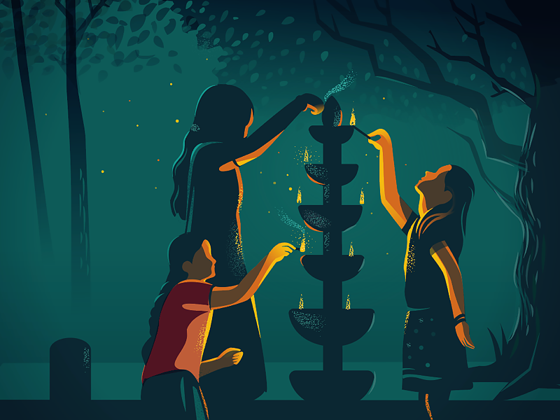
Fig 1.3 Minimalist poster for 127 hours Source: https://displate.com/displate/238703 |

|
|
Fig 1.4 Minimalist poster of the episode Source: https://www.reddit.com/r/stevenuniverse/comments/8i4n8z |
This is a simple poster but it sums up part of the episode well (The story
takes place in Pearl's gem where Steven sees Pearl shapeshifted as Rose Quartz
stab Pink Diamond beside her palanquin, and the pink hibiscus is what started
the plot too). The dark colour use here gives a sense of an ominous
feeling.

|
|
Fig 1.5 Poster illustration of the episode Source: https://www.pinterest.com/pin/733664595528794139/ |
Another way of summing up the episode, with more focus on the twist. Showing layers of Pearl's face is an interesting way on representing Steven going deeper and deeper into Pearl's memory. And using that layer of her face as the wall and interior of the palanquin is cleverly done too.
|
|
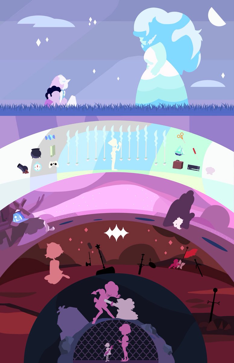
Fig 1.6 Vector poster of the first appearance of Rose Quartz and the
episode Source: https://mobile.twitter.com/AndrewMcBurgess/status/1003732990005075968 |
This poster present the episode (and also a scene from "Rose's Scabbard") by visually showing each scene in the literal sense. What I mostly focus on this poster is how the props and characters are simplified into minimalist design.
Sketches

|
| Fig 2.1 Sketches of the poster (30/9/2021) |
I started out by thinking the different ways I can portray that scene in the episode and did a lot of brainstorming sketches, but these are the ones that I think it's the most possible to convey the scene effectively. I focus more on incorporating the important plot elements in sketch #1, which are Rose's sword, gem shard and the pink hibiscus. I went for showing the scene taking place in Pearl's gem concept in sketch #2, while for sketch #3 it's more of a literal depiction of the scene.
After receiving feedback from Ms. Anis and Ms. Jennifer, I decided to choose
sketch #2 to develop as my minimalist poster because it doesn't only show the
decisive moment, but also a bit of the story background too.
Digitization of sketch

|
| Fig 3.1 Adobe Illustrator workspace and first tracing from sketch (7/10/2021) |
 |
| Fig 3.2 Tracing sketch of Pearl with a combination of shape tool and pen tool (7/10/2021) |
I started by tracing my sketch in Adobe Illustrator and resizing Pearl and
Rose to a smaller scale. I also tried out making the shadow for Pearl's gem
and see how it would work. Other than that, I looked at pictures from the
show and from the game "Steven Universe: Attack the Light" as reference to
the characters and how I can simplify them to a minimalist design.

|
| Fig 3.3 Colour palette from Adobe Color (7/10/2021) |
After that, I went to the website
Adobe Color to pick a colour palette that has a matching pale pink and pale blue,
as they're the colours I wanted to use on Rose and Pearl respectively. I
also wanted a darker shade of pink and blue ready to use if I want to pair
them up with a dark background.

|
|
Fig 3.4 Poster with only Pearl's gem (left) and with the decisive moment in the gem (right) (7/10/2021) |
Later on I separately made one version where only Pearl's gem is in the
poster and another where it shows the decisive moment because I'm planning
on making a reflection reveal of the scene in my animation. I set the
background colour to be similar to Pearl's skin colour, so the poster would
look like it's a close up of her forehead. I also kept the design of the
characters simple, with pearl's hand consisting only a simple shape, so that
it'll fit with the overall simplistic design.

|
| Fig 3.5 Digitization of sketch with straight reflection (7/10/2021) |

|
| Fig 3.6 Digitization of sketch with wavy reflection (7/10/2021) |
Then, I proceeded to make the poster with my animation plan in mind. Since
the animation is going to show a reflection, I want the still image poster
to convey the same idea too. I tried out two different types of "reflection
shape" to see which would work better.
I kept the overall poster design
simple, using only gradients and flat colours, to keep it minimalist and also make
it fitting to the idea I have in mind. The glowing effect of Rose is made by duplicating the original layer and recolour it to a lighter shade. Then, resize the duplicated layer to be larger and apply gaussian blur effect.
After receiving feedback from Ms. Anis and Ms. Jennifer, I decided to choose
Fig 3.4 to develop as my final outcome. I first went to the website
dafont.com to choose a suitable typeface as the default choices in
Illustrator doesn't have what I have in mind. I searched for a serif
typeface that's simple and elegant, in which I came across a typeface named
Linux Libertine.

|
|
Fig 3.7 Linux Libertine typeface (18/10/2021) Source: https://www.dafont.com/linux-libertine.font?psize=s&text=Your+status%2C+my+purpose%2C+none+of+it+will+matter+anymore |
It's simple serif typeface and the curve strokes in the italic font isn't
too exaggerated. So, I decided to use this for the logline text in my
poster. After that, I went on and create the frames I need for my animation
in Illustrator.
Animation process of minimalist poster

|
| Fig 3.8 Adobe Illustrator workspace showing one of the frames (18/10/2021) |
I created frames for the gradient transition of the gem and the gem's
shadow, and also frames for Rose shapeshifting in case I have time to try
and animate her.
|
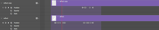
| Fig 3.9 Keyframes for the reflection white rectangle (18/10/2021) |
|
| Fig 3.10 Frame timing for the starting sequence of the gem gradient transition (18/10/2021) |

|
| Fig 3.11 Animated gif with reflection transition only (18/10/2021) |

|
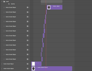
| Fig 3.12 Keyframes for Pearl's hand and Rose's gem (18/10/2021) |

|
| Fig 3.13 Frame timing for Rose shapeshifting (18/10/2021) |

|
| Fig 3.14 Animated gif with reflection transition and Rose shapeshifting (18/10/2021) |
Further development on poster and animated gif

|
| Fig 3.15 Layout testing (29/10/2021) |
After receiving feedback from Ms. Anis and Ms. Jennifer, I went on to add
the logo for Steven Universe in the poster. I tried out different position
of the logo placement and also sizing of it. I also changed the logline from italic to regular font as the italic font will clash with the slanted style of the logo. In the end, I think Layout
#4 works best because it looks more balanced.

|
| Fig 3.16 Gradient testing (29/10/2021) |
I also tried out a very subtle addition of gradient for the background that transition from the original background colour to a darker shade at the bottom of the poster. I used the freeform gradient tool for it because I wanted it to change from light to dark faintly, smoothly and with a bit of a curve. But since I wanted the background to be recognizable as Pearl’s head, I still think using only solid colour would be better as the gradient kind of throws off the recognition. So, I chose Layout #4 in Fig 3.14 as my final.

|
| Fig 3.17 Reworked gif animation (29/10/2021) |
Fig 3.18 Full timeline screenshot from Adobe Photoshop, 24fps
(from the top most layer to the bottom most layer)
and screenshot of frames done in Adobe Illustrator (29/10/2021)
Link to view pictures in fullscreen: https://albumizr.com/a/b1RJ
Final minimalist poster design

|
| Fig 4.1 Final minimalist poster (29/10/2021) |

|
| Fig 4.2 Final animated gif (29/10/2021) |
Feedback
Week 6
Sketch #1 and sketch #2 are good. Sketch #2 captures the moment more as
the episode is about discovering the truth through Pearl's memory. Resize
the characters to be smaller and put them in the middle so it's not too
"in your face". Suggestion to make the pearl gem shine to act as a
transition from nothing to the characters or from only Pearl to Pearl and
Rose.
Week 7
The poster design is simple and good the colour scheme is also good. But
change to another more suitable typeface for the logline. The animation
might need to be done using frame to frame.
Week 9
The animation is nicely done. Remember to put the logo of the show in the
final poster and animated gif.
Reflection
Experience
This project was very fun and enjoyable to do. Even though it does take a longer time to complete from coming up with ideas to the animation part, but hey, time spent with my favourite show is always time well spent! Haha. One thing that I found out when digitizing my sketch in Adobe Illustrator is the pen tool doesn’t necessarily have to be used all the time when tracing/creating a character (other than vormator shapes character). Shape tool can be used as well. I think using shape tool is sometimes faster and easier to deform later on or to create parts for animation. But of course, when it comes to shapes with curves, pen tool is always your best friend. The most fun part for me is probably the animation. I always enjoy animating even though it’s very tedious, and in this case, technical issues in Photoshop just adds to the frustration to it. But once I figured out a work around, everything would run smoothly again and I felt glad to see the final outcome get done as well.
Observation
When looking at my classmates’ work, I observed that there’s a lot of wats to go about creating a minimalist poster. The composition could be very simple or have a bit more complex detailing. But as long as all the elements work well together, fits the theme or idea of the poster, and also adheres to the minimalist style, then it would be a good design.
Finding
I found that colours are, again, important. Different colour combinations can create different mood that’s able to set the tone of a poster design. Dark colours would set a dark tone, lighter colours would set a more comforting tone, bright colours would set a joyful tone and so on. I also found that preparation and planning is crucial in animation. While I did plan on what I want to do for my animation when creating the still poster, I skipped out some preparation work which resulted in me needing to do more task later on. A plan done right would save a lot of time in the animation process so that’s something I’ll have to keep in mind for my future tasks.
Comments
Post a Comment