26/8/2021 - 16/9/2021 (Week 1 - Week 4)
Chung Yi Ki / 0345014 /
BDCM
Illustration and Visual Narrative
Task 1 / Exercises
LECTURE
Week 1 / Introduction & Briefing
This week was an introductory week to the module. We met up with Miss Anis and Miss Jennifer and were given a module briefing by Miss Anis. We were briefed on the exercises and projects we needed to do throughout the module, which consists of the Vormator Challange, minimalist poster design, creating a Webtoon graphic novel and animating it. We were then tasked with our first exercise for this week, as well as creating a blog link and google drive folder.
Week 2 / Introduction to Character Design
Stylization is crucial in character design as it is what sets the design
apart from others.
Principle of character design
1. Shapes
Use shapes to build a character. Shapes are what determine the
character’s silhouette and a clear silhouette is what makes a character
design iconic and appealing.

|
|
Fig 1.1 Shapes can also be used to indicate a character's
personality Source: https://yamino.tumblr.com/post/78459281321/ive-been-trawling-the-internet-for-character |
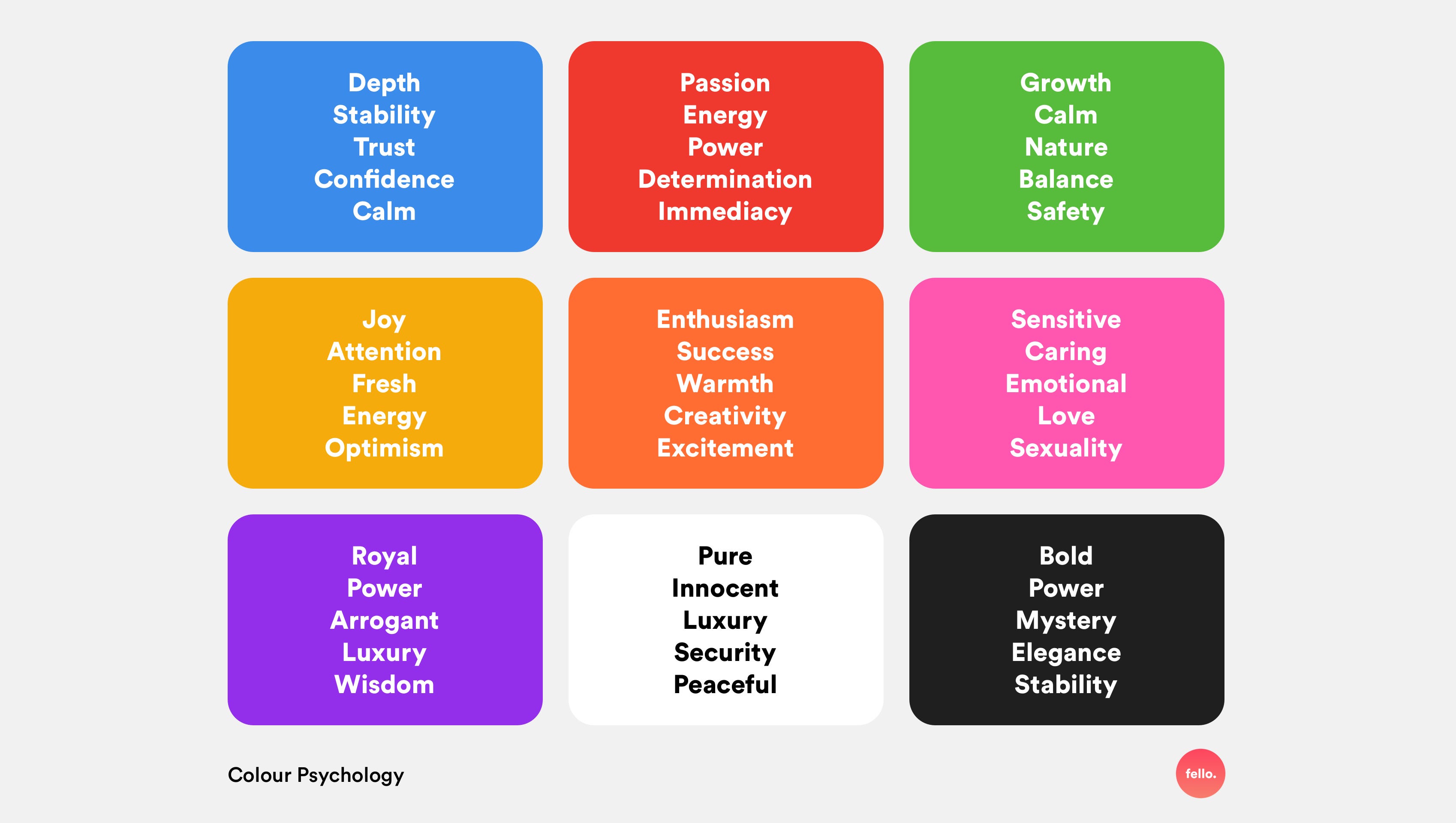
2. Colours
Colours can evoke emotions and thus, it can be used to give an
impression on a character and determine whether a character is the
protagonist or the antagonist.
|
|
Fig 1.1 Colour psychology Source: https://uxplanet.org/ux-design-colour-psychology-theory-accessibility-40c095cc1077 |
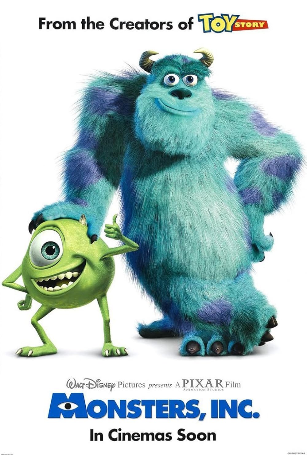
3. Emphasis and contrast
Putting emphasis on a certain visual element through exaggeration will
make a character (or a group of characters) more iconic and
memorable
|
|
Fig 1.2 Exaggeration of scale (Mike smaller and had big eyes while Sully is larger and has small eyes) Source: https://m.imdb.com/title/tt0198781/mediaviewer/rm2785401856 |
4. Harmony
Visual hierarchy is important in creating harmony. Every elements used
in a character design must fit together and complement each other.
Good colour theory is one way to achieve harmony.
5. Expression / Poses
The character must be able to express themselves through facial
expressions and poses as it is how they communicate with the audience.
Week 3 / Visual Techniques: Composition (1)
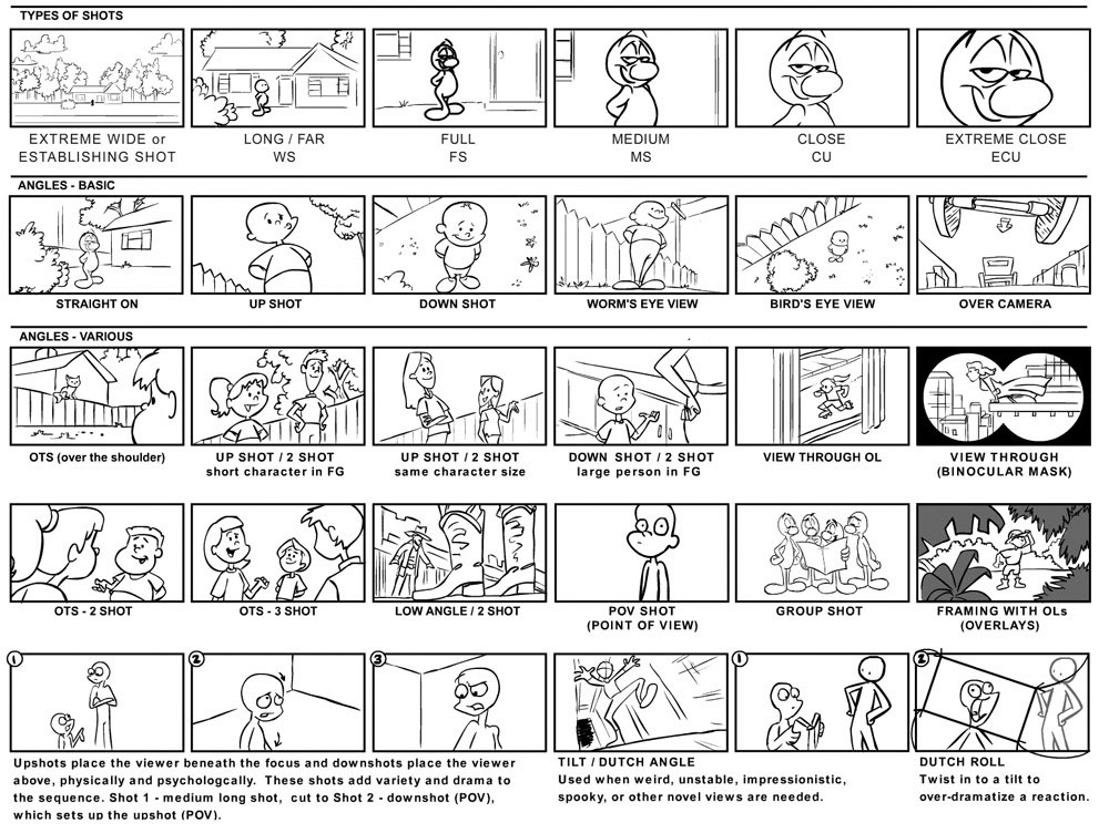
Composition
Composition is all about establishing visual hierarchy through
positioning of elements in the frame and the use of positive and
negative space.
Types of shots/composition
|
|
Fig 1.3 Different types of camera shots Source: https://roblevintennis.medium.com/illustration-teardowns-layout-50119287d695 |
Composition rule no.1
Negative and postive space
- Find a balance of positives and negatives
- Audience should know what is the focal point of the composition at first at the first look
Other aspects to focus on are setting the scene and mood of the
composition and add rhythm or movement to it.
Week 4 / Visual Techniques: Composition (2)
Perspective
Perspective is essential in composition as it makes the narrative in
the work immersive. It is used to create a sense of depth and a 3D
illusion on a 2D surface. Effective use of the 3 planes (foreground,
mid-ground, background) and perspective is able to create a very
immersive artwork.
Types of perspective

|
|
Fig 1.4 Different types of perspective with different numbers of vanishing points Source: https://www.sketchlikeanarchitect.com/blog/what-type-of-perspective-should-you-choose |
Parallax effect
Instead of using vanishing points, parallax effect uses layers to
create a sense of depth.
|
|
Fig 1.5 Parallax background animation Source: https://dribbble.com/shots/8164583-Parallax-Effect |
INSTRUCTIONS
Task 1: Exercises
Exercise 1: Vormator Challenge

|
| Fig 1 Vormator Shapes |
Idea Development
Sketches
|
| Fig 1.1 First character sketch (2/9/2021) |

|
| Fig 1.2 Second character sketch (2/9/2021) |
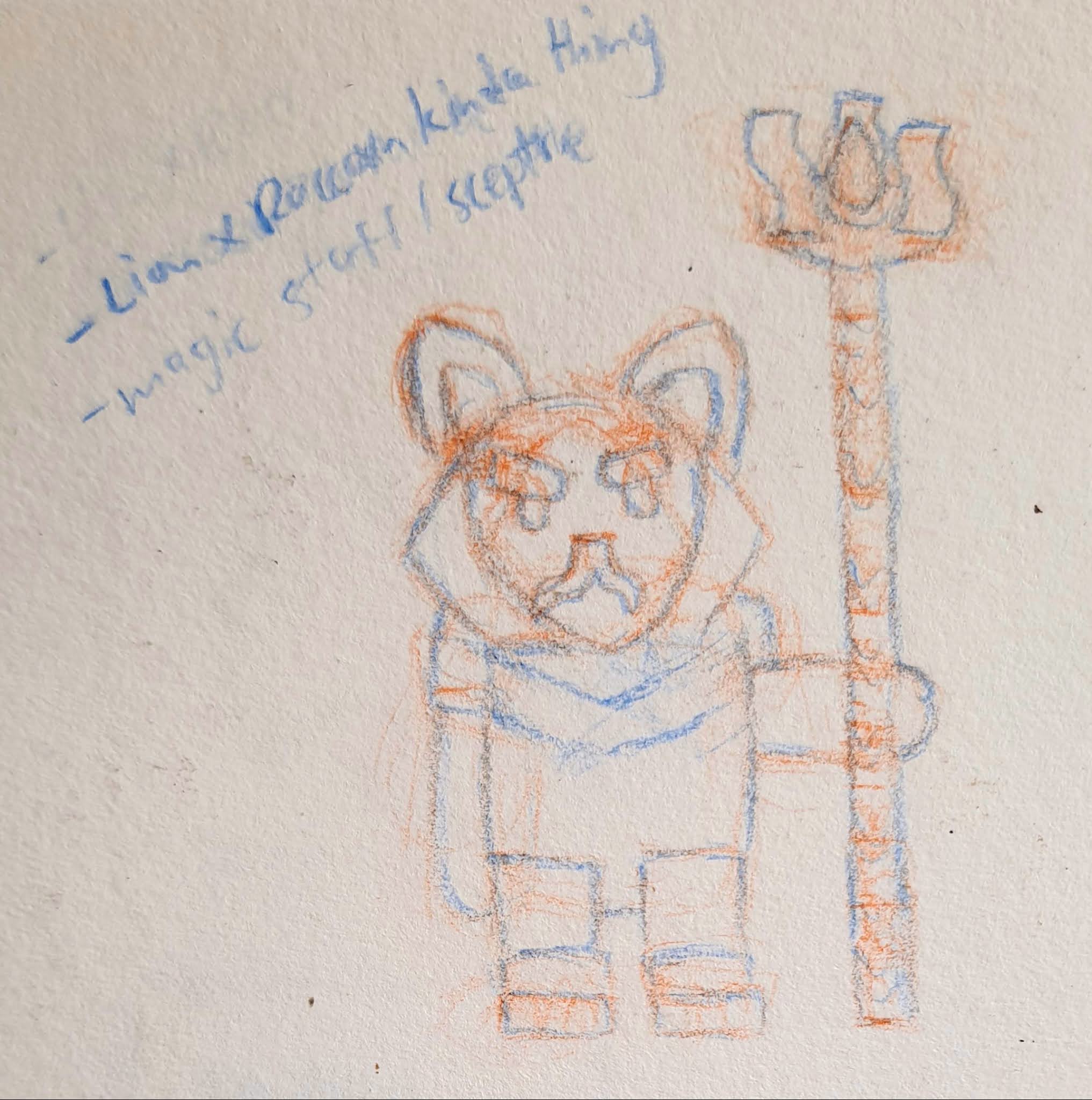
For my second character sketch, I started with the idea of how "the badge" can
be used to create a robotic arm like shape. I then thought of using that to
merge with a more organic-looking form which led to the idea of a floating
biotechnological looking monster. It is a 3-headed monster each with its own
personality and power transmitters on each of their back with leads to the
main power source in the sphere body.


|


|
Fig 1.3 Digital sketches and clean up of first character
design (above) and second character design (below) (2/9/2021)
After that, I traced the Vormator shapes digitally and put them together to
see if they'll work for my character ideas. Since I find the second
character design to look weird and Ms. Anis and Ms. Jennifer liked the first
character design as it fits to be a character, I decided to choose my first
idea to develop for the final vector illustration.
Digitization of sketch in Illustrator

|
| Fig 2.1 Digitization of sketch (Flat colours) (9/9/2021) |

|
| Fig 2.2 First try of applying gradient (9/9/2021) |

|
| Fig 2.3 Second try of applying gradient (9/9/2021) |
When digitizing in illustrator, I traced out each of the Vormator shapes and
placed them according to the sketch, and with some adjustments made where
needed. I changed how the Chevron is used on the armour with the help of the
shape builder tool, and also added two Wursts on each hand to complete the
armour look. I then plan out the base colours with the colour scheme I had
in my mind and tried out using the gradient tool to create some
shadows.
Final Vormator challenge character design

|
| Fig 2.4 Final character vector illustration (23/9/2021) |
Fig 2.5 Final character vector illustration - PDF (23/9/2021)
After receiving feedback from Ms. Anis and Ms. Jennifer in week 3, I went to
make some changes on the colours and gradient. I made the Drop on the staff
and the middle part of the chest armour from blue to red to symbolize fire.
I added gradient to the hands and legs so the overall colour scheme would
look more coherent.
Character story
In a land of dragons, elves and other fantastical creatures, there exist a tribe of protectors who looks after a sacred forest. Those who saw them said they look like lions, fierce and strong. Others oppose saying they look like bears because of their stocky build. Rogthl here is the Elder of the tribe. He may be grouchy and commanding but he trains the the next generation of protectors with great skills and knowledge. Though he does not enter the battlefield now, his fighting spirit still burns brightly and his decades-old armour still shines with great pride. An ancient staff now holds the place where his sword once was, with a floating gemstone at the top which could be presumed to hold the secret of the tribe.
In a land of dragons, elves and other fantastical creatures, there exist a tribe of protectors who looks after a sacred forest. Those who saw them said they look like lions, fierce and strong. Others oppose saying they look like bears because of their stocky build. Rogthl here is the Elder of the tribe. He may be grouchy and commanding but he trains the the next generation of protectors with great skills and knowledge. Though he does not enter the battlefield now, his fighting spirit still burns brightly and his decades-old armour still shines with great pride. An ancient staff now holds the place where his sword once was, with a floating gemstone at the top which could be presumed to hold the secret of the tribe.
Exercise 2: Vector Illustration
Idea development
References and inspirations

|
|
Fig 1.1 Card layout reference (23/9/2021) Source: https://www.moregamesplease.com/art-in-boardgames/2018/5/22/victoria-ying-art-in-board-games-37 |

|
|
Fig 1.2 Card layout reference (23/9/2021) Source: http://www.evenbothun.no/card-game-design/ |
To match with my character's story, I wanted to create a fantasy theme game card layout design with stated characters attributes. As I was searching for references, I found these two game card designs with an interesting layout concept. So I wanted to apply the same idea in my design.

|
|
Fig 1.3 Coven symbols from The Owl House (23/9/2021) Source: https://theowlhouse.fandom.com/wiki/Coven_System |
I also wanted to imply in my game card design that the game follows the fantasy RPG character classes mechanic, where these classes determine the character's attribute. So I wanted to create symbols for each classes I have in mind: Fighter, Magic, Royalty, Alchemy, Ranger, Bard. I wanted the symbols to look simple and flat, and this reminds me of the coven symbols from an animated show called "The Owl House", which I used as my inspiration.
Sketches

|
| Fig 2.1 Card layout rough sketch (Back) (23/9/2021) |

|
| Fig 2.2 Card layout rough sketch (Front) (23/9/2021) |
I started roughly sketching out the layout design I want. I planned on having a forest background for my character to match his story. The attributes I first given for him were "fire" and "forest" in Fig 2.2, which I later on changed as I planned out the character classes I wanted to include in Fig 2.1.
Digitization of card layout

|
| Fig 3.1 Card layout front (left) and back (right) with test background |
I changed some parts of the layout from the sketches because I found the
layout in the sketch was too cramped up and the character wasn't
emphasised enough. I used black strokes on the scroll elements at the
front of the card so the form can be clearly seen. Other than that, I made
a test background in the card layout to test out the concept and to
determine the colour scheme later on. I planned on making a night time
forest background as blue would contrast better with the yellow and brown
colours of the character.
For the symbols, they are arranged in this order (from left to right, top
to bottom): Fighter, Magic, Royalty, Alchemy, Ranger, Bard. I used a
more abstract symbol for Magic because I wanted to use the spiral to show
the smooth flowy nature of magic. The circle is to reference how most magic glyphs
are drawn with a circle and the sparkle is to show the amazement of
magic.
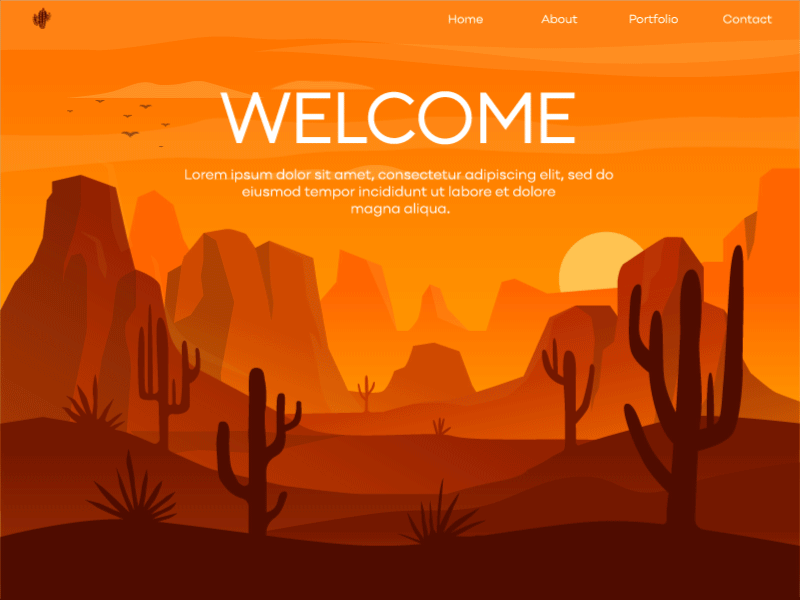
Background

|
|
Fig 4.1 Reference image (23/9/2021) Source: https://www.freepik.com/free-vector/cartoon-forest-background-nature-park-landscape_8067055.htm#&position=49 |

|
| Fig 4.2 Rough background digital sketch (23/9/2021) |
I wanted to use a parallax effect to create a sense of depth in my background. I came across the reference image above (Fig 4.1) while I was searching on the Internet and I thought it's a good reference for my background design.
|
|
Fig 4.3 Workspace in Illustrator with colour palette and colour palette
reference used Source of colour palette reference: http://paperheartdesign.com/blog/color-palette-forest-floor (top) https://icolorpalette.com/palette-by-themes/forest/page/16 (bottom) (23/9/2021) |

|
| Fig 4.4 Background design with planned colour palette used (23/9/2021) |

|
|
Fig 4.5 Background design with darker colours Recoloured using the recolour artwork tool (23/9/2021) |
I added some glowing elements at the back to set a fantasy mood to the background and I also used texture so it wouldn't look too plain. I recoloured the background later on to have a darker colour so the night time atmosphere is more clearly shown.

|
| Fig 4.6 Second attempt of card layout design (front) (23/9/2021) |

|
| Fig 4.7 Second attempt of card layout design (back) (23/9/2021) |
I also added an old paper texture to the scroll elements and a scratch texture
to the grey text field so it'll look like smoothed stone. I removed the stroke
for the two character class scrolls in Fig 3.6 and added a drop shadow effect
instead. Other than that, I used the blend tool on the sword and the shield to
give some shading to them.
Final game card layout design

|
| Fig 5.1 Final game card layout design (front) (24/9/2021) |
 |
| Fig 5.2 Final game card layout design (back) (24/9/2021) |
Fig 5.3 Final game card layout design front (left) and back (right) - PDF (24/9/2021)
After receiving feedbacks from Ms. Anis and Ms. Jennifer, I did some
correction and adjustments on the game card design. I made the white "hard
shadow" behind the word "Attack" more apparent and I also added a blurred
gradient on top of the word so the black colour would contrast on the
lighter background. I changed the "Fighter & Magic Bonus" sentence
from red to black and changed the black stroke of the scroll to dark
brown. I also added 6 rays of light burst effect behind the sword and
shield at the back of the card using the gradient tool. Along with that, I
added a faint gradient on the shield so it would look like its shining. I
also placed two of the blurred gradient on the top left and bottom right
corner at the back of the card so the colour scheme on both sides would
tie in together.
FEEDBACK
Week 2
Develop the first character idea as the character because it has expressions and the overall design is more appealing.
Develop the first character idea as the character because it has expressions and the overall design is more appealing.
Week 3
The first gradient tryout has a good look in the subtle change of colours. Try putting a symbol on the armour of the character or change the blue Drop to red, or any colour that can contrast with the character's main colour scheme.
The first gradient tryout has a good look in the subtle change of colours. Try putting a symbol on the armour of the character or change the blue Drop to red, or any colour that can contrast with the character's main colour scheme.
Week 5
The typeface used for "Attack" looses readability when it's not
over a plain background. Think of an adjustment for the background
behind the word so it's more clearly seen. Change the stroke
colour of the scrolls to dark brown so it'll tie in together with
the game card design. Change the red sentence to black so it'll be
more readable. Add some sort of light burst/gradient burst behind
the shield to fill up the empty spaces.
REFLECTIONS
Experience
This was an enjoyable exercise to do but it does come with its
challenge. I had fun figuring out how to use the Vormator shapes to
create a character and come up with a backstory for it. Creating the
game card was fun too especially when I’m figuring out the design
for the 6 character classes symbols. I always admired how these 2D
flat symbols are often formed from simple geometric shapes but are
able to convey its subject in a detailed pictorial way, so it was
interesting to study then and learn how to use the same technique
for my idea. Creating the background was the challenging part for
me. As I rarely do background drawings, figuring out a scenic
background for my character that will also work with the card layout
design has its difficulty. But after a number of throw-away sketches
and looking at background references, I eventually came up with an
idea on the background I wanted.
Observation
When I look at the work of my peers, I realized that there are
actually a lot of creative ways in using the Vormator shapes to
create a character. A lot of new shapes can be formed from the 8
given shapes if you don’t restrict yourself when experimenting with
it.
Findings
I found that colour theory is essential in creating illustration. If
the chosen colours doesn't match together well, it might make the
final result end up either looking flat or hard to discern, so
creating a contrast is important. It’s also good to test out
creating contrast with different hue of colours rather than just
sticking to one hue of colour with different brightness (the latter
one often times would result in a muted colour palette). Other than
that, I also found that Adobe Illustrator is very useful in creating
illustrations. It is difficult to learn and get used to but it gets
better with practice.
FURTHER READINGS
Ms. Anis shared some notes on composition and perspective for us to
read so we'll have a better understanding on them. These are the notes
I've taken on the topics that caught my attention:
Composition notes
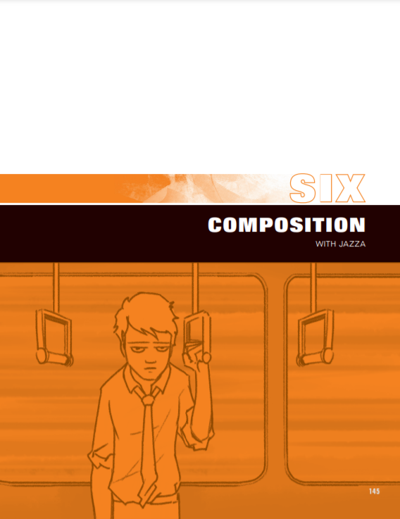
|
| Fig 1.1 "Six Composition" written by Jazza from 21 Draw Illustrator's Guidebook |
Rule of thirds
Align the subject on the intersection points of the grid or along
the horizontal and vertical lines. Primary focus should be at the
top left intersection of the grid and secondary focus should be at
the bottom right intersection of the grid.

|
| Fig 1.2 Example use of rule of thirds (pg 148) |
Creating environment art
A good use of foreground, midground and background can communicate a
sense of scale and depth between the characters and environment in
the scene.

|
| Fig 1.3 Different way of creating overlaps in landscape design (pg136) |
Contrast and detail
A good use of contrast can direct the viewers' eye to the focal
point. Focus on putting details on the areas you want the viewers to
focus on, too much details in an artwork can cause chaos and lack of
focal point
Symmetry and asymmetry
Symmetrical composition often communicates a static and predictable
scene. Asymmetrical composition would create a sense of drama in a
scene
Perspective notes

|
| Fig 2.1 "What is perspective?" written by Jazza from 21 Draw Illustrator's Guidebook |
2-point perspective
In 2-point perspective, match the corners of the building or
structure at the intersection point of the grid lines (lines
emerged from the 2 vanishing points).
3-point perspective
When drawing 3 points perspective, it's good to use blocks as
guides in planning out the position of the characters so it'll be
easier to fill in the characters later on.

|
| Fig 2.1 Example use of guiding boxes/blocks in 3-point perspective (pg118) |
Dynamic scenes
In some scenes to create dyanamism, perspective rules doesn't need
to be followed stritctly. For example in Fig 2.2, there are two
different horizontal lines and the perspective lines of the ground
are curved.

|
| Fig 2.2 Example of dynamic application of perspective (pg119) |
Isometric view
When designing individual building, it's better to use isometric
view as it shows 3 sides of the building structure clearing
without perspective distortion.

|
| Fig 2.3 Example of isometric drawing using the isometric grid (pg133) |
Comments
Post a Comment