14.9.2021 - 28.9.2021 (Week 4 - Week 6)
Chung Yi Ki / 0345014 / BDCM
Design
Principles
Exercise 3
Main menu
Sub-Menu (Tasks)
Lecture
Week 4 / Harmony and Unity, Word and Symbol
Harmony
- Harmony is achieved when similar elements are used in a design. (constant use of the same shape, similar colour tones etc.)
- Variation is needed to avoid monotony

|
|
Fig 1.1 Warm colours and rectangular shapes harmony Contrasted with cool colours and round shapes Source: https://www.johnlovett.com/harmony |
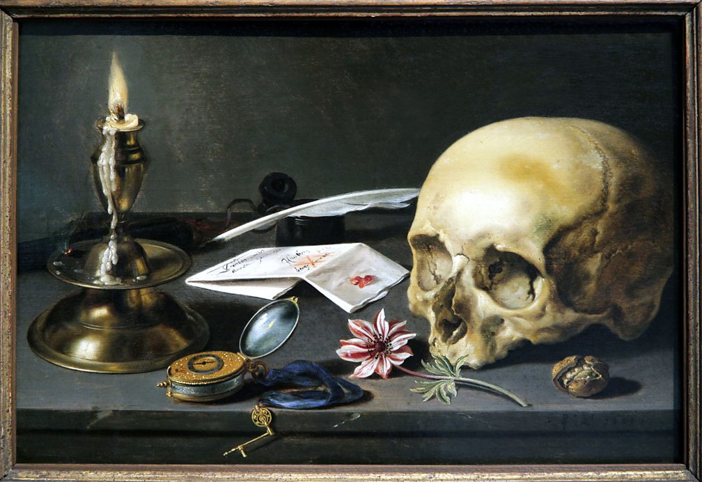
Unity
- Unity is achieved when all the elements in a design work together to convey a single message (i.e viewers will see all the elements as one thing instead of different separate groups)
- It gives a sense of balance and help to keep the design in a single theme
- Variation is also needed to avoid monotony

|
|
Fig 1.2 Unity through shapes Source: https://www.pluralsight.com/blog/creative-professional/creating-better-harmony-by-understanding-unity-in-graphic-design |
|
|
Fig 1.3 Unity through proximity and theme Source: https://www.bbc.co.uk/bitesize/guides/zy4mmnb/revision/3 |
Scale and proportion
Scale
- The comparison of size and dimension between objects by using measurements
- Two types of measurement: actual measurement and visual estimation
- Deviation from normal scale relationship can create visual interest and gives dynamism to a design
Proportion
- The relation of size, colours, quantity, etc. between different parts of the same object
- Can create harmony and unity if it’s effectively used
Symbols
Human have used symbols to communicate since the start of civilization. In
this week’s lecture, we discussed about three kinds of graphic
symbols:
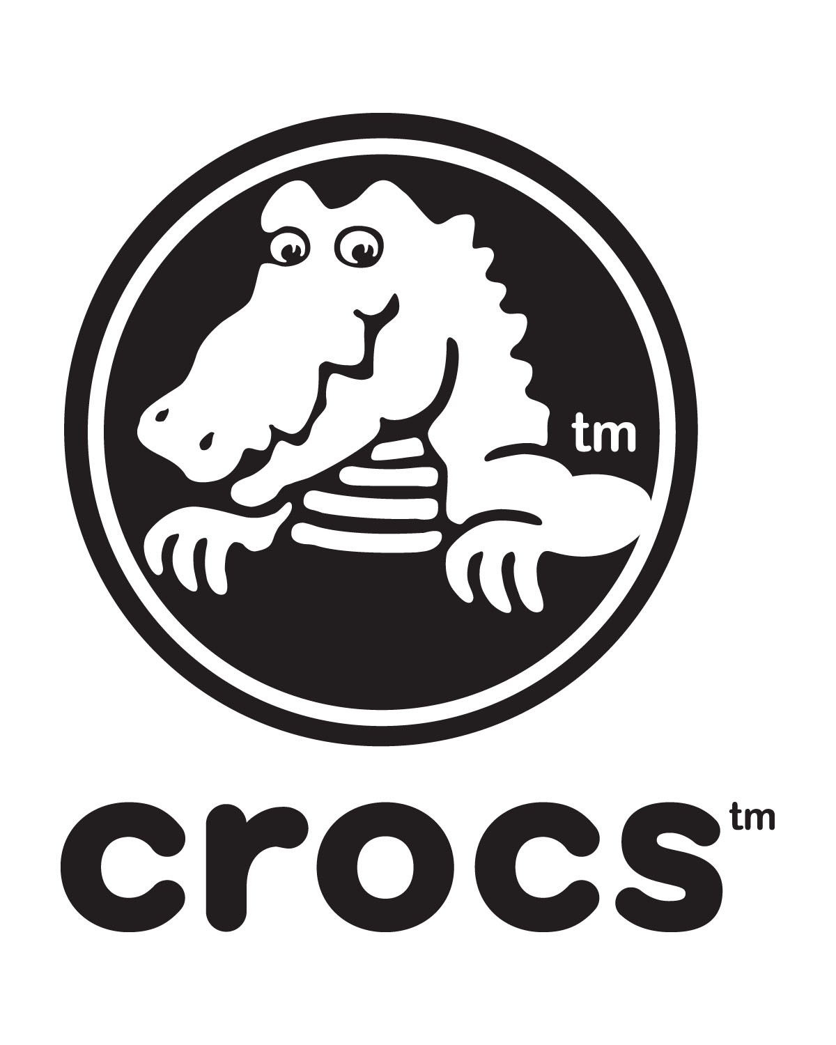
Pictorial symbols
- Symbols that look like what they’re representing. They rely on the use of
images and simplified pictures.
- Useful in educational materials as it allows learners to visually learn the related subject matter.
- Useful in educational materials as it allows learners to visually learn the related subject matter.
|
| Fig 1.4 Pictorial symbol in a logo |
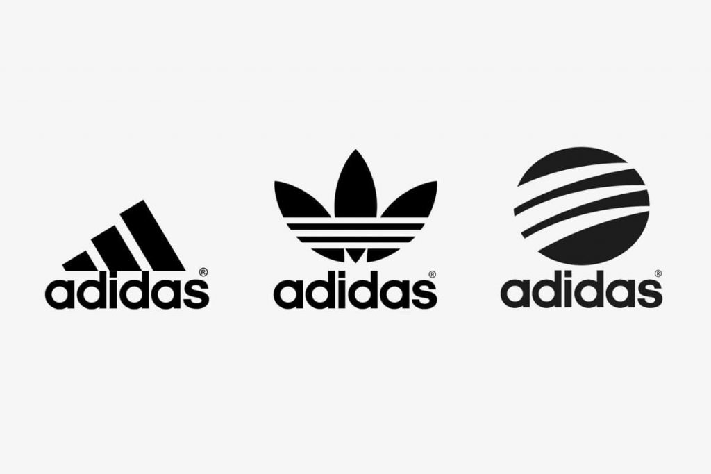
Abstract symbols
Symbols that look like the objects they’re representing but with less
details compared to pictorial symbols. In other words, a more simplified
version of pictorial symbols.
- Often used in creating logos.
|
|
Fig 1.5 Abstract symbol logos Source: https://www.logaster.com/blog/adidas-logo/ |
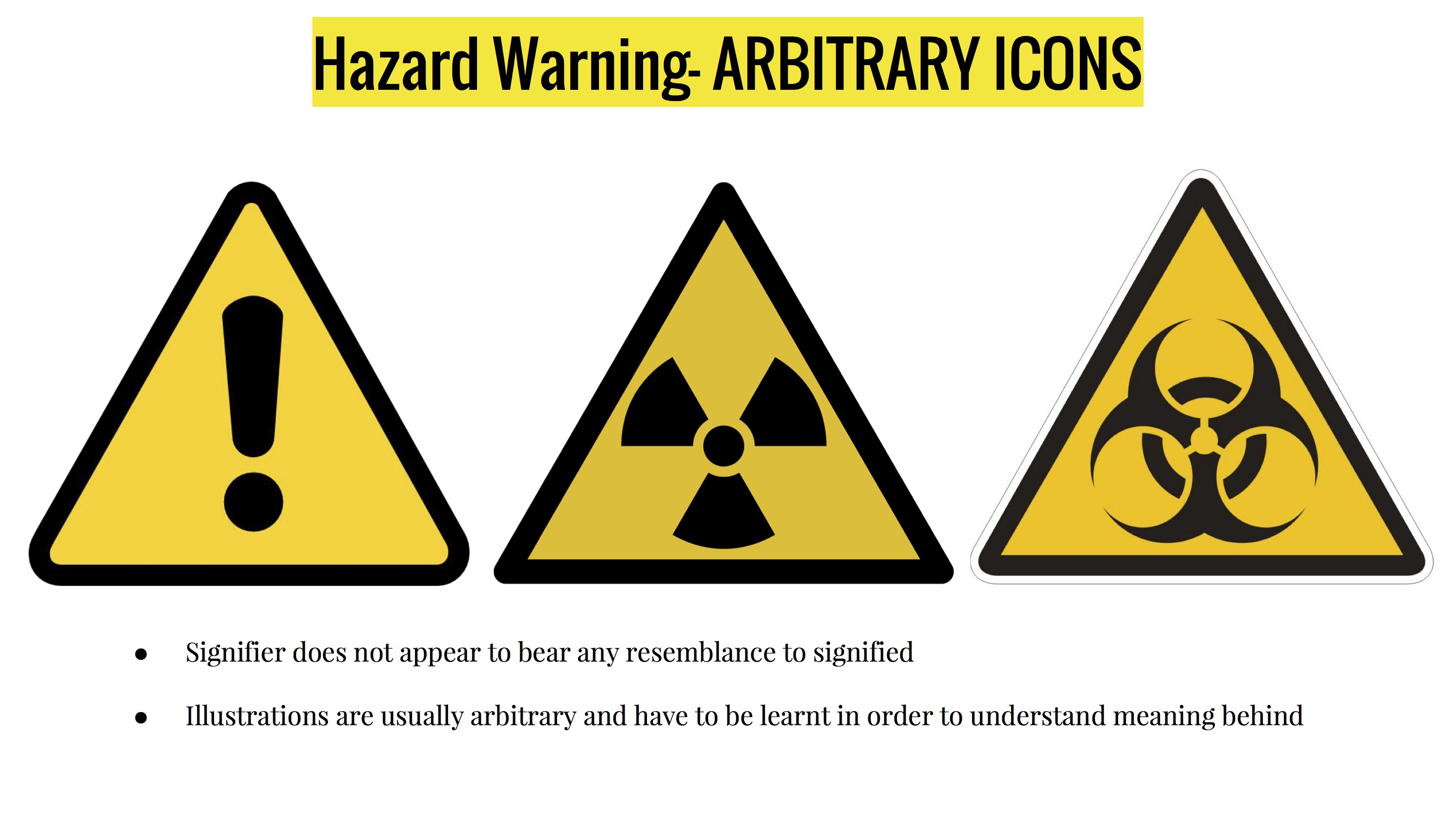
Arbitrary symbols
- Symbols that does not look like the objects they’re representing.
- These symbols are created out of the designer’s imagination and the
meaning of them is intentionally put upon by the designer. So, the meaning
behind these symbols have to be learnt as they can’t be guessed.
- Usually formed using geometric shapes and colours.
|
|
Fig 1.6 Arbitrary symbols - Warning signs Source: https://images.app.goo.gl/TFexL6ibFyzXr5k87 |
Word and image
- Suitable image and word pairing is important to create meaning to a design
- Typography is essential in arranging and choosing the right typeface for the chosen words.
- Visual hierarchy is important so the image and words are balanced.
Tasks
Instructions
Exercise 3
For this exercise, we are tasked to choose 2 principles from
harmony/unity/symbol/word and image, and produce a design for each of the
chosen principles.
Visual research
I decided to choose symbol and word and image out of the 4 design principles
and focused my visual research on them.
Symbol

|
|
Fig 1.1 Lyrics of "mirrorball" Source: https://imglyrics.com/23-taylor-swi-mirrorball-lyrics.html |
When thinking about what do I want to make a symbol of, the song
“mirrorball”
by Taylor Swift came to my mind. According to Swift in her "Folklore: The
Long Pond Studio Sessions" documentary concert film, the song uses
mirrorball (aka disco ball) as a metaphor to describe how some of us feel
the need to be duplicitous when facing different people. Mirrorballs are so
reflective because they are formed by many pieces of cut glass, resulting in
them having a lot of facets. They’re hanged on the ceiling to spin and shine
for people, and they are very fragile objects. In society, there are also
people who adopts multiple façades to please different people. Although this
is a very tiring action, they are still willing to keep on doing it for the
sake of keeping validity.
After understanding what I want to portray, I went to look at some icons of
mirrorballs.

|
|
Fig 1.2 Disco party flyer template Source: https://designtemplateplace.com/product/disco-party-flyer-59171 |
The different hue of colours represented the reflective and shiny
characteristic of a mirrorball. The lines, sparkle and asterisk-shaped
elements signified that the mirrorball is glowing.
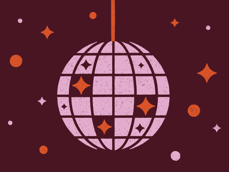
|
|
Fig 1.3 Disco ball illustration Source: https://dribbble.com/shots/6688333-Boogie-Down |
For this design, it didn’t use colours but rather different elements to
symbolize that the mirrorball is shining and glowing.
Word and image
|
|
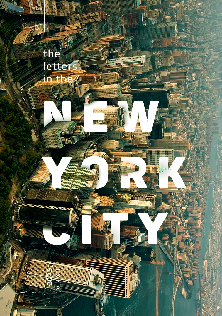
Fig 1.4 New York City poster Source: https://www.behance.net/gallery/31856945/The-letters-in-the-cities |
Making the letters to look like they’re hiding behind the buildings through the use of layering created dynamism in the poster. The bold typeface kept the letters clear and readable although having some parts of them covered up.
|
|
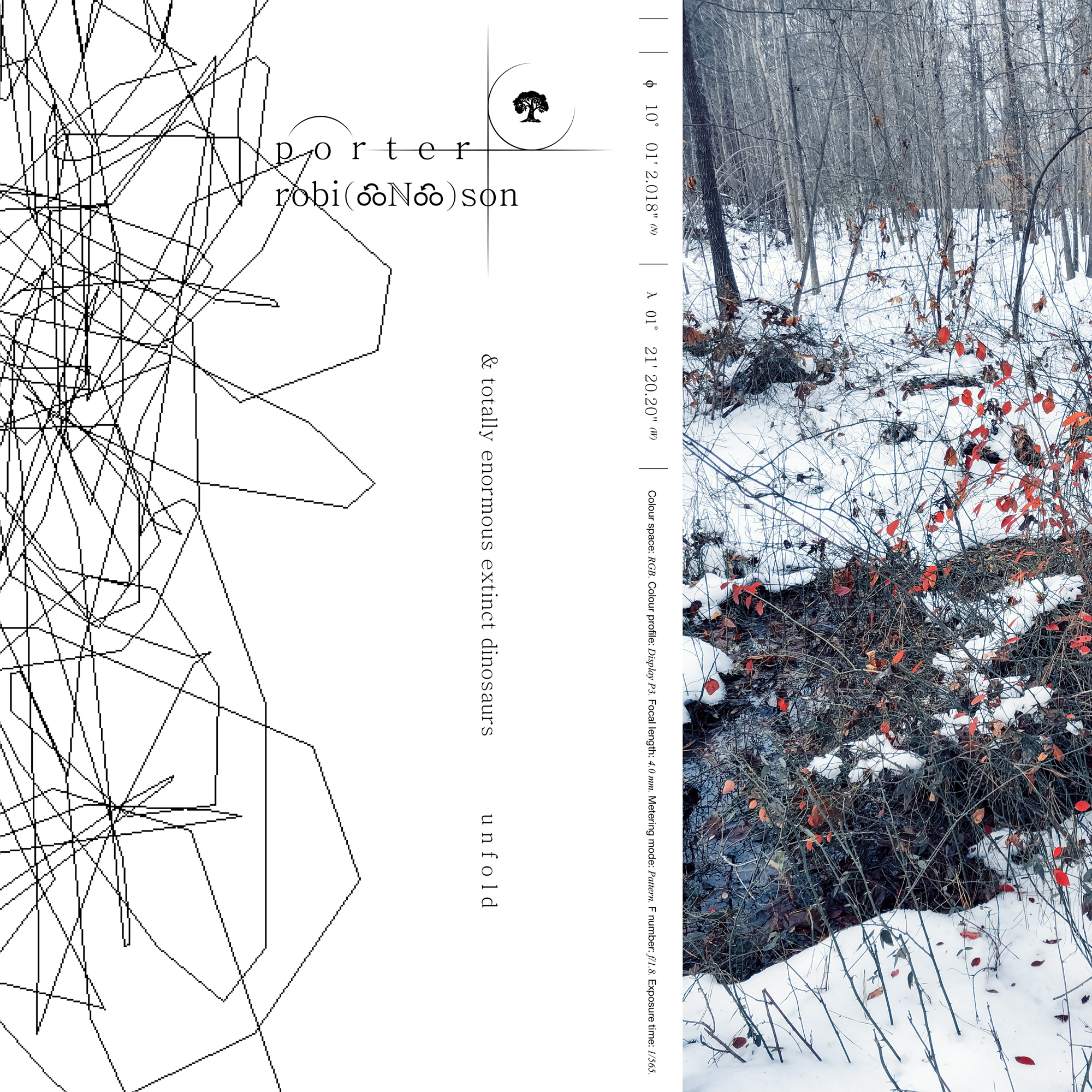
Fig 1.5 "Unfold" single cover Source: https://porterrobinson.com/unfold |
The cover art for the single "Unfold" by Porter Robinson and Totally Enormous Extinct Dinosaurs is clean, minimalist layout gives focus to the small sized font. The words are positioned with close proximity to the objects they’re signifying, creating a good sense of visual hierarchy.
Idea exploration
Sketches

|
| Fig 2.1 Viking symbol sketch (left) and mirrorball symbol sketch (right) |
I only have sketches for my symbol ideation as my word and image ideations
are done directly in Adobe Photoshop. When I was brainstorming ideas for
symbols, I actually started out with a Viking pictorial symbol idea with the
word “Viking” written in Elder Futhrak runes (the first rune system the
Viking uses) to label the symbol. But later on, I thought it’s too simple
which led me to the mirrorball idea.
For the mirrorball idea sketch, I first thought of having each tiles to be
in different colours and to also include different mouth expression in each
tile. But then that idea would look weird so I decided to only go with the
different colours direction.
Symbol idea development
I decided to create a vector artwork using Adobe Illustrator for the
mirrorball symbol. I used different colours to represent different emotions
and used yellow lines to symbolize glowing. I added two crack lines to
indicate that the mirrorball is cracking but even then, it still continues to
spin and glow to keep the party people happy.

|
| Fig 3.3 Using grid to make the second draft of the symbol |
After receiving feedback from Mr. Charles, I went on to make some changes to
the first draft of the symbol. I tried to make it more geometrically accurate
by reconstructing the form of the mirroball using grids. I made each tiles to
have similar size with their mirror parts. (left and right, and up and down
for the centre column). I changed the colours for some of the tiles to give a
"reflective" look to the mirrorball and match the colours more
pleasingly.

|
| Fig 3.4 Using grid to position the yellow lines |
I also used the grids to help me get a similar spacing and positioning between the yellow lines. I changed some of the colour of the tiles again because I wanted each tiles to have different hue of colours.

|
| Fig 3.5 Final work of mirrorball |
Each tiles have different hue of colours to represent the different degrees
of emotion. I changed to having only one crack to try a more subtle approach
in showing the mirrorball is breaking. While the "person" is trying hard to
be someone else for everyone, there's hardly anyone that'll notice that the
person is slowly breaking down into pieces. And even when the person notices
it themselves, they won't pay a lot of attention to it even when the crack
is getting bigger. As long as they're still hanging like a mirrorball for
everyone to see, then everything's fine to them.
I added 10 thicker yellow lines (5 at the left and 5 at the right) to show
that all the 5 emotions are making the mirrorball to shine. The thinner
yellow lines are counted from the top left to the bottom and the top right
to the bottom, making it 5 on both left and right side. The thinner lines
are there to complete the shining effect but I wanted them to relate to the
5 emotions too.
Out of curiosity, I wanted to try out whether I can use only 2 images to visually convey an existing narrative. So, for my first idea, I made a minimalistic poster where the images are paired up with the first verse of the song “Two Birds” by Regina Spektor. The verse basically describes the meaning of the whole song - two metaphorical birds where one wants to “explore” and doesn’t want to stay at the same place, while the other is unwilling to follow but lies that he shares the same dream anyway. So, I wanted to portray the feeling of that verse through the images and arrangement too.
Following the feedback Mr. Charles gave me, I tried out changing the font, alignments and adding extra lines to get a better sense of visual hierarchy. The wires below the bird in the 4th column in tryout #1 and #2 are removed to emphasize more on the lonely mood of that picture. I also went and took a picture of a bird flying away so that I can use it for the third column.
For my second idea, I was directly inspired by the New York City poster. Instead of showing cities, I wanted to relate the word and image to the MCO situation. During the MCO period, some shops were forced to close until further noticed. So, I chose to use a photo that I’ve taken last month. The picture shows a close-up lock found on the metal door gate of a closed shop. Then, I typed in the word “lockdown” to relate to the cause of the store being closed. After that, I layered the word behind the metal bar and the lock to create a kind of interactivity between the word and the image. I also added drop shadows to give a sense of 3D.
Two column of pictures showing one bird in each with a line drawn connecting the wire they're standing on visualizes the lyric "two birds on a wire". "one tries to fly away and the other..." is shown by the two birds being in separate frames with the second frame positioned higher and the second bird positioned a bit out of its frame.
The reader's eyes would then move up to read "watches him close from that wire" with a picture of a flying bird in the sky. This creates a feeling that the reader is seeing the picture from the first bird's point of view, where the first bird looks up to see the second bird fly away.
The reader would then look down to read "he says he wants to as well...but he's a liar", creating a sudden saddened feeling/realization along with the repeated picture of the first bird but now only one wire can be seen in the picture, adding to the lonely visualization of the lyric.
Word and image idea development
First idea - Minimalistic poster for "Two Birds"

|
| Fig 4.5 "Two Birds" poster |
Out of curiosity, I wanted to try out whether I can use only 2 images to visually convey an existing narrative. So, for my first idea, I made a minimalistic poster where the images are paired up with the first verse of the song “Two Birds” by Regina Spektor. The verse basically describes the meaning of the whole song - two metaphorical birds where one wants to “explore” and doesn’t want to stay at the same place, while the other is unwilling to follow but lies that he shares the same dream anyway. So, I wanted to portray the feeling of that verse through the images and arrangement too.
Further development of first idea

|
| Fig 4.7 Different layout ideas for "Two Birds" poster |
Following the feedback Mr. Charles gave me, I tried out changing the font, alignments and adding extra lines to get a better sense of visual hierarchy. The wires below the bird in the 4th column in tryout #1 and #2 are removed to emphasize more on the lonely mood of that picture. I also went and took a picture of a bird flying away so that I can use it for the third column.

|
| Fig 4.8 Adjusted dimension and arrangement of tryout #2 |
After receiving some more feedbacks from Dr. Charles, I decided to go
for the layout in tryout #2 in Fig 4.7 but using the alignment I did in
tryout #3. Because while I purposely moved the second bird out of its
framing in tryout #3 to grab the audience's attention, I didn't like the
visual tension of it after looking at the poster for a prolonged period
of time, and the second column seems out of place with the larger
negative space created. But I noticed the visual hierarchy in tryout #2
isn't good enough as viewers would think the rightmost column comes in
third when it should be the one in the middle. So, I later on figured
out it's not a matter of alignment but a matter of proximity. The text
on the rightmost column is overlapping with the middle space of the
composition, making the audience notice it first before noticing the
middle column.
The original dimension I used is 2480px x 3508px (A4 size). Since there
was no restriction in the size we can use, I changed the dimension to
2753px x 3508px. I moved the rightmost column and text further to the
right and adjusted the middle column and text a little to the left so it
would be closer to the rightmost column and create a bigger white space
between it and the second column. In doing so, there are more space
between the second and the rightmost column, making the middle column
able to take the stage in the centre space of the composition. Hence,
the order of the text and column of pictures are more clearly
established:
1. "two birds on a wire"
2. "one tries to fly away and the other..."
3. "watches him close from that wire"
4. "he says he wants to as well...but he's a liar"
1. "two birds on a wire"
2. "one tries to fly away and the other..."
3. "watches him close from that wire"
4. "he says he wants to as well...but he's a liar"
Second idea - Lockdown poster

|
| Fig 4.10 Lockdown poster |
For my second idea, I was directly inspired by the New York City poster. Instead of showing cities, I wanted to relate the word and image to the MCO situation. During the MCO period, some shops were forced to close until further noticed. So, I chose to use a photo that I’ve taken last month. The picture shows a close-up lock found on the metal door gate of a closed shop. Then, I typed in the word “lockdown” to relate to the cause of the store being closed. After that, I layered the word behind the metal bar and the lock to create a kind of interactivity between the word and the image. I also added drop shadows to give a sense of 3D.
I decided to go with my first idea as my final outcome as I think the
concept and composition is more interesting.
Feedback
Week 5
Elaborate more on the symbolism of the symbol design and make the
mirrorball to be geometrically accurate. Drawing in a grid is a good way
to start. The crack could be more defined too. The first idea for word and
image is good but it lacks hierarchy. Try changing the font size and
style, experiment with adding lines to connect the wires too. Also, type
everything in lowercase letters to match the rebellious characteristics of
the composition.
Week 6
The improvement made on the outcome for symbol is good, it has made the symbol stronger and convincing. For word and image, the line added in tryout #2 between the two birds in the first two columns of picture is nice as it gives a sense of grouping that those two relate to each other. The empty space between the two birds in the first two columns of picture in tryout #3 creates visual tension as the second bird is out of frame, but it works for the composition if that's my intention.
The improvement made on the outcome for symbol is good, it has made the symbol stronger and convincing. For word and image, the line added in tryout #2 between the two birds in the first two columns of picture is nice as it gives a sense of grouping that those two relate to each other. The empty space between the two birds in the first two columns of picture in tryout #3 creates visual tension as the second bird is out of frame, but it works for the composition if that's my intention.
Final outcome
Symbol
In this symbol design, it is to show the message of the kind of person who
feels the need to be someone else in front of different people. Even if
it's a tiring task and it's likely to break them, they still continue to
do it with seemingly no end for the sake of pleasing anyone they interact
with.
Overall rationale of the symbol can be found
here
Some extra elaboration of the explanation:
Some extra elaboration of the explanation:
5 main colours are used for the tiles of the mirrorball, yellow, green,
purple, red and blue. These colours are used to represent different
emotions where yellow can be viewed as joy, green as jealousy or disgust,
purple as fear or mysteriousness, red as anger, blue as sadness etc. Each
tiles have different hues of these 5 colours which represent different
degrees of emotions.
Word and image
In this word an image layout, although the words are not perfectly aligned
with the pictures, but the closeness of their position with their
respective pictures creates a grouping for each of them. Since the words
used are lyrics from the song "Two Birds", the word "two birds" are in
bold and underlined to not only grab attention that it's the starting
point of the composition, but to also act as a title indicating the song
name.
Two column of pictures showing one bird in each with a line drawn connecting the wire they're standing on visualizes the lyric "two birds on a wire". "one tries to fly away and the other..." is shown by the two birds being in separate frames with the second frame positioned higher and the second bird positioned a bit out of its frame.
The reader's eyes would then move up to read "watches him close from that wire" with a picture of a flying bird in the sky. This creates a feeling that the reader is seeing the picture from the first bird's point of view, where the first bird looks up to see the second bird fly away.
The reader would then look down to read "he says he wants to as well...but he's a liar", creating a sudden saddened feeling/realization along with the repeated picture of the first bird but now only one wire can be seen in the picture, adding to the lonely visualization of the lyric.
Reflection
This exercise has helped me to understand how to use symbolism in design
through creating a symbol, and how to pair up words with suitable images
and create a good visual hierarchy through making a design for word and
image. It has also lead me to think out of the box when solving problems
in making a design. For symbol, I had to figure out how to make every
element work together neatly in delivering the message. The colours
matching in the tiles was a challenge in making them to not look too
chaotic, and the yellow lines too in not making them look too out of
place. But I'm glad in the end everything worked visually well enough to
bring out the message. I learned that in creating a symbol, every element
has to be there for a reason, nothing can be taken for granted.
For word and image, I kept constraining myself in making the layout work
within the A4 size dimension, and I didn't want to resize anything so I
kept adjusting the alignment. But I realized that sometimes, I just need
to let go of that initial idea and think "out of the frame" to find a
solution.


So glad to see how much thinking has gone into the whole process. Essentially that is how we engage in critical and analytical thought. It does lead to new discoveries and new understanding. Good work!
ReplyDelete