31.8.2021 - 14.9.2021 (Week 2 - Week 4)
Chung Yi Ki / 0345014 / BDCM
Design
Principles
Exercise 2
Main Menu
Sub-Menu (Tasks)
Lecture
Week 2 / Balance and Emphasis, Repetition and Movement
Balance and symmetry
Balance is an equal distribution of visual weights in a design. Example of
visual weights: Dark colours are “heavier” while light colours are
“lighter”, a bigger object weights “heavier” while a smaller object weights
“lighter”.
Balance can be achieved by using either symmetrical balance or asymmetrical
balance.
3 types of symmetrical balance are discussed in the lecture:
- Bilateral symmetry – Both sides are mirror image of each other.
- Radial symmetry - Radiates out from a point. It can be used to create focus.
- Approximate symmetry – Both sides of the design have variations but are almost symmetrical.

|
|
Fig 1.1 Illustration showing approximate symmetry Source: https://www.pinterest.com/pin/308496643221746490/ |
Asymmetrical balance has unequal visual weights on both sides of a
composition.
- Usually achieved by having a larger size dominant element together with several smaller and less important element
- It’s more dynamic and visually interesting. But it can be difficult to achieve because of the complex elements needed in it.
The golden ratio
A mathematical concept and is also considered as a representative of perfect
beauty. In design, it is used to create harmony, balance and
structure.
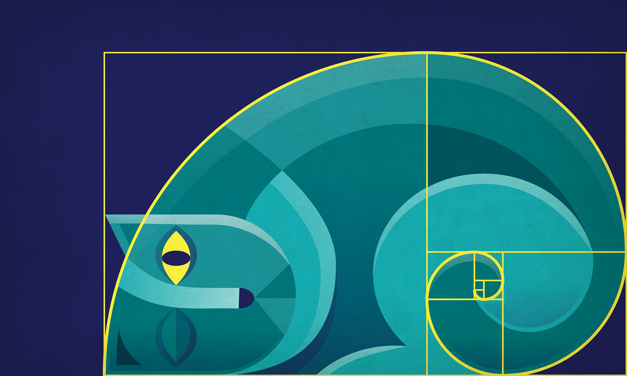
|
|
Fig 1.2 Golden ratio in use Source: https://99designs.com/blog/tips/the-golden-ratio/ |
Rule of thirds
A compositional guideline formed by having a 3x3 grid. It can be used to
create dynamism. Subjects are either placed on one of the intersection
points of the grid or along the vertical and horizontal lines.

|
|
Fig 1.3 Rule of thirds composition guideline Source: https://sketchplanations.com/compose-with-the-rule-of-thirds |
Emphasis and dominance
Emphasis creates dominance and focus to a certain element. It can be
achieved through the use of colours, shapes, values, placement and
size.
Repetition
Repetition exists in both still and moving images. It makes a work seems
active by creative rhythm and pattern. But in order to keep the design
visually interesting, variations are needed to avoid monotony.
Movement
Movement is the way how a design leads the eye. It creates a sense of
movement in the composition and can be made through the use of shapes,
forms, lines and curves. Repetition of elements at different positions can
also create movement.
One of the ways to create movement is by using guiding lines to guide the
viewers’ eyes through the information in a composition.
Hierarchy
A composition with a good hierarchy directs viewers’ eyes to the most
important element/information at the first glance. One of the ways to
achieve hierarchy is by making the important element bigger and positioning
it at the top or at the eye level. It’s also useful to have the element
contrast with the background behind it to draw in focus.
Alignment
Alignment is the arrangement of elements along a common horizontal line,
vertical line, rows or column. Good alignment creates sense of unity,
cohesion and promotes stability. It can also help to guide the viewers’ eye
through the composition.
Tasks
Instructions
Exercise 2
For this exercise, we are tasked to choose 2 principles out of
emphasis/balance/repetition/movement and produce a design for each of our
choices.
Visual research
In my visual research, I decided to look more into emphasis and movement as I
think of inspiration.
Emphasis

|
|
Fig 1.1 Red fox in a wood illustration Source: https://1000drawings.tumblr.com/post/78905813903/kesakettu-by-uuju |
I was searching through Pinterest to find some inspiration and I stumbled upon this artwork. I like how the bright red colour of the fox catches our eye instantly over the dull colour background. And this lets me understand more about how emphasis in colour is used.

|
|
Fig 1.2 A scene from "Amphibia" Season 2 episode 20 "True Colors" Source: https://amphibia.fandom.com/wiki/True_Colors/Gallery?file=True_Colors-00885.png |
As I was searching, I was reminded of this scene from an animated show called
“Amphibia”. Although the character at the back is blurred out, his size which
extends beyond the frame puts an emphasis on his presence in the scene.
In the end, I decided to produce emphasis by using both colour contrast and
scale.
Movement

|
|
Fig 1.3 Milky Way galaxy (A spiral galaxy) Source: https://www.universetoday.com/106062/what-is-the-milky-way-2/ |
As I was finding inspirations, I thought about doing something space themed
which led me to look at pictures of the Milky Way galaxy. I like how the
spiral shape of the galaxy gives a sense of movement to it, as if it is
constantly spirally to the centre.

|
|
Fig 1.4 Outlaws of Time: The Legend of Sam Miracle book cover Source: https://www.commonsensemedia.org/book-reviews/outlaws-of-time-the-legend-of-sam-miracle |
But I was then reminded of a book I’ve read recently which has a really cool book cover design. The cover shows a girl holding an open-ended hourglass with sand swishing out and I really like the curve movement of the sand. So, I later on decided to change the theme to something related to time but keep the spiral idea I had from the Milky Way galaxy.
Idea exploration
Sketches

|
|
Fig 1.1 Thumbnail sketches 1. Movement, 3. Repetition, 2. & 4. Emphasis |

|
| Fig 1.2 Digital sketch for movement |
For movement, I started off with the Milky Way concept sketch (sketch number 1
in Fig 1.1) where planets are arranged in a spiral which meets at the centre.
But later on I did another sketch (Fig 1.2) based on the first sketch which
shows an hourglass at the middle with spiraling lines passing through
it.
For emphasis, I went with the theme of space and wanted to create an idea of
taking a picture of a planet. (sketch number 3 Fig 1.1) Saturn came to mind
because of its well known ring and I wanted to make it huge in size where its
ring would go out of bound from the frame. The camera on the other hand, would
have a smaller size in front of Saturn.
Sketch number 3 and 4 in Fig 1.1 are ideas that came into mind while I was
brainstorming. Although they fit their associated principle, I wanted to try
out something different so I went with the other ideas.
Emphasis idea development

|
|
Fig 1.3 Pre-composition Testing out different backgrounds |
I painted a piece of paper orange with acrylic before cutting the big circle
out. I then cut out the rings from a yellow book cover. As for the camera, I
sketched it out on another piece of paper and coloured it with colour pencil
before cutting it out. Lastly I placed all of them on a piece of black paper.
At first the background was just plain black but it felt a bit boring so I
added some white dots in the background to represent stars and to add visual
interest to the design.

|
| Fig 1.4 Final work with mounting tape added |

|
| Fig 1.5 Final work with a light source shining from below |
After receiving feedback from Dr. Charles, I added mounting tapes behind
Saturn, Saturn's front ring and the camera. Saturn and its ring has one layer
of mounting tape while the camera has 5 layers of mounting tape so that the
distance between them is more prominent.
Movement idea development

|
| Fig 1.6 Word spiral test |
I wanted to try a mixed media approach to this idea and since the theme is about time, I thought of making the spiral out of torn pieces of papers with "time" written and printed on them. I also wanted to create an "opposite" idea where the bottom part of the spiral are printed words and the top part of the spiral are written words.

|
|
Fig 1.7 Pre-composition full image (left) Pre-composition cropped (right) |
After that, I drew the hourglass with marker and coloured it with colour pencil before cutting it out and placing all of the elements on a piece of black paper.
Feedback
Since the picture of my emphasis design has a subtle drop shadow that can be
seen behind the camera, Dr. Charles suggest me to try putting foam or mounting
tape behind Saturn and the camera to create distance between the two subjects.
Other than that, Dr. Charles also liked the movement design and said to write
down my explanation on why movement is present in the work.
Final outcome
Emphasis
 |
| Fig 2.1 Final emphasis outcome - JPEG |
Fig 2.2 Final emphasis outcome - PDF
In this design, there are two subjects in emphasis which are Saturn and the
camera. It is clear that Saturn is the main emphasis of the work. Its size is
the biggest and its colour contrast with all the other elements, making it the
first to grab our attention. The camera while being in the foreground, has a
much more smaller size and its colour is a lot more muted and darker. So, it
grabs the viewer’s attention later and shows that it is in secondary
importance compared to Saturn.
Movement
 |
| Fig 2.3 Final movement outcome - JPEG |
Fig 2.4 Final movement outcome - PDF
For me, the challenge in this was figuring out how to use rectangular or
“blocky” shapes to create a curve line movement. I intentionally left the
printed words and handwriting in a normal horizontal alignment so the movement
effect would be how I would arrange the words. The handwritten words
themselves have different weights of strokes which gave variation to the
design. But the printed words, although having different typefaces, the
letters are perfectly aligned in order which made them look stiff. But the
trick here is to arrange the words following a curve and using different sizes
(the white spaces) to not only add variation, but also to create a sense of
distance when the words are moving toward the hourglass. Different position
(upside down, slanted, straight) of each torn out pieces also adds to the
illusion of movement along with the curved shape.
Reflection
In doing this exercise, it helped me to understand more about how emphasis
and movement is created. At first I thought emphasis and contrast is the
same but after doing some visual researches, I understand that contrast can
exist in emphasis but emphasis doesn’t necessarily need contrast to
exist.
Movement is an interesting principle itself and the idea I decided for my
exercise is perhaps the most fun challenge I’ve ever done. I honestly didn’t
thought it would work at first but I’m really glad the final result achieved
my aim. Through making that design, I found out that actual lines and
colours may not be a must to create movement, as long as the elements used
follow a curve and has enough variations to them, movement can be
achieved.
Beautiful! Very good improvements!
ReplyDelete