24.8.2021-14.9.2021 (Week 1 - Week 4)
Chung Yi Ki / 0345014 / BDCM
Design Principles
Exercise 1
Chung Yi Ki / 0345014 / BDCM
Design Principles
Exercise 1
Main Menu
3. Reflection
Elements and Principles of Design
Gestalt theory & Contrast
For my visual research, I focused on researching about principle of figure/ground and principle of closure for Gestalt theory as they are interesting. I found a lot of interesting design works based on those 2 principles and here are the ones that inspired me:
For Gestalt theory, I decided to create a design of a cat and a dog and apply the upside down idea that I got from the Batman vs Penguin poster and add eyes for clarity like the Disney's Brave poster.
Sub-Menu (Tasks)
Lecture
Week 1/ Introduction, Elements and principles of design, Contrast,
Gestalt Theory
This week was an introductory week to the module. We met up with Dr. Charles
and he gave us an introduction and explanation to the module as well as
briefed us on important deadlines and our first exercise. But in addition to
that, Dr. Jinchi also gave us two recorded lectures on elements and
principles of design, and Gestalt theory and contrast. These are my
notes along with additional information I found while researching on the
Internet:
Elements and Principles of Design
Elements of design refers to the building blocks needed to create a
design work, while principles of design refer to the guidelines in the
ways to use the elements effectively. In other words, elements are the
Lego pieces while principles are the instruction booklets. There are 7
elements of design: point, line, shape, form, texture, space and colour.
Points form a line, a line can be different kinds of lines. Shapes are
2-D. 3-D shapes produce forms. Textures are tactile illusions, while
spaces are the empty regions in a design. Colours have different tones,
tints, and shades.
To put things more simply, here are some images explaining elements and
principles that I’ve found from a website:

|
| Fig 1.1 Tables showing a brief explanation of the elements and principles |

|
|
Fig 1.2 A matrix graph showing the elements and their usage in
each principles Source: http://www.wheelerarts.org/elements-and-principles-of-art.html
|
Gestalt theory & Contrast
Contrast
Contrast occurs when two very different elements are used in a
design/artwork. It can be a light colour vs a dark colour, a soft
texture vs a rough texture, or even blocky letters vs cursive
letters. Contrast makes a piece more interesting and eye-catching,
as well as helps to draw focus on the subjects in the
design.
Gestalt Theory
Reference website: https://www.usertesting.com/blog/gestalt-principles#similarity
(note: these are combination of information gathered from the lecture recording and UserTesting's 2019 website article)
Reference website: https://www.usertesting.com/blog/gestalt-principles#similarity
(note: these are combination of information gathered from the lecture recording and UserTesting's 2019 website article)
Gestalt principles are laws/rules that describe how human perceive
visual elements. Based on these principles, it is found that the human
eye tends to recognize patterns, group similar elements together and
simplify a complex form. By using these principles, designers are able
to turn a complex layout or idea to a more simplify version so the end
product will be easier to understand.
6 Gestalt principles are discussed in this week’s lecture:
1. Principle of similarity – We
tend to group elements that are similar together and also tend to
think that they have the same functions. (e.g: all blue words
represent hyperlinks)
2. Principle of continuation –
Our eyes naturally follow lines and curves so we perceive elements
arranged in a line or a curve to be related to each other.
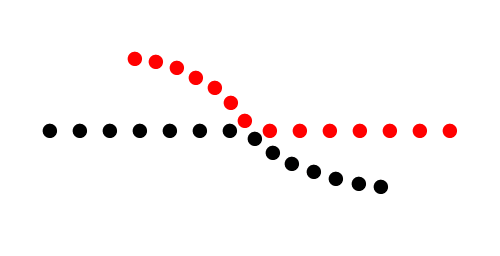
|
|
Fig. 2.1 We tend to see a straight line and a curved line
rather
than following the dots according to their individual colours |
3. Principle of closure – Our
brains tend to look for a recognizable pattern in a complex
arrangement of visual elements. So, when looking at a design piece
with missing parts, we tend to fill in the blanks to make sense of the
complete image.
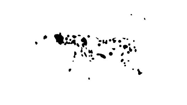
|
|
Fig 2.2 Closure design of a Dalmatian |
4. Principle of proximity –
This states that elements which are related to each other should be
placed close to one another, as our eyes group objects that are close
to each other as one single unit.
5. Principle of figure/ground –
Our eyes instinctively perceive objects as being either the subject of
interest (figure) or the background (ground). While this principle can
be used to draw focus on our subjects like in this example:

|
|
Fig 2.3 The white areas stand out first so it lets us know
that the contents in those areas are important (the figure) |
But it can also be used creatively by making both the figure and
ground subjects of the design, much like making the use of negative
spaces, for example:

|
|
Fig 2.4 We see the white apple at first but the black
background also forms a silhouette of a face in the apple |
6. Law of symmetry and order –
This law states that objects or elements that are symmetrical to each
other will be grouped together and seen as a singular unit.
Tasks
Instructions
Exercise 1
We are tasked to produce 2 designs each for Gestalt theory and
contrast. We are allowed to use any materials of our choice in our
work.
Visual Research
For my visual research, I focused on researching about principle of figure/ground and principle of closure for Gestalt theory as they are interesting. I found a lot of interesting design works based on those 2 principles and here are the ones that inspired me:
Principle of figure/ground

Fig 1.1 Batman vs Penguin poster
Source: https://www.behance.net/gallery/2562707/Print-Selection-1
This poster might be simple but it uses Gestalt theory cleverly.
When viewed upright, the silhouette of Batman can be clearly seen.
But when turned upside down, the silhouette of Penguin (Batman’s
villain) becomes apparent.

|
|
Fig 1.1 Batman vs Penguin poster Source: https://www.behance.net/gallery/2562707/Print-Selection-1 |

|
|
Fig 1.2 Disney's Brave poster illustration Source: http://cromeyellow.com/michael-depippos-breathtaking-brave-poster/ |
The shape of Merida’s hair forms the shape of a bear in the negative
space and an eye is added to the bear for clarity. This kind of
figure/ground stylization is not as common compared to the others, as
two figures are more easily seen at first look unlike the
aforementioned Batman vs Penguin poster.
Principle of closure

|
|
Fig 2.1 Closure illustration of an orca Source: https://www.reddit.com/r/Design/comments/4dwuip/first_semester_student_studying_the_gestalt/ |

|
|
Fig 2.2 Closure illustration of a woman Source: https://www.tedthomas101.com/gestalt-perception-meaning-and-design/ |
With principle of closure, I noticed that when enough shapes are
used and correctly placed, closure can be achieved as the shapes
around the unenclosed spaces are clear enough for people to perceive
the outline of the complete image.
At the end, I decided to use principle of figure/ground in coming up
with my Gestalt design because I wanted to create something
simple like the Batman vs Penguin poster but with the clarity of
Disney’s Brave poster. Although I didn’t choose principle of
closure, it gave me an inspiration on what I want to make for my
design on contrast.
Idea exploration
Sketches

|
| Fig 1.1 Thumbnail sketches for Gestalt theory (left) and contrast (right) |
|
| Fig 1.2 Thumbnail sketches for contrast |
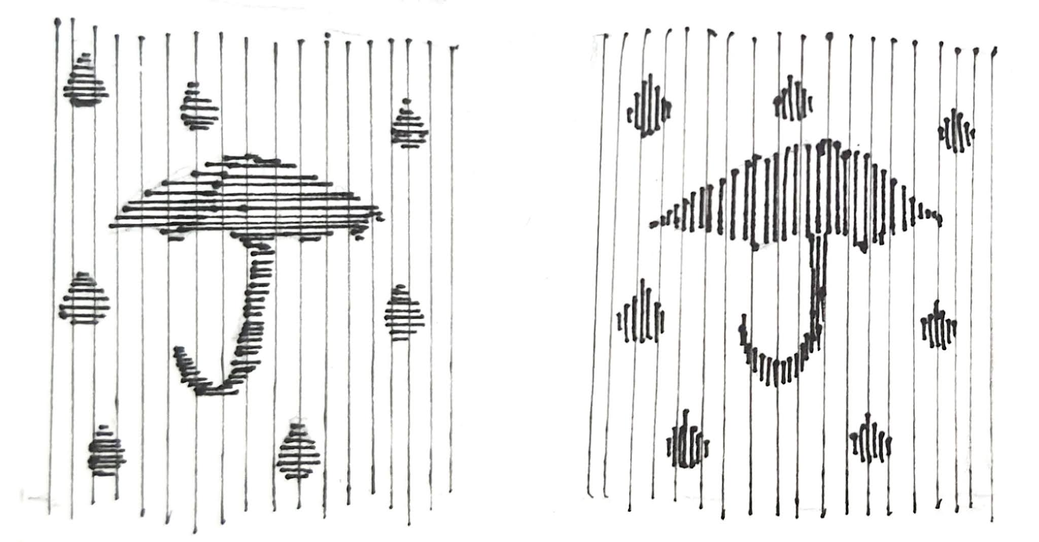
For Gestalt theory, I decided to create a design of a cat and a dog and apply the upside down idea that I got from the Batman vs Penguin poster and add eyes for clarity like the Disney's Brave poster.
For contrast, I first came up with the umbrella idea (Fig 1.2) using
different weights and direction of lines to create contrast between
the subjects and the background. Later on, I thought of a sun bear
idea (Fig 1.1) that applies a bit of closure and contrast between
colours. I liked the latter on so I decide to go with that.
Gestalt theory idea development

|
|
Fig 2.2 Pre-composition Different element test for the idea |

|
|
Fig 2.3 Pre-composition Rotated |
I drew the sketch again on a piece of white paper and cut out the
cat and place it on a black paper. I tested out the difference
between not having any other elements beside the plain cat and dog,
accentuate the dog's ear with a black 'u' shape and going back to
placing the eyes for each of them. I still think that the eyes
communicate the design better as it helps to show each of the
subjects.
Contrast idea development

|
| Fig 2.4 Contrast digital try-out |
Since sun bears are known for their yellow "V" pattern on their
neck, I wanted to show that in my contrast design idea. Before
making the physical artwork, I did a try-out of the idea digitally
based on my sketch to get the right shape and see if it'll work. I
used a yellow and black contrast for this idea.

|
| Fig 2.5 Tracing from the digital try-out |

|
| Fig 2.6 Physical work pre-composition |
I then traced out the digital try-out on a tracing paper and made
some refinements before cutting out the needed parts from white and
black papers and placing them on a yellow paper.
Feedback
Dr. Charles note that the gestalt theory design is a good
experimentation from the Batman vs Penguin poster inspiration.
Overall the feedback was that the works are on the right track in
attaining their respective principles.
Final outcome
Gestalt theory
 |
| Fig 3.1 Final gestalt theory outcome - JPEG |
Fig 3.2 Final gestalt theory outcome - PDF
On an upright position, the cat catches our attention first as it's head is
on our eye level. While on an upside down position, the dog becomes more
apparent as it has taken the place of the cat. Since the black dog borrow
its ear from the white cat, it would be harder to distinguish the two
subjects separately if the eyes were not given to them. Besides that, the
shape of the eyes also gives them somewhat of an expression.
Contrast
 |
| Fig 3.3 Final contrast outcome - JPEG |
Fig 3.4 Final contrast outcome - PDF
Yellow having a lighter hue and value, contrast heavily with black which has
a darker hue and value. The yellow background here doesn’t only act as
the background, but it is also used to form the “V” shape neck of the sun
bear. The white face of the sun bear, although it’s not contrasting with the
yellow background, contrasts with the black body, eye and nose instead which
helps to show its contour clearer.
Reflection
Through this exercise, I was able to learn more about Gestalt theory and
the different kinds of contrast by doing additional research besides
listening to lecture recordings. Gestalt theory was challenging for me as
it was the first time I got to know about this principle. So, when doing
the exercise I had to spend a lot of time looking at other people’s
artworks (from the internet and from seniors) and read a lot of articles
about it to understand how to create it.
When thinking of an idea for contrast, I learnt that contrast doesn't have
to be the usual black and white combination. If there’s very opposing
elements included in a design, then contrast is present. It was
interesting trying on a different idea in my contrast design and I was
able to learn from it as well.
Well done
ReplyDelete